.
ENGRAVERS AND ETCHERS
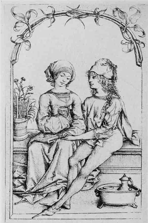
MASTER OF THE AMSTERDAM CABINET. TWO LOVERS
Size of the original engraving, 6½ × 4⅛ inches
In the Ducal Collection, Coburg
ENGRAVERS
AND
ETCHERS
SIX LECTURES DELIVERED ON THE SCAMMON FOUNDATION
AT THE ART INSTITUTE OF CHICAGO, MARCH 1916
BY
FITZROY CARRINGTON, M. A.
CURATOR OF PRINTS AT THE MUSEUM OF FINE ARTS,
BOSTON; LECTURER ON THE HISTORY AND PRINCIPLES
OF ENGRAVING AT HARVARD UNIVERSITY; EDITOR OF
“THE PRINT-COLLECTOR’S QUARTERLY”
WITH 133 ILLUSTRATIONS
THE ART INSTITUTE OF CHICAGO
1917
COPYRIGHT 1917
THOMSEN-BRYAN-ELLIS COMPANY
DESIGNED AND PUBLISHED BY
THOMSEN-BRYAN-ELLIS COMPANY
WASHINGTON BALTIMORE
NEW YORK PHILADELPHIA
TO THOSE
WHO HELPED ME MAKE THIS BOOK
IN GRATEFUL RECOGNITION
NOTE
The lectures presented in this volume comprise the twelfth series delivered at the Art Institute of Chicago on the Scammon Foundation. The Scammon Lectureship is established on an ample basis by bequest of Mrs. Maria Sheldon Scammon, who died in 1901. The will prescribes that these lectures shall be upon the history, theory, and practice of the Fine Arts (meaning thereby the graphic and plastic arts), by persons of distinction or authority on the subject on which they lecture, such lectures to be primarily for the benefit of the students of the Art Institute, and secondarily for members and other persons. The lectures are known as “The Scammon Lectures.”
CONTENTS
| PAGE | |
| LECTURE I | |
| German Engraving: From the Beginnings to Martin Schongauer |
13 |
| LECTURE II | |
| Italian Engraving: The Florentines | 51 |
| LECTURE III | |
| German Engraving: The Master of the Amsterdam Cabinet and Albrecht Dürer |
95 |
| LECTURE IV | |
| Italian Engraving: Mantegna to Marcantonio Raimondi |
139 |
| LECTURE V | |
| Some Masters of Portraiture | 181 |
| LECTURE VI | |
| Landscape Etching | 227 |
LIST OF ILLUSTRATIONS
| PAGE | |
| Master of the Amsterdam Cabinet. Two Lovers | Frontispiece |
| Master of the Playing Cards. St. George | 15 |
| Man of Sorrows | 16 |
| Master of the Year 1446. Christ Nailed to the Cross | 19 |
| Master of St. John the Baptist. St. John the Baptist | 20 |
| Master E. S. of 1466. Madonna and Child with Saints Marguerite and Catherine |
23 |
| Ecstasy of St. Mary Magdalen | 24 |
| Design for a Paten | 27 |
| St. John on the Island of Patmos | 28 |
| Martin Schongauer. Virgin with a Parrot | 31 |
| Temptation of St. Anthony | 32 |
| Death of the Virgin | 33 |
| Pilate Washing His Hands | 34 |
| St. John on the Island of Patmos | 37 |
| Christ Appearing to the Magdalen | 38 |
| Virgin Seated in a Courtyard | 39 |
| Angel of the Annunciation | 40 |
| The Miller | 43 |
| Censer | 44 |
| Master L Cz. Christ Tempted | 47 |
| Christ Entering Jerusalem | 48 |
| Anonymous Florentine, XV Century. Profile Portrait of a Lady |
53 |
| Wild Animals Hunting and Fighting | 54 |
| Triumphal Procession of Bacchus and Ariadne | 57 |
| Jupiter | 58 |
| Mercury | 63 |
| Lady with a Unicorn | 64 |
| The Christian’s Ascent to the Glory of Paradise. From “Il Monte Sancto di Dio,” Florence, 1477 |
67 |
| Dante and Virgil with the Vision of Beatrice. From the “Divina Commedia,” Florence, 1481 |
68 |
| Assumption of the Virgin (After Botticelli) | 71 |
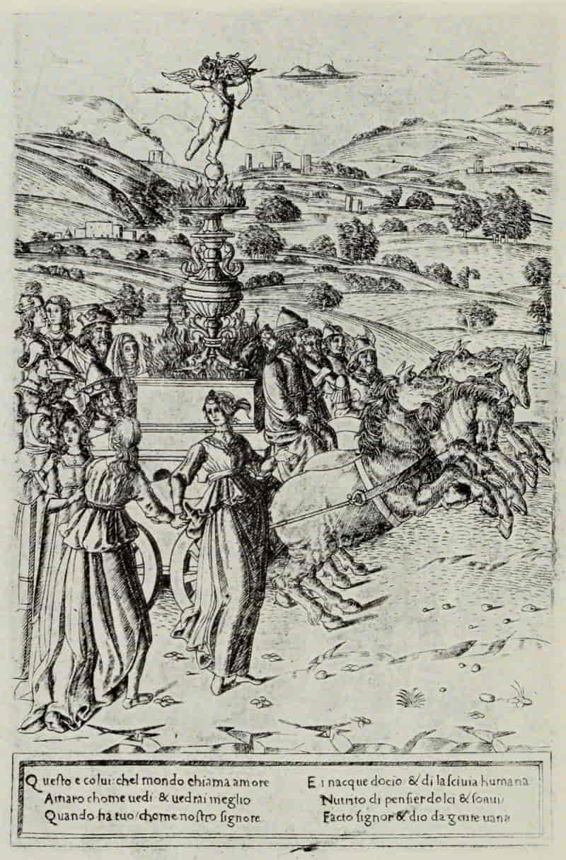
| Triumph of Love. From the Triumphs of Petrarch | 72 |
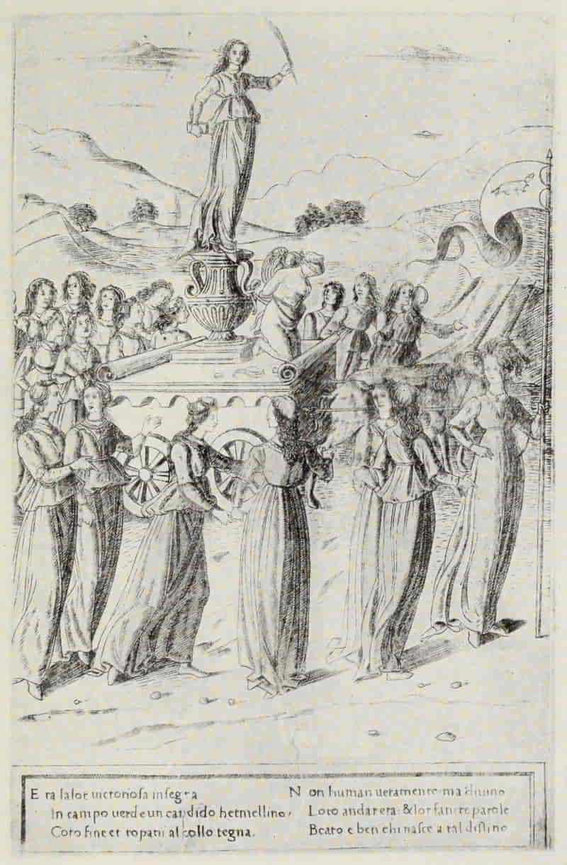
| Triumph of Chastity. From the Triumphs of Petrarch | 75 |
| Libyan Sibyl | 76 |
| Anonymous North Italian, XV Century. The Gentleman. From the Tarocchi Prints (E Series) |
79 |
| Clio. From the Tarocchi Prints (S Series) | 80 |
| The Sun. From the Tarocchi Prints (E Series) | 83 |
| Angel of the Eighth Sphere. From the Tarocchi Prints (E Series) |
84 |
| Cristofano Robetta. Adoration of the Magi | 87 |
| Antonio Pollaiuolo. Battle of Naked Men | 88 |
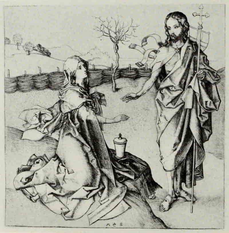
| Master of the Amsterdam Cabinet. Ecstasy of St. Mary Magdalen |
97 |
| Crucifixion | 98 |
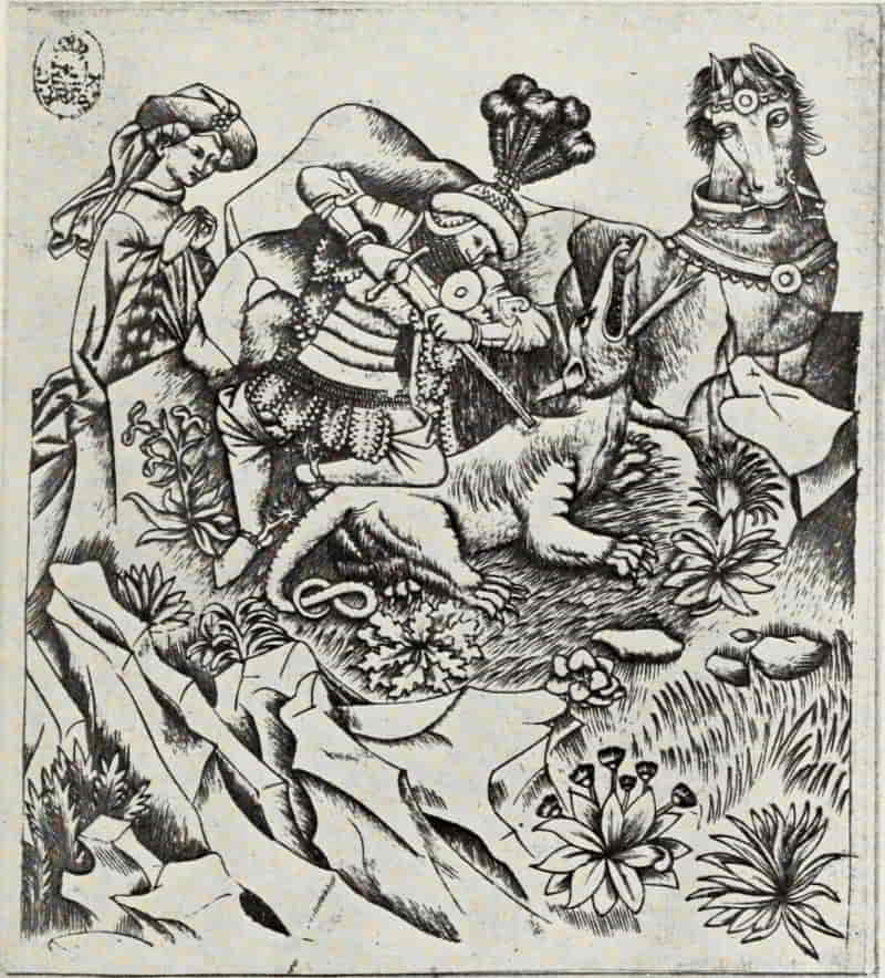
| Stag Hunt | 101 |
| St. George | 102 |
| Albrecht Dürer. Virgin and Child with the Monkey | 107 |
| Four Naked Women | 108 |
| Hercules | 111 |
| Anonymous North Italian, XV Century. Death of Orpheus |
112 |
| Albrecht Dürer. Death of Orpheus | 113 |
| Battle of the Sea-Gods (After Mantegna) | 114 |
| Adam and Eve | 117 |
| Apollo and Diana | 118 |
| St. Jerome by the Willow Tree (First State) | 121 |
| Holy Family | 122 |
| Knight, Death and the Devil | 125 |
| Melancholia | 126 |
| St. Jerome in His Cell | 129 |
| Virgin Seated Beside a Wall | 130 |
| Christ in the Garden | 133 |
| Erasmus of Rotterdam | 134 |
| Andrea Mantegna. Virgin and Child | 141 |
| Battle of the Sea-Gods | 142 |
| The Risen Christ Between Saints Andrew and Longinus |
147 |
| School of Andrea Mantegna. Adoration of the Magi | 148 |
| Zoan Andrea (?). Four Women Dancing | 151 |
| Giovanni Antonio da Brescia. Holy Family with Saints Elizabeth and John |
152 |
| School of Leonardo da Vinci. Profile Bust of a Young Woman |
155 |
| Nicoletto Rosex da Modena. Orpheus | 156 |
| Jacopo de’ Barbari. Apollo and Diana | 159 |
| St. Catherine | 160 |
| Giulio Campagnola. Christ and the Woman of Samaria |
163 |
| Ganymede (First State) | 164 |
| St. John the Baptist | 167 |
| Giulio and Domenico Campagnola. Shepherds in a Landscape |
168 |
| Marcantonio Raimondi. St. George and the Dragon | 171 |
| Bathers | 172 |
| St. Cecelia | 173 |
| Death of Lucretia | 174 |
| Philotheo Achillini (“The Guitar Player”) | 177 |
| Pietro Aretino | 178 |
Master  . Head of a Young Woman . Head of a Young Woman |
183 |
| Albrecht Dürer. Albert of Brandenburg | 184 |
| Philip Melanchthon | 187 |
| Anthony Van Dyck. Portrait of Himself (First State) | 188 |
| Frans Snyders (First State) | 191 |
| Lucas Vorsterman (First State) | 192 |
| Rembrandt. Jan Cornelis Sylvius | 195 |
| Rembrandt Leaning on a Stone Sill | 196 |
| Clement de Jonghe (First State) | 197 |
| Jan Lutma (First State) | 198 |
| Claude Mellan. Virginia da Vezzo | 201 |
| Fabri de Peiresc | 202 |
| Jean Morin. Cardinal Guido Bentivoglio | 205 |
| Robert Nanteuil. Pompone de Bellièvre | 206 |
| Basile Fouquet | 211 |
| Jean Loret | 212 |
| J. A. McN. Whistler. Annie Haden | 215 |
| Riault, the Engraver | 216 |
| Anders Zorn. Ernest Renan | 219 |
| The Toast | 220 |
| Madame Simon | 221 |
| Miss Emma Rassmussen | 222 |
| Albrecht Dürer. The Cannon | 229 |
| Augustin Hirschvogel. Landscape | 230 |
| Rembrandt. The Windmill | 233 |
| Three Trees | 234 |
| Six’s Bridge | 237 |
| Landscape with a Ruined Tower and Clear Foreground | 238 |
| Landscape with a Haybarn and a Flock of Sheep | 239 |
| Three Cottages | 240 |
| Goldweigher’s Field | 243 |
| Jacob Ruysdael. Wheat Field | 244 |
| Claude Lorrain. Le Bouvier | 249 |
| Charles Jacque. Troupeau de Porcs | 250 |
| Storm—Landscape with a White Horse | 253 |
| Charles-François Daubigny. Deer in a Wood | 254 |
| Deer Coming Down to Drink | 257 |
| Moonlight on the Banks of the Oise | 258 |
| Camille Corot. Souvenir of Italy | 261 |
| Jean-François Millet. The Gleaners | 262 |
| Seymour Haden. Cardigan Bridge | 265 |
| By-Road in Tipperary | 266 |
| Sunset in Ireland | 267 |
| Sawley Abbey | 268 |
| J. A. McN. Whistler. Zaandam (First State) | 271 |
| Rembrandt. View of Amsterdam from the East | 272 |
TO THE READER
When that most sensitive of American print-lovers, the late Francis Bullard, learned that I was to deliver at Harvard, each year, a course of lectures on the History and Principles of Engraving, he wrote me one of those characteristic letters which endeared him to his friends, concluding his wise counsels with these words: “Nothing original—get it all out of the books.”
In these six lectures I have endeavored to profit by his suggestion. In them there is little original: most of it is out of the books. Books, however, like Nature, are a storehouse from which we draw whatever is best suited to our immediate needs; and if in choosing that which might interest an audience, to the majority of whom engravings and etchings were an unexplored country, I have preferred the obvious to the profound, I trust that the true-blue Print Expert will forgive me. These simple lectures make no pretense of being a History of Engraving, or a manual of How to Appreciate Prints. My sole aim has been to share with my audience the stimulation and pleasure which certain prints by the great engravers and etchers have given me. If I have succeeded, even a little, I shall be happy. I would add that the lectures are printed in substantially the same form as they were delivered. Consequently they must be read in connection with the illustrations which accompany them.
The Bibliographies which follow each chapter have been prepared by Mr. Adam E. M. Paff, Assistant in the Department of Prints at the Museum of Fine Arts, Boston.
FitzRoy Carrington
Museum of Fine Arts, Boston
June 26, 1916
[Pg 13]
ENGRAVERS AND ETCHERS
GERMAN ENGRAVING: FROM THE BEGINNINGS
TO MARTIN SCHONGAUER
WHERE were the beginnings? When were the beginnings? Germany, the Netherlands, and Italy have each claimed priority. Max Lehrs has settled these rival claims, so far as they can be settled at the present time, by locating the cradle of engraving neither in Germany, in the Netherlands, nor in Italy, but in a neutral country—Switzerland, in the vicinity of Basle—naming the Master of the Playing Cards as probably the earliest engraver whose works have come down to us. Undoubtedly this artist was not the first to engrave upon metal plates, but of his predecessors nothing is known, nor has any example of their work survived.
The technical method of the Master of the Playing Cards is that of a painter rather than of a goldsmith. There is practically no cross-hatching, and the effect is produced by a series of delicate lines, mostly vertical, laid close together. His plates are unsigned and undated, so that we can only approximate the period of his activity. That he preceded, by at least ten years, the earliest dated engraving,[Pg 14] the Flagellation, by the Master of 1446, may safely be assumed, since in the manuscript copy of Conrad von Würzburg’s “The Trojan War,” transcribed in 1441 by Heinrich von Steinfurt (an ecclesiastic of Osnabrück), there are pen drawings of figures wearing costumes which correspond exactly with those in prints by the Master of the Playing Cards in his middle period. The Master of the Playing Cards is, therefore, the first bright morning star of engraving. From him there flows a stream of influence affecting substantially all of the German masters until the time of Martin Schongauer, some of whose earlier plates show unmistakable traces of an acquaintanceship with his work.
MASTER OF THE PLAYING CARDS. ST. GEORGE
Size of the original engraving, 5⅞ × 5¼ inches
In the Royal Print Room, Dresden
MASTER OF THE PLAYING CARDS. MAN OF SORROWS
Size of the original engraving, 7¾ × 5⅛ inches
In the British Museum
St. George and the Dragon is in his early manner. Here are plainly to be seen the characteristics of this first period—the broken, stratified rocks, the isolated and conventionalized plants, and the peculiar drawing of the horse, especially its slanting and half-human eyes. The Playing Cards, from which he takes his name, may safely be assigned to his middle period. The suits are made up of Flowers (roses and cyclamen), Wild Men, Birds, and Deer, with a fifth, or alternative suit of Lions and Bears. Like all the early German designers of playing cards, he has given free rein to his fancy and inventiveness. The position of the different emblems is varied for each numeral card; and each flower, wild [Pg 17]man, bird, or beast, has an attitude and character of its own, no two being identical. No engraver has surpassed him in truthfulness and subtlety of observation and in the delineation of birds few artists have equalled him. His rendering of the growth and form of flowers would have delighted John Ruskin. In the King of Cyclamen and the Queen of Cyclamen the faces have an almost portrait-like individuality. The hands are well drawn and do not yet display that attenuation which is characteristic of nearly all fifteenth century German masters and is a noticeable feature in engravings by Martin Schongauer himself. The clothing falls in natural folds, and in the King of Cyclamen the representation of fur could hardly be bettered.
To his latest and most mature period must be assigned the Man of Sorrows—in some ways his finest, and certainly his most moving, plate. Not only has he differentiated between the textures of the linen loin-cloth and the coarser material of the cloak; but the column, the cross with its beautiful and truthful indication of the grain of the wood, and the ground itself, all are treated with a knowledge and a sensitiveness that is surprising. The engraver’s greatest triumph, however, is in the figure of Christ. There is a feeling for form and structure, sadly lacking in the work of his successors, and his suggestion of the strained and[Pg 18] pulsing veins, which throb through the Redeemer’s tortured limbs, is of a compelling truth.
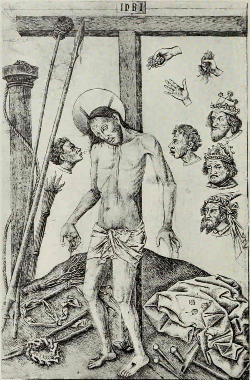
Chief among the engravers who show most clearly the influence of the Master of the Playing Cards is the Master of the Year 1446, so named from the date which appears in the Flagellation. His prints present a more or less primitive appearance, and were it not for this date, one might be tempted, on internal evidence, to assign them to an earlier period. In the Passion series, in particular, many of the figures are more gnome-like than human. Such creatures as the man blowing a horn, in Christ Nailed to the Cross, and the man pulling upon a rope, in the same print, recall to our minds, by an association of ideas, the old German fairy tales.
Contemporary with the Master of 1446, and belonging to the Burgundian-Netherlands group, to which also belong the two anonymous engravers known as the Master of the Mount of Calvary and the Master of the Death of Mary, is the Master of the Gardens of Love. His figures are crude in drawing and stiff in their movements. His knowledge of tree forms is rudimentary; but his animals and birds show real observation and seem to have been studied from life.
MASTER OF THE YEAR 1446. CHRIST NAILED TO THE CROSS
Size of the original engraving, 4⅛ × 3¼ inches
In the Royal Print Room, Berlin
MASTER OF ST. JOHN THE BAPTIST. ST. JOHN THE BAPTIST
Size of the original engraving, 8½ × 5⅞ inches
In the Albertina, Vienna
In the larger of the two engravings from which he takes his name, we see reflected the pleasure-loving court of the Dukes of Burgundy. On [Pg 21]the right, a lady leads her lover to a table spread with tempting viands. She stretches forth her right hand to take the fruit. It is a fig, the sign of fertility. To their right, drinking from a stream, is a unicorn, the sign of chastity. The artist seemingly wishes the lady’s message to read that she is still unwedded, and that, were she wedded, she would be a good mother. Observe, likewise, the way in which the engraver has placed the wild hogs, deer, and bears emerging from the woods, while, in the sky, numerous birds wing their flight. In the immediate foreground a lady and a cavalier are reading poetry to each other. Another lady plays to a gallant who, in a most uncomfortable attitude, holds a sheet of music. In the right-hand corner is a fourth pair, the lady busily twining a wreath for her lover’s hat, which lies on her lap. We have here a compendium of the courtly life of the time, which is about 1448.
The Master of St. John the Baptist may fittingly be called the first realist in engraving. His plates do not display that extraordinary delicacy in cutting which is characteristic of the Master of the Playing Cards. Like that earlier engraver, he makes little use of cross-hatching, and his strokes are freely disposed—more in the manner of a painter than a goldsmith-engraver. His birds and flowers are closely observed and admirably rendered.
[Pg 22]
The mullein, the columbine, and the iris in St. John the Baptist are each given their individual character; the tree trunks to the right no longer resemble twisted columns, as in earlier work, but have real bark with knot holes and branches organically joined, though the foliage is still conventionally treated. One cannot but remark, also, the skilful way in which the engraver has differentiated between the furry undergarment and the cloak which St. John the Baptist wears.
In St. Christopher we have probably one of his latest works. His representation of the waves, of the sky and clouds, is noteworthy, while, on the beach, the sea-shells give mute testimony to his love for little things.
Of the predecessors of Martin Schongauer, none exerted a greater influence than the Master E. S. of 1466. On the technical side he was the actual creator of engraving as practised in modern times, and was a determining factor in the progress of the art. Even the Italian engravers were unable to withstand it; their Prophets and Sibyls are partly derived from his Evangelists and Apostles, the easy disposition of his draperies furnishing them with models. Over three hundred engravings by the Master E. S. have come down to us, and over a hundred more can be traced through copies by other hands, or as having formed component parts [Pg 25]of his two sets of playing cards—the smaller set made up of Wild Animals, Helmets, Escutcheons, and Flowers, while the larger set comprises Men, Dogs, Birds, and Escutcheons.
MASTER E. S. OF 1466. MADONNA AND CHILD WITH SAINTS
MARGUERITE AND CATHERINE
Size of the original engraving, 8⅝ × 6⅜ inches
In the Royal Print Room, Dresden
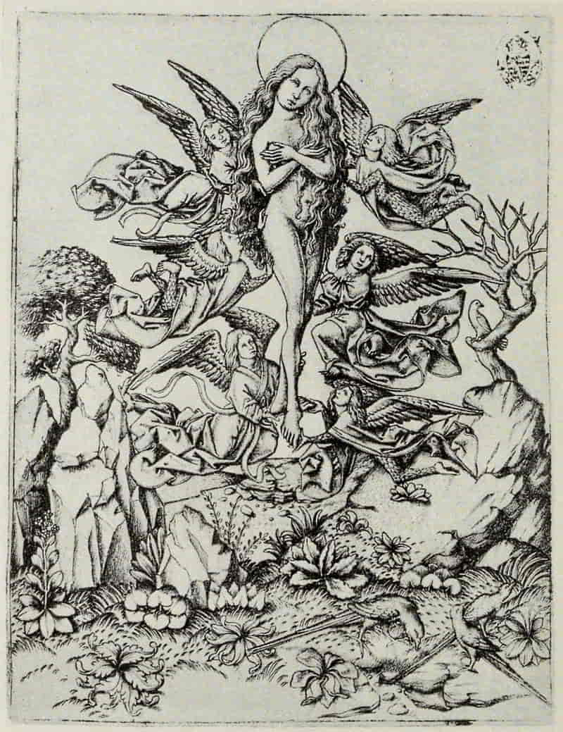
MASTER E. S. OF 1466. ECSTASY OF ST. MARY MAGDALEN
Size of the original engraving, 6½ × 5 inches
In the Royal Print Room, Dresden
His work shows unmistakably the influence of the Master of the Playing Cards, and we may safely place him in the region of the upper Rhine, probably in the vicinity of Freiburg or Breisach. In the Madonna and Child with Saints Marguerite and Catherine his peculiar qualities and limitations may clearly be seen. The plants and flowers, with which the ground is thickly carpeted, are engraved in firm, clear-cut lines, betokening the trained hand of the goldsmith. The figures and drapery are rendered with delicate single strokes; but in the shaded portions of the wall, back of the Madonna, cross-hatching is skilfully employed. As is the case in nearly all the works of the early German engravers, the laws of perspective are imperfectly understood, but none the less the composition has a charm all its own.
The Ecstasy of St. Mary Magdalen is of interest, not only technically and artistically, but because of its influence upon the Master of the Amsterdam Cabinet, who has twice treated the subject, and upon Albrecht Dürer, by whom we have a woodcut seemingly copied from this engraving. Martin Schongauer, likewise, may have profited by the[Pg 26] feathered forms of the angels which reappear, somewhat modified, in his engraving of the Nativity. The birds and the isolated plants in the foreground still show the influence of the Master of the Playing Cards.
St. Matthew (whom we shall meet again in our consideration of Florentine engraving, transformed into the Tiburtine Sibyl, engraved in the Fine Manner of the Finiguerra School) and St. Paul (who likewise reappears as Amos in the series of Prophets and Sibyls) show an increasing command of technical resources. The draperies are beautifully disposed; and, in St. Paul, the system of cross-hatching upon the back of the chair, in the shaded portions beneath, and upon the mantle of the saint, is fully developed.
The Madonna of Einsiedeln, dated 1466, is usually accounted the engraver’s masterpiece. Beautiful though it is in composition and in execution, it suggests a translation, into black and white, of a painting, and on technical grounds, as well as for the beauty of its component parts, one may prefer the Design for a Paten, dating from the same year [1466]. Here the central scene, representing St. John the Baptist, owes not a little, both in composition and in technique, to the Master of St. John the Baptist. The four Evangelists, arranged in alternation with their appropriate symbols, around [Pg 29]the central picture, are little masterpieces of characterization and of engraving, and there can be nothing but unmixed admiration for the way in which plant and bird forms are woven into a perfectly harmonious pattern.
MASTER E. S. OF 1466. DESIGN FOR A PATEN
Size of the original engraving, 7⅛ inches in diameter
In the Royal Print Room, Berlin
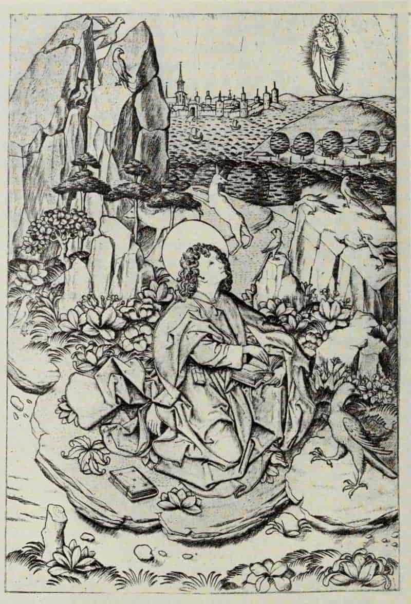
MASTER E. S. OF 1466. ST. JOHN ON THE ISLAND OF PATMOS
Size of the original engraving, 8⅛ × 5½ inches
In the Hofbibliotek, Vienna
St. John on the Island of Patmos likewise shows unmistakably the influence of the Master of St. John the Baptist and is doubly interesting inasmuch as, in its turn, it had a shaping influence upon the engraving of the same subject by Martin Schongauer. It is dated 1467, the latest date found upon any plate by the Master E. S., and it is assumed that in this year his activity came to an end.
Martin Schongauer, who was born in Colmar about 1445 and is known to have died in 1491, is not only the most eminent painter and engraver in the latter third of the fifteenth century, he is one of the very greatest masters of the graphic arts. His plates number one hundred and fifteen, and, as in the case of Albrecht Dürer, it is upon his engraved work, rather than upon his all too few paintings, that his immortality must rest.
Schongauer’s prints can be arranged in something approximating chronological order. In the earliest twelve engravings the shanks of the letter M, in his monogram, are drawn vertically, whereas in all his later prints they slant outward. This apparently minor point is really of great significance in a study[Pg 30] of his development, since it enables us to place correctly certain plates which, until recently, were assigned to his latest period, such as the Death of the Virgin, the Adoration of the Magi, and the Flight Into Egypt.
One of the richest toned plates in this first group is the Virgin with a Parrot, an engraving which, incidentally, exists in two states. In the second state, the cushion upon which the Christ Child is seated, instead of being plain, has an elaborate pattern upon the upper side, and the flowing tresses of the Virgin are extended more to the left, thereby greatly improving the composition as a whole.
For Martin Schongauer, as for nearly all the earlier German masters, the grotesque had a strange fascination. His power of welding together parts of various animals into living fantastic creatures is nowhere better seen than in the Temptation of St. Anthony. Vasari tells how the young Michelangelo, meeting with an impression of this engraving in Florence, was impelled to copy it with a pen “in such a manner as had never before been seen. He painted it in colors also, and the better to imitate the strange forms among these devils, he bought fish which had scales somewhat resembling those of the demon. In this pen copy also he displayed so much ability that his credit and reputation were greatly enhanced thereby.” [Pg 35]It would appear to be one of Schongauer’s early plates, not only from the form of the monogram, but also from the treatment of the upper portion of the sky, shaded with many horizontal graver strokes, growing stronger as the upper edge of the plate is reached—a treatment which does not occur in any other print by him.
MARTIN SCHONGAUER. VIRGIN WITH A PARROT
Size of the original engraving, 6¼ × 4¼ inches
In the Public Art Collections, Basle
MARTIN SCHONGAUER. TEMPTATION OF ST. ANTHONY
Size of the original engraving, 12⅜ × 9⅛ inches
In the Museum of Fine Arts, Boston
MARTIN SCHONGAUER. DEATH OF THE VIRGIN
Size of the original engraving, 10⅛ × 6⅝ inches
In the Museum of Fine Arts, Boston
MARTIN SCHONGAUER. PILATE WASHING HIS HANDS
Size of the original engraving, 6⅜ × 4½ inches
In the Museum of Fine Arts, Boston
Among the myriad renderings of the Death of the Virgin, by painters and engravers, it is doubtful if any version is superior, so far as dramatic intensity is concerned, to Schongauer’s. As a composition, Dürer’s woodcut from the Life of the Virgin, is simpler and more “telling,” in that certain non-essentials have been eliminated; but could we well spare so beautiful a design as that of the candelabrum which, in Schongauer’s engraving, stands at the foot of the bed?
From the twelve plates of the Passion, each of which repays study, it is not easy to select one for reproduction. The Crucifixion, a subject which Schongauer engraved no less than six times, has a poignant charm; and for sheer beauty the Resurrection is among the most significant of the series. Pilate Washing His Hands has, however, a double interest. The faces of Christ’s tormentors and of the figures standing beside and to the left of Pilate’s throne, are strongly characterized, portrait-like heads, in marked contrast with the gentleness[Pg 36] of Christ, and the weak and vacillating Pilate. The enthroned Pilate later reappears as the Prophet Daniel in the series of Prophets and Sibyls, Florentine engravings in the Fine Manner.
We have already referred to St. John on the Island of Patmos by the Master E. S. A more significant contrast between the work of the earlier engraver and that of Schongauer could hardly be found. The Master E. S. gives a multiplicity of objects, animate and inanimate, charming and interesting in themselves, but distracting from the main purpose of the composition—witness the St. Christopher crossing the river in the middle distance, the lion and the terrified horse in the wood to the right, the swan in the stream to the left, and the life-like birds perched upon the castle-crowned cliff. Schongauer eliminates all these accessories. One vessel and two small boats alone break the calm expanse of the unruffled sea. Save for the two plants in the foreground (which betray the influence of the Master of the Playing Cards) the ground is simply treated and offers little to distract our attention from the seated figure of St. John, who faces to the left and gazes upwards at the Madonna and Child in glory. The eagle bears a strong family likeness to the same bird in the Design for a Paten by the Master E. S. Schongauer has here drawn a tree, not bare, as is his wont, [Pg 41]but adorned with foliage beautifully disposed and artistically treated, in marked contrast to the conventional and decorative manner of the Master E. S. and his predecessors.
MARTIN SCHONGAUER. ST. JOHN ON THE ISLAND OF PATMOS
Size of the original engraving, 6½ × 4⅝ inches
In the Kunsthalle, Hamburg
MARTIN SCHONGAUER. CHRIST APPEARING TO THE
MAGDALEN
Size of the original engraving, 6¼ × 6⅛ inches
In the Kunsthalle, Hamburg
MARTIN SCHONGAUER. VIRGIN SEATED IN A
COURTYARD
Size of the original engraving, 6¾ × 4⅞ inches
In the Museum of Fine Arts, Boston
MARTIN SCHONGAUER. ANGEL OF THE ANNUNCIATION
Size of the original engraving, 6⅝ × 4½ inches
In the Museum of Fine Arts, Boston
The type of the Redeemer, which Schongauer has made so peculiarly his own, is nowhere seen to better advantage than in the two beautiful plates of the Baptism of Christ and Christ Appearing to the Magdalen. Max Geisberg acclaims the last-named as Schongauer’s most beautiful engraving. “Here, the contents of the composition have received an embodiment, the fervor, depth, and delicacy of which have never been surpassed in art.”[1] It can, however, share this high praise with the Virgin Seated in a Courtyard and the Angel of the Annunciation. For sheer beauty, these plates remain to this day not only unsurpassed, but unequalled. What quietude and restraint there is in the Virgin Seated in a Courtyard, the wall back of her discreetly bare, the grass indicated by a few small but significant strokes, while the branches of one little, leafless tree form an exquisite pattern against the untouched sky! By contrast one of Dürer’s technical masterpieces—the Virgin Seated by a City Wall—seems overworked and overloaded with needless accessories.
[1] Martin Schongauer. By Dr. Max Geisberg. The Print-Collector’s Quarterly. Vol. IV. April, 1914. p. 128.
[Pg 42]
The Angel of the Annunciation marks the culmination of Schongauer’s art and belongs to his most mature period. Everything not absolutely necessary for a clear presentation has been eliminated. A slight shadow upon the ground gives solidity to the figure. All else is blank. The art of simplification can hardly go further, and were one to be restricted to the choice of a single print by any of Dürer’s predecessors, one might wisely select the Angel of the Annunciation.
That Schongauer was equally interested in things mundane is convincingly proved by Peasants Going to Market, Goldsmith’s Apprentices Fighting, or The Miller. How well he has differentiated between the mother-ass, filled with maternal solicitude, and the woolly, stocky, and somewhat foolish little donkey which follows, while the miller with upraised staff urges her onward.
The Crozier and the Censer furnish unmistakable proof, were such needed, that as a goldsmith-designer, no less than as an engraver, Schongauer is entitled to the loftiest place in German art. They are masterpieces, alike in invention and in execution. His influence was not confined to his contemporaries, but can be traced in many ways, and in many media, long after his death. His School, however, produced no engraver worthy, for a moment, of comparison with him.
[Pg 43]
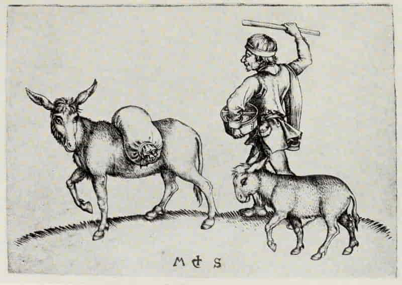
MARTIN SCHONGAUER. THE MILLER
Size of the original engraving, 3½ × 4⅞ inches
In the Albertina, Vienna
[Pg 44]
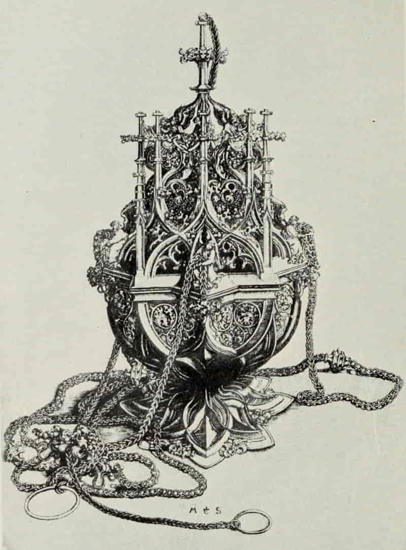
MARTIN SCHONGAUER. CENSER
Size of the original engraving, 11½ × 8¼ inches
[Pg 45]
The Master L Cz alone seems to have caught something of Schongauer’s spirit while, at the same time, preserving his own individuality. The face of the Redeemer in Christ Entering Jerusalem is reminiscent of the earlier engraver; and, among the Apostles to the left, two, at least, are taken, with slight modifications, from Schongauer’s Death of the Virgin.
Christ Tempted has a singular charm. The figure of Satan, realistically treated, is an interesting example of that passion for the grotesque from which even the greatest artists in the North seemed unable to shake themselves wholly free. The wood in the middle distance, to the left of Christ, evinces a close study of natural forms, while the landscape takes its place admirably in the composition. The excessive rarity of engravings by L Cz alone has prevented them from being appreciated at their true worth. They are original in composition, full of fantasy and charm. Even so universal an artist as Albrecht Dürer did not disdain to borrow, from Christ Tempted, the motive of the mountain goat gazing downward, which reappears, slightly modified, in Adam and Eve, his masterpiece of the year 1504.
[Pg 46]
ENGRAVERS AND ETCHERS
GERMAN ENGRAVING: FROM THE BEGINNINGS
TO MARTIN SCHONGAUER
BIBLIOGRAPHY
Le Peintre Graveur. By Adam Bartsch. 21 volumes. Vienna: 1803-1821. Volumes 6 and 10, Early German Engravers.
Les deux cents Incunables xylographiques du Département des Estampes. By Henri Bouchot. Volume 1, Text. Volume 2, Atlas (191 reproductions). Paris: Librairie Centrale des Beaux-Arts. 1903.
Geschichte und kritischer Katalog des deutschen, niederländischen und französischen Kupferstichs im XV. Jahrhundert. By Max Lehrs. Vienna: Gesellschaft für vervielfältigende Kunst. Volume 1. The Primitives. With portfolio of 114 reproductions on 43 plates. 1908. Volume 2. Master E. S. With portfolio of 237 reproductions on 92 plates. 1910.
Die ältesten deutschen Spielkarten des königlichen Kupferstich-cabinets zu Dresden. By Max Lehrs. 97 reproductions on 29 plates. Dresden: W. Hoffmann. 1885.
Katalog der im germanischen Museum befindlichen deutschen Kupferstiche des XV. Jahrhunderts. By Max Lehrs. 1 original engraving and 9 reproductions. Nürnberg. 1887.
Le Peintre-Graveur. By J. D. Passavant. 6 volumes. Leipzig: Rudolph Weigel. 1860-1864. Volumes 1 and 2, Early German Engravers.
Histoire de l’origine et des progrès de la gravure dans les Pays-Bas et en Allemagne, jusqu’à la fin du quinzième siècle. By Jules Renouvier. Brussels: M. Hayez. 1860.
Die Inkunabeln des Kupferstichs im Kgl. Kabinet zu München. By Wilhelm Schmidt. 32 reproductions. Munich. 1887.
Manuel de l’amateur de la gravure sur bois et sur métal au XVᵉ SIÈCLE. By Wilhelm Ludwig Schreiber. Volumes 1-4, Text. Volumes 6-8, Reproductions. Berlin: Albert Cohn, 1891-1900. (Vol. 4 in Leipzig: O. Harrassowitz.)
A Descriptive Catalogue of Early Prints in the British Museum. By William Hughes Willshire. 2 volumes. 22 reproductions. London: The Trustees. 1879-1883.
Master of the Playing Cards (flourished 1440-1450)
Das älteste gestochene deutsche Kartenspiel vom Meister der Spielkarten (vor 1446). By Max Geisberg. 68 reproductions on 33 plates. Strassburg: J. H. Ed. Heitz (Heitz & Mündel). 1905. (Studien zur deutschen Kunstgeschichte. Part 66.)
Master of the Gardens of Love (flourished 1445-1450)
Der Meister der Liebesgärten; ein Beitrag zur Geschichte des ältesten Kupferstichs in den Niederlanden. By Max Lehrs. 28 reproductions on 10 plates. Dresden: Bruno Schulze. 1893.
[Pg 49]Master E. S. (flourished 1450-1470)
Der Meister E. S.; sein Name, seine Heimat, und sein Ende. By Peter P. Albert. 20 reproductions on 16 plates. Strassburg: J. H. Ed-Heitz (Heitz & Mündel). 1911. (Studien zur deutschen Kunstgeschichte. Part 137.)
The Master E. S. and the “Ars Moriendi”; A Chapter in the History of Engraving During the Fifteenth Century. By Lionel Cust. 46 reproductions. Oxford: Clarendon Press. 1898.
Die Anfänge des deutschen Kupferstiches und der Meister E. S. By Max Geisberg. 121 reproductions on 71 plates. Leipzig: Klinkhardt & Biermann. 1909. (Meister der Graphik. Vol. 2.)
Geschichte und kritischer Katalog des deutschen, niederländischen und französischen Kupferstichs im XV. Jahrhundert. By Max Lehrs. Vienna: Gesellschaft für vervielfältigende Kunst. 1908-1910. Volume 2. Master E. S. With portfolio of 237 reproductions on 92 plates.
The Playing Cards of the Master E. S. of 1466. Edited by Max Lehrs. 45 reproductions. London: Asher & Co. 1892. (International Chalcographical Society. Extraordinary Publication. Vol. 1.)
Schongauer, Martin (1445(?)-1491)
Zwei datierte Zeichnungen Martin Schongauers. By Sidney Calvin. 2 illustrations. Jahrbuch der königlichen preussischen Kunstsammlungen, Vol. 6, pp. 69-74. Berlin. 1885.
Martin Schongauer’s Kupferstiche. By Max G. Friedländer. 5 illustrations. Zeitschrift für bildende Kunst, Vol. 26, pp. 105-112. Leipzig. 1915.
Martin Schongauer. By Max Geisberg. 14 illustrations. The Print-Collector’s Quarterly, Vol. 4, No. 2, pp. 102-129. Boston. 1914.
Martin Schongauer; Nachbildungen seiner Kupferstiche. Edited by Max Lehrs. 115 reproductions on 72 plates. Berlin: Bruno Cassirer. 1914. (Graphische Gesellschaft. Extraordinary Publication 5.)
Schongauerstudien. By Wilhelm Lübke. 3 illustrations. Zeitschrift für bildende Kunst, Vol. 16, pp. 74-86. Leipzig. 1881.
Schongauer und der Meister des Bartholomäus. By L. Scheibler. Repertorium für Kunstwissenschaft, Vol. 7, pp. 31-68. Berlin and Stuttgart. 1884.
Martin Schongauer als Kupferstecher. By Woldemar von Seidlitz. Repertorium für Kunstwissenschaft, Vol. 7, pp. 169-182. Berlin and Stuttgart. 1884.
Martin Schongauer als Kupferstecher. By Hans Wendland. 32 reproductions. Berlin: Edmund Meyer. 1907.
Martin Schongauer. Eine kritische Untersuchung seines Lebens und seiner Werke nebst einem chronologischen Verzeichnisse seiner Kupferstiche. By Alfred von Wurzbach. Vienna: Manz’sche K. K. Hofverlags und Universitäts Buchhandlung. 1880.
[Pg 50]
Master of the Banderoles (flourished c. 1464)
Der Meister mit den Bandrollen; ein Beitrag zur Geschichte des ältesten Kupferstichs in Deutschland. By Max Lehrs. 19 reproductions on 7 plates. Dresden: W. Hoffmann. 1886.
Meckenem, Israhel van (c. 1440-1503)
Der Meister der Berliner Passion und Israhel van Meckenem. By Max Geisberg. 6 reproductions. Strassburg: J. H. Ed. Heitz (Heitz & Mündel). 1903. (Studien zur deutschen Kunstgeschichte. Part 42.)
Verzeichnis der Kupferstiche Israhels van Meckenem. By Max Geisberg. 11 reproductions on 9 plates. Strassburg: J. H. Ed. Heitz (Heitz & Mündel). 1905. (Studien zur deutschen Kunstgeschichte. Part 58.)
Master  (flourished c. 1470)
Der Meister  ; ein Kupferstecher der Zeit Karls des Kühnen. By Max Lehrs. 77 reproductions on 31 plates. Dresden: W. Hoffmann. 1895.
Stoss, Veit (c. 1450-c. 1533)
Veit Stoss; Nachbildungen seiner Kupferstiche. Edited by Engelbert Baumeister. 13 reproductions. Berlin: Bruno Cassirer. 1913. (Graphische Gesellschaft. Publication 17.)
Olmütz, Wenzel von (flourished 1480-1500)
Wenzel von Olmütz. By Max Lehrs. 22 reproductions on 11 plates. Dresden: W. Hoffmann. 1889 (In German.)
[Pg 51]
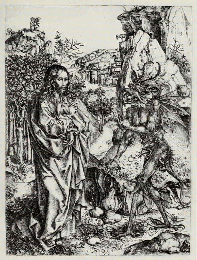
MASTER L Cz. CHRIST TEMPTED
Size of the original engraving 8¾ × 6⅝ inches
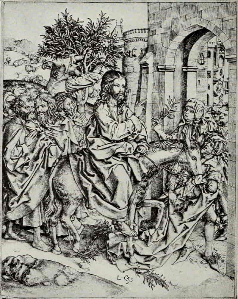
MASTER L Cz. CHRIST ENTERING JERUSALEM
Size of the original engraving, 8⅞ × 7 inches
In the Museum of Fine Arts, Boston
ITALIAN ENGRAVING:
THE FLORENTINES
ENGRAVING in Italy differs, in many essentials, from the art as practised in Germany. Germany may claim priority in point of time, but it is doubtful whether the Florentines—for in Florence, and among the goldsmiths, the art took its rise in Italy—in the beginning were influenced by, or even acquainted with, the work of their northern contemporaries. In Germany the designer and the engraver were one, and some of the greatest masters embodied their finest conceptions in their prints. We may truly say that the world-wide reputation which Dürer and Schongauer have enjoyed for four centuries and more, rests almost entirely upon their engraved, rather than upon their painted, work.
In Italy it was otherwise. There, with a few signal exceptions, engraving was used merely as a convenient method of multiplying an existing design. It may be that we owe to this fact both the color of the ink used in these early Florentine prints, and the method of taking impressions. This would seem, in many cases, to be by rubbing rather than by the[Pg 52] use of the roller press, which appears to have been known and used in the North substantially from the very beginning. The Florentine, aiming to duplicate a drawing in silver-point or wash, would naturally endeavor to approximate the color of his original. Consequently we do not find the lustrous black impressions, strongly printed, which are the prize of the collector of early German engravings.
Vasari’s story of the invention of engraving by Maso Finiguerra (1426-1464) was long ago disproved, and for a time it seemed as though Finiguerra and his work were likely to be consigned to that limbo of the legendary from which Baldini—at one time accredited with many prints—is only just now emerging. Yet Finiguerra, although not the “inventor” of the art, is, beyond peradventure, the most important influence in early Italian engraving, not only on account of his own work on copper, but still more through the Picture-Chronicle, which served as an inspiration to the artists working in his School and continuing his tradition after his death. So that Vasari’s tale, though not accurate in the matter of fact, was veracious in the larger sense.
ANONYMOUS FLORENTINE, XV CENTURY. PROFILE
PORTRAIT OF A LADY
Size of the original engraving, 8⅞ × 5⅝ inches
In the Royal Print Room, Berlin
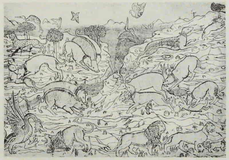
ANONYMOUS FLORENTINE, XV CENTURY. WILD ANIMALS HUNTING
AND FIGHTING
Size of the original engraving, 10⅛ × 14¾ inches
In the British Museum
The Picture-Chronicle is a book of drawings illustrating the History of the World, and evidently proceeds from the hand and workshop of a Florentine [Pg 55]goldsmith-engraver of about 1460. It was acquired by the British Museum from Mr. Ruskin in 1888. The drawings are in pen and ink and wash, often reinforced with open pen-shading like that imitated later by the Broad Manner engravers. At its best the work has the true early Renaissance combination of archaic strength with attractive naiveté—the ornamental detail carried out with a masterly power of pen, and with the patient delight of one who is by instinct and training above all things a jeweler.
Finiguerra’s fame as the leading worker in niello was firmly established by 1450; and although we cannot assign certainly any engraving by him to a date earlier than 1460, there is a group of Florentine primitives which may be placed between the years 1450 and 1460, thus antedating Finiguerra’s first plate by about ten years. The most beautiful of these early prints in conception, and the purest in execution, is the Profile Portrait of a Lady, a single impression of which has come down to us and is now in Berlin. In style it recalls the paintings of Piero della Francesca, Verrocchio, Uccello, or Pollaiuolo, and although it would be unwise to attribute it to any known master, there is a sensitive quality in the drawing, and a restraint, which differentiates it from any other print of this period.
Among the engravings which may be by Finiguerra [Pg 56]himself, one of the most interesting is the plate of Wild Animals Hunting and Fighting, wherein we see a number of motives taken directly from the Picture-Chronicle—motives which reappear again and again in works undoubtedly by other hands. This print, as also the Encounter of a Hunting Party with a Family of Wild Folk, is unique. In the last-named we see a number of motives repeated from the Wild Animals Hunting and Fighting: such as the boar being pulled down by two hounds, the hound chasing a hare, in the upper right corner; and the dog, slightly to the left, devouring the entrails of yet another hare.
The Road to Calvary and the Crucifixion is a far more elaborate and important composition, and in this engraving we see that which is especially noteworthy in the Judgment Hall of Pilate—the largest and most important of all the Fine Manner prints—the goldsmith’s love of ornament. In the Judgment Hall of Pilate the head-dresses, and especially the armor, are highly elaborate, while the architecture itself is overlaid with ornate decoration directly drawn from the Picture-Chronicle. In the only known impression the plate seems to have been re-worked, in the Broad Manner, by a later hand.
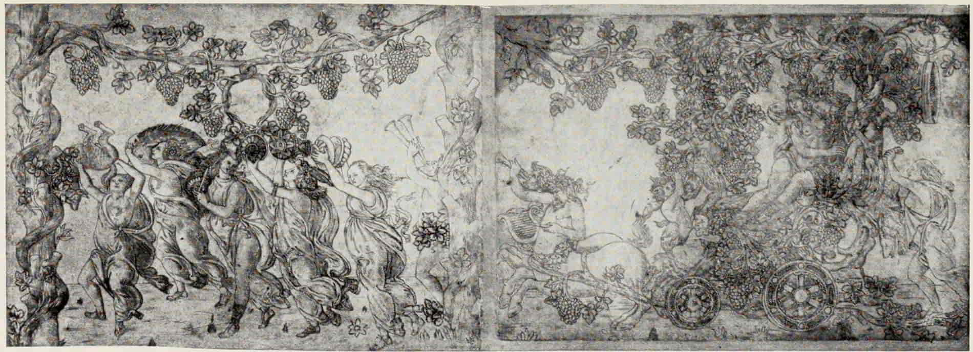
ANONYMOUS FLORENTINE, XV CENTURY. TRIUMPHAL PROCESSION OF BACCHUS
AND ARIADNE
Size of the original engraving, 8⅛ × 22 inches
In the British Museum
(If supported click figure to enlarge.)
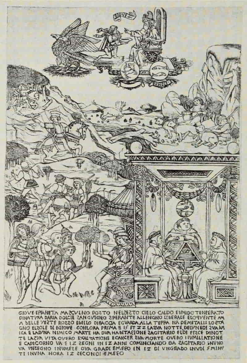
ANONYMOUS FLORENTINE, XV CENTURY. JUPITER
Size of the original engraving, 12⅝ × 8½ inches
In the British Museum
Somewhat later in date, by an engraver of the Finiguerra School, is the Triumphal Procession of [Pg 59]Bacchus and Ariadne, the most joyous of all Florentine engravings. The original design was attributed at one time to Botticelli; and although, as Herbert P. Horne has shown, it cannot be by this master, it is similar in style to his compositions. Whatever the immediate original, it shows marked traces of classical influences, and its motive is directly derived from antique sculpture—a sarcophagus in all probability. “The splendid design has suffered not only from the feebleness of the engraving, but also from the florid manner in which the engraver has exaggerated some of the decorative details and added others.... In spite of the feebleness of its execution it remains an incomparably greater work of art than any other print in the Fine Manner.”[2]
[2] Sandro Botticelli. By Herbert P. Horne. London: George Bell & Sons. 1908. p. 84.
The Fine Manner, in which all of the engravings hitherto mentioned are executed, owes its name to the method employed. The engraver has incised his outlines upon the plate—probably unbeaten copper or some even softer metal—and for his shading has employed a system of delicate strokes, laid close to one another and overlaid with two, and, at times, three, sets of cross-hatching. Such engravings, when printed, as is usually the case, in a greenish or grayish ink, give a result similar to a[Pg 60] wash drawing. In the Broad Manner the style of engraving is based upon that of pen drawing, with open, diagonal shade strokes and without cross-hatching. The Broad Manner was finally developed by Pollaiuolo and Mantegna, who modified it by a series of delicate lines laid at an acute angle to the heavier shadings, blending the main lines into a harmonious whole.
“None of the sciences that descended from antiquity,” writes Arthur M. Hind,[3] “possessed a firmer hold on the popular imagination of the Middle Ages than that of Astrology. That science took as its foundation the ancient conception of the universe, with the earth as the centre round which all the heavenly bodies revolved in the space of a day and a night. Encircling the earth were the successive spheres of water, air, fire, the seven planets (Moon, Mercury, Venus, Sun, Mars, Jupiter, Saturn), the firmament with the constellations (the cœlum crystallinum), and the Primum Mobile. To each of the planets were ascribed attributes according to the traditional character of the deity whose name it bore, and these attributes were regarded as transmissible under certain conditions to mankind. The influence of the planets depended on their position in the heavens in respect[Pg 61] of the various constellations, with which each had different relations. Each planet had what was called its ‘house’ in one of the constellations, and according to its position relative to these was said to be in the ‘ascendant’ or ‘descendant’. In regard to individual human beings the date of birth was the decisive point, and the degree of influence transmitted from the planets depended on the respective degree of ‘ascendance’ or ‘descendance’ at the particular epoch.”
[3] Catalogue of Early Italian Engravings ... in the British Museum. By Arthur Mayger Hind. London. 1910. pp. 49-50.
The planets and their influences afforded subject matter for many artists of the fifteenth and sixteenth centuries, and the finest and most important series is that engraved in the Fine Manner by an artist of the Finiguerra School, who has, as usual, drawn directly upon the Picture-Chronicle for his ornamental accessories. We can reproduce two only from the set of seven—Jupiter and Mercury. The inscription beneath Jupiter reads, in part, as follows: “Jupiter is a male planet in the sixth sphere, warm and moist, temperate by nature, and of gentle disposition; he is sanguine, cheerful, liberal, eloquent; he loves fine clothes, is handsome and ruddy of aspect, and looks toward the Earth. Tin is his metal; his days are Sunday and Thursday, with the first, eighth, fifteenth and twenty-fourth hours; his night is that of Wednesday; he is friendly to the Moon, hostile to Mars....”[Pg 62] In the landscape we again meet with several of the stock Finiguerra motives, the muzzled hounds, the dog chasing the hare, etc. Of especial interest is the group at the right—“wing-bearing Dante who flew through Hell, through the starry Heavens and o’er the intermediate hill of Purgatory beneath the beauteous brows of Beatrice; and Petrarch too, who tells again the tale of Cupid’s triumph; and the man who, in ten days, portrays a hundred stories (Boccaccio).”
Mercury—“eloquent and inventive ... slender of figure, tall and well grown, with delicate lips. Quicksilver is his metal”—sets forth various applications of the arts and sciences. Especially interesting is the goldsmith’s shop at the left, where we see an engraver actually at work upon a plate. The goldsmith is seated, his apprentice behind him, as a prospective purchaser examines a richly ornamented vessel. In the foreground a sculptor is chiseling his statue, while, standing above, on a scaffolding, a fresco painter is actively at work—a record of the Florence of 1460 or thereabouts, full of interest for us.
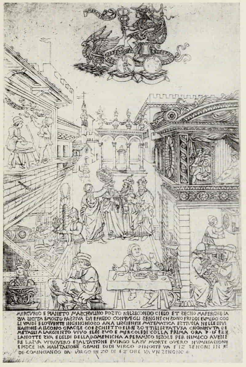
ANONYMOUS FLORENTINE, XV CENTURY. MERCURY
Size of the original engraving, 12¾ × 8½ inches
In the British Museum
ANONYMOUS FLORENTINE, XV CENTURY. LADY
WITH A UNICORN
Size of the original engraving, 6¼ inches in diameter
In the British Museum
To a slightly later date, 1465-1470, belong the group of Fine Manner prints, known as the Otto Prints, also emanating from the Finiguerra workshop. They are not a series, in any true sense, and owe their name—also their fortunate preservation—to the accidental circumstance[Pg 65] of their having belonged at one time to Peter Ernst Otto, a merchant and collector of Leipzig. The purpose served by these prints—twenty-four in all—was the decoration of box lids, either as patterns to be copied, in the case of metal caskets, or to be colored and pasted on the lids of wooden boxes. The escutcheons are usually left blank, to be filled in by hand with the device of the donor or the recipient, or with some appropriate sentiment.
In the print entitled Two Heads in Medallions and Two Hunting Scenes we again meet with the animal motives taken from the Picture-Chronicle. One of the most charming is the Lady with a Unicorn (Chastity), in its arrangement suggestive of the beautiful drawing by Leonardo da Vinci in the British Museum; and its symbolic meaning is doubtless the same. “The unicorn,” writes Leonardo in his “Bestiarius,” “is distinguished for lack of moderation and self-control. His passionate love of young women makes him entirely forget his shyness and ferocity. Oblivious of all dangers, he comes straight to the seated maiden and falling asleep in her lap is then caught by the hunter.” The ermine, likewise a sign of chastity, is to be seen at the right, gazing upward into Marietta’s face.
Still later than the Otto prints, and greatly inferior[Pg 66] to them in execution, are the three illustrations for Il Monte Sancto di Dio, of 1477; and the nineteen engravings for Dante’s Divina Commedia, with Landino’s Commentary, of 1481. Il Monte Sancto di Dio is the first book in Italy or in Germany in which there appear illustrations from engraved plates printed on the text page. This entailed much additional labor, and was soon discontinued in favor of the wood-block, which could be printed simultaneously with the letterpress, and was not taken up again until nearly the end of the sixteenth century.
Alike by tradition and internal evidence, Botticelli is unquestionably the author of the Dante designs; but no artist has been suggested as the probable designer of the three illustrations for Il Monte Sancto di Dio. In the first illustration the costume and general attitude of the young gallant to the left are strongly reminiscent of the Otto prints. The lower portion of the plate shows all the characteristics of the Fine Manner, but the angel heads are treated in a simpler and more open linear method. The Christian’s Ascent to the Glory of Paradise is allegorically represented by a ladder placed firmly in the ground of widespread Knowledge and Humility, and reaching up to the triple mountain of Faith, Hope, and Charity, on the summit of which stands the Saviour. This ladder is called Perseverance,[Pg 69] one of its sides being Prayer, the other Sacrament. It has eleven steps: Prudence, Temperance, Fortitude, Justice, etc.
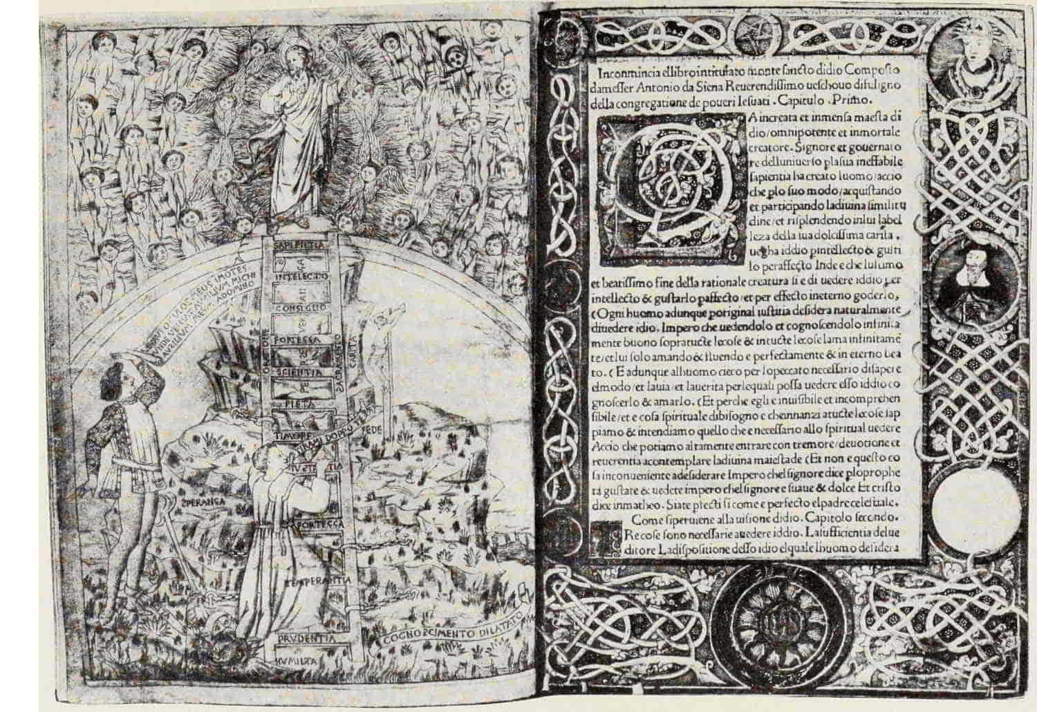
ANONYMOUS FLORENTINE, XV CENTURY. THE CHRISTIAN’S ASCENT TO
THE GLORY OF PARADISE. FROM “IL MONTE SANCTO DI DIO,”
FLORENCE, 1477
Size of the original engraving, 9⅞ × 7 inches
In the Fogg Art Museum, Harvard University
(If supported click figure to enlarge.)
ANONYMOUS FLORENTINE, XV CENTURY. DANTE AND VIRGIL WITH THE VISION
OF BEATRICE. FROM THE “DIVINA COMMEDIA,” FLORENCE, 1481
Size of the original engraving, 3½ × 6⅞ inches
In the Museum of Fine Arts, Boston
The second illustration depicts the glory of Paradise; the third the punishment of Hell, the main motives of the last-named being adapted from the fresco attributed to Orcagna, in the Campo Santo at Pisa.
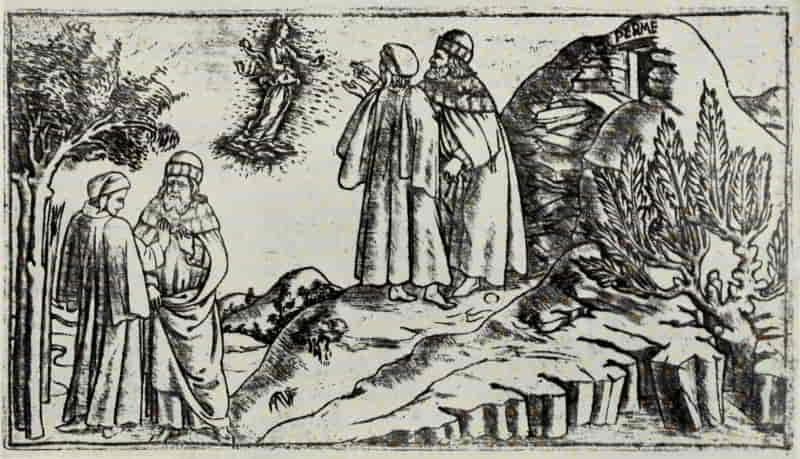
In the illustrations to the Divina Commedia, of 1481, there is little left of the beauty which the original designs must have possessed. They are, indeed, “disguised into puerility by the feebleness of the engraver”; but, none the less, they remain, with the exception of Botticelli’s superb series of drawings on vellum, in Berlin and in the Vatican, unquestionably the best, one might say the only, satisfactory illustrations of Dante’s text. No known copy contains more than the first three engravings printed directly upon the page itself. In every other case, where a greater number of illustrations appear, they are printed separately and pasted in place, indicating the difficulty experienced by the Renaissance printer in making his plates register with the letterpress.
The first print of the series shows Dante lost in the wood, emerging therefrom, and his meeting with Virgil—three subjects on a single plate. The second represents Dante and Virgil with the Vision[Pg 70] of Beatrice. Dante and Virgil are seen twice—first to the left, where Dante doubts whether to follow the guidance of Virgil further, and again on the slope of the hill to the right, where Virgil relates how the vision of Beatrice appeared to him. Near the summit of the rocky mountain is seen the entrance to Hell.
“Of the extant engravings in the Broad Manner, unquestionably the most remarkable is the large print on two sheets of the Assumption of the Virgin, after Botticelli. The original design [no longer known to exist], whether drawing or painting, from which this engraving was taken, must have been among the grandest and most vigorous works of the last period of Botticelli’s art. The large and rugged treatment of the figures of the apostles, their strange mane-like hair and beards, their fervent and agitated gestures and attitudes, lend to this part of the design a forcible and primitive character, which recalls, though largely, perhaps, in an accidental fashion, the grand and impressive art of Andrea del Castagno. Not less vigorous in conception, but of greater beauty of form and movement, is the figure of the Virgin, and the motive and arrangement of the angels who form a ‘mandorla’ around her are among the most lovely and imaginative of the many inventions of the kind[Pg 73] which Botticelli has left us.”[4] In the distant valley is a view of Rome showing the Pantheon, the Column of Trajan, the Colosseum, and other buildings.
[4] Sandro Botticelli. By Herbert P. Horne. London: George Bell & Sons. 1908. p. 289.
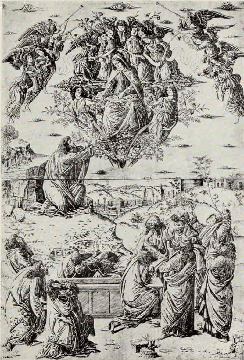
ANONYMOUS FLORENTINE, XV CENTURY. ASSUMPTION
OF THE VIRGIN (After Botticelli)
Size of the original engraving, 32⅝ × 22¼ inches
In the Museum of Fine Arts, Boston
ANONYMOUS FLORENTINE, XV CENTURY. TRIUMPH OF
LOVE. FROM THE TRIUMPHS OF PETRARCH.
Size of the original engraving, 10⅜ × 6¾ inches
In the Museum of Fine Arts, Boston
If the Assumption of the Virgin is the noblest print in the Broad Manner, the Triumphs of Petrarch—a set of six prints—may be said to possess the greatest charm, not less by its subject than by its treatment. Petrarch first saw Laura on April 6, 1327, in the Church of Santa Clara at Avignon, and “in the same city, on the same 6th day of the same month of April, in the year 1348, the bright light of her life was taken away from the light of this earth.” The poet’s aim in composing these Trionfi is the same which he proposed to himself in the Canzoniere: namely, “to return in thought, from time to time, now to the beginning, now to the progress, and now to the end of his passion, taking by the way frequent opportunities of rendering praise and honor to the single and exalted object of his love. To reach this aim he devised a description of man in his various conditions of life, wherein he might naturally find occasion to speak of himself and of his Laura.
“Man in his first stage of youth is the slave of appetites, which may all be included under the generic name of Love, or Self-Love. But as he[Pg 74] gains understanding, he sees the impropriety of such a condition, so that he strives advisedly against those appetites and overcomes them by means of Chastity, that is, by denying himself the opportunity of satisfying them. Amid these struggles and victories Death overtakes him and makes victors and vanquished equal by taking them all out of the world. Nevertheless, it has no power to destroy the memory of a man, who by illustrious and honorable deeds seeks to survive his own death. Such a man truly lives through a long course of ages by means of his Fame. But Time at length obliterates all memory of him, and he finds, in the last resort, that his only sure hope of living forever is by joy in God and by partaking with God in his blessed Eternity.
“Thus Love triumphs over man, Chastity over Love, and Death over both alike; Fame triumphs over Death, Time over Fame, and Eternity over Time.”[5]
[5] Le Rime di Francesco Petrarca con l’interpretazione di Giacomo Leopardi ... e gli argomenti di A. Marsand. Florence. 1839. p. 866. Translation in, Petrarch: His Life and Times. By H. C. Hollway-Calthrop. London. 1907. pp. 41-42.
With the exception of the first plate, The Triumph of Love, none of these engravings illustrates, in any strict sense of the word, the text of Petrarch’s poem. It is the spirit which the engraver has interpreted. Who may have been the designer [Pg 77]we know not, but they show certain affinities to the work of Pesellino and Baldovinetti.
ANONYMOUS FLORENTINE, XV CENTURY. TRIUMPH OF
CHASTITY. FROM THE TRIUMPHS OF PETRARCH
Size of the original engraving, 10 × 6⅜ inches
In the Fogg Art Museum, Harvard University
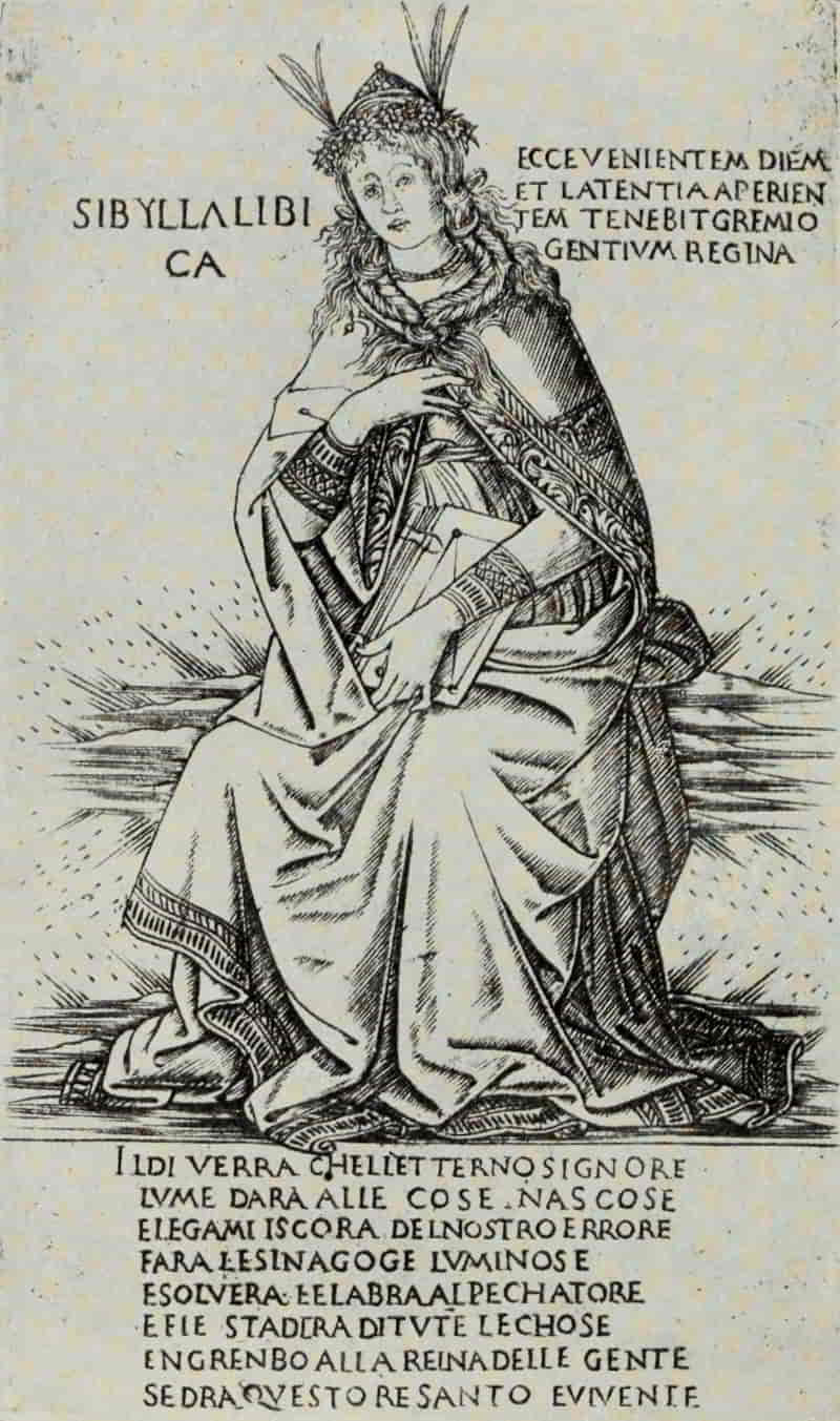
ANONYMOUS FLORENTINE, XV CENTURY. LIBYAN SIBYL
Size of the original engraving, 7 × 4¼ inches
In the British Museum
In the first plate, Cupid, the blind archer, with flame-tipped arrow, is poised upon a ball rising from a flaming vase, the base of which, in its turn, rests upon flame. Jupiter(?), chained, is seated in the front of the car, while Samson, bearing a column, walks upon the further side. Four prancing steeds draw the car; behind, Love’s victims follow in endless procession. In the second plate, Chastity stands upon an urn; in front of her kneels Cupid, still blindfolded, with his broken arrow beside him. Two unicorns, symbols of chastity, draw the car, while upon the banner borne by the maiden at the extreme right there appears the symbolic ermine. Then follow in order the Triumphs of Death, of Fame, of Time, and of Eternity.
This series of illustrations reappears, somewhat modified and simplified, in the form of woodcuts, in the editions of the Trionfi published in Venice in 1488, 1490, 1492, and in Florence in 1499.
We have already referred to the Evangelists and Apostles engraved by the German, Master E. S. of 1466. It is from him that the anonymous Florentine engraver borrowed his figures, in many cases leaving the form of the drapery unchanged but enriching it with elaborate designs in the manner of Finiguerra. The Prophet Ezekiel is thus compounded[Pg 78] of St. John and St. Peter, while Amos is copied in reverse from St. Paul. The seated figure of Daniel, in its turn, is derived from Martin Schongauer’s engraving, Christ Before Pilate, but the throne upon which he is seated is strongly reminiscent of the Picture-Chronicle, and likewise recalls Botticelli’s early painting of Fortitude. The Tiburtine Sibyl is derived from St. Matthew, who, in changing his position, has likewise changed his sex. The precedent thus established has been followed by St. John, transformed into the Libyan Sibyl in the Fine Manner, with the addition of a flying veil, to the right, copied from the Woman with the Escutcheon, also by the Master E. S. In the Broad Manner print the figure of this Sibyl gains in dignity by the elimination of much superfluous ornament upon her outer garment, and from the fact that she now sits in a more upright posture, the Fine Manner print still suggesting the crouching attitude of its Northern prototype. It is to the influence, if not to the hand, of Botticelli that such improvement is most likely due.
The twenty-four Prophets and the twelve Sibyls, engraved both in the Fine and in the Broad Manner of the Finiguerra School, are individually and collectively among the most delightful productions of Italian art. It was doubtless as illustrations of mystery plays or pageants in Florence that this[Pg 81] series of engravings was designed, and we are able to reconstruct from the Triumphs of Petrarch, and from these prints, a Florentine street pageant at its loveliest.
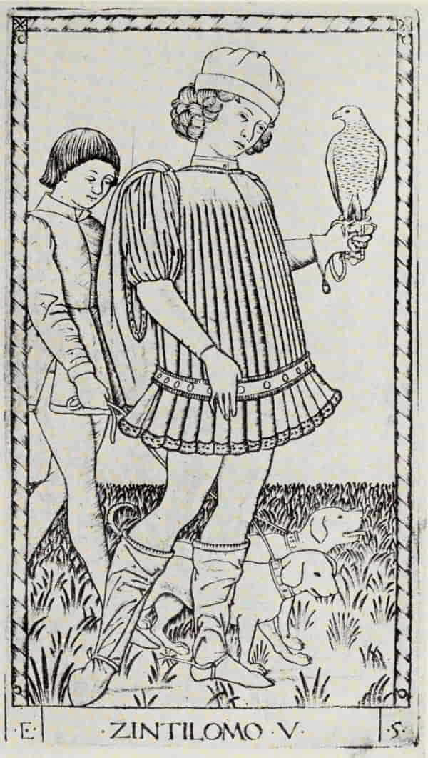
ANONYMOUS NORTH ITALIAN, XV CENTURY. THE
GENTLEMAN. FROM THE TAROCCHI PRINTS
(E Series)
Size of the original engraving, 7⅛ × 4 inches
In the Museum of Fine Arts, Boston
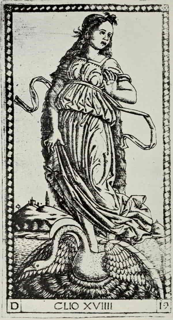
ANONYMOUS NORTH ITALIAN, XV CENTURY. CLIO.
FROM THE TAROCCHI PRINTS (S Series)
Size of the original engraving, 7⅛ × 4 inches
In the Museum of Fine Arts, Boston
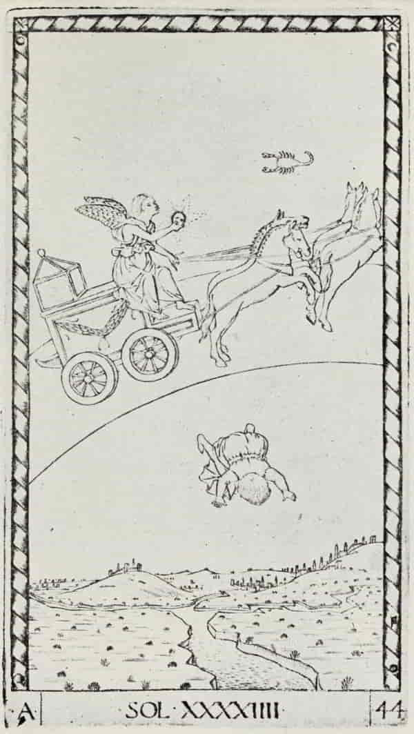
However great their beauty and however strong the fascination which they exert, they have a rival in the series of fifty instructive prints, which, for many years, were miscalled the Tarocchi Cards of Mantegna. Tarocchi cards they are not, and of Mantegna’s influence, direct or indirect, there would seem to be no trace whatsoever. They are of North Italian origin and are the work, in all probability, of some anonymous Venetian engraver, working from Venetian or Ferrarese originals, about 1465—contemporary, therefore, with the Florentine engravings of the Prophets and Sibyls. Forming, apparently, a pictorial cyclopædia of the mediæval universe, with its systematic classification of the various powers of Heaven and Earth, they divide themselves into five groups of ten cards each. First we have the ranks and conditions of men from Beggar to Pope; next Apollo and the nine Muses; then the Liberal Arts, with the addition of Poetry, Philosophy, and Theology, in order to make up the ten; next the Seven Virtues, the set being brought up to the required number by the addition of Chronico, the genius of Time, Cosmico, the genius of the Universe, and Iliaco, the genius[Pg 82] of the Sun. The fifth group is based on the Seven Planets, together with the Sphere of the Fixed Stars and the Primum Mobile, which imparts its own revolving motion to all the spheres within it; and enfolding all the Empyrean Sphere, the abode of Heavenly Wisdom.
Much wisdom and many words have been expended upon the still unsolved riddle as to which of the two sets, known respectively as the E series and the S series (from the letters which appear in the lower left-hand corners of the ten cards of the Sorts and Conditions of Men) may claim priority of date. Both series are in the Fine Manner, the outlines clearly defined, the shadings and modelling indicated with delicate burin strokes, crossed and re-crossed so as to give a tonal effect. These delicate strokes soon wore out in printing, and the structural lines of the figures then emerge in all their beauty. It may seem absurd that one should admire impressions from plates obviously worn, but the critic would do well to suspend his condemnation, since the Tarocchi Prints present many and manifold forms of beauty—in the early impressions a delicate and bloom-like quality; in certain somewhat later proofs, a charm of line which recalls the art of the Far East.
ANONYMOUS NORTH ITALIAN, XV CENTURY. THE SUN.
FROM THE TAROCCHI PRINTS (E Series)
Size of the original engraving, 7⅛ × 4 inches
In the Museum of Fine Arts, Boston
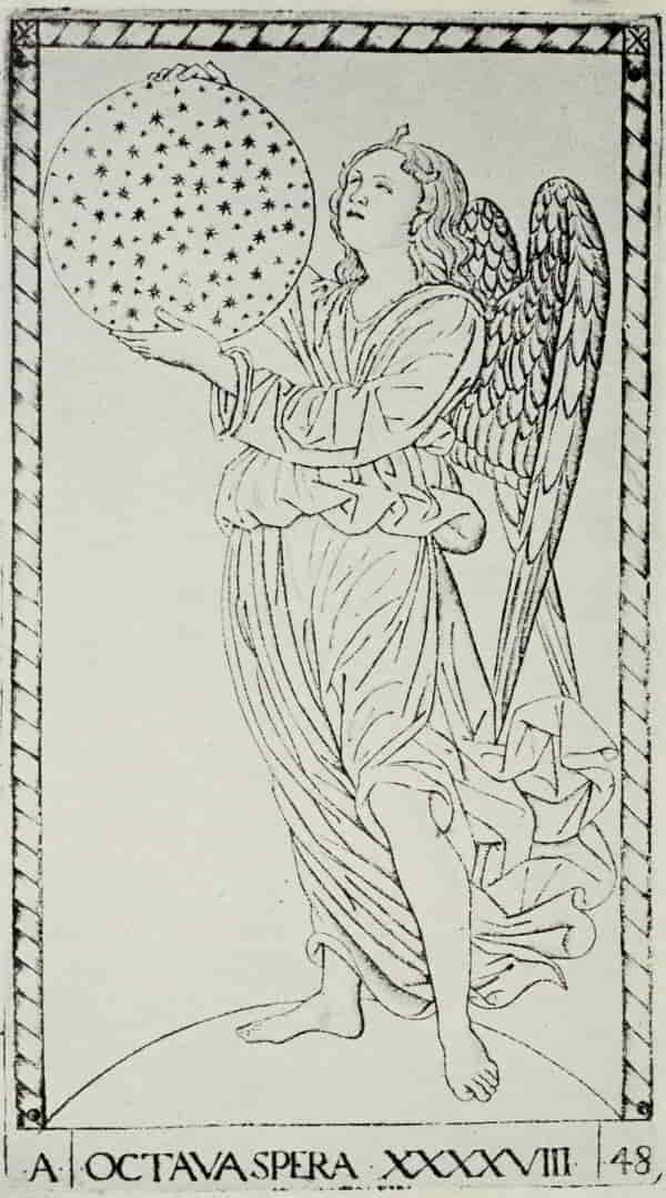
ANONYMOUS NORTH ITALIAN, XV CENTURY. ANGEL OF
THE EIGHTH SPHERE. FROM THE TAROCCHI PRINTS
(E Series)
Size of the original engraving, 7⅛ × 4 inches
In the Museum of Fine Arts, Boston
The Gentleman is the fifth in order in the first group of the Sorts and Conditions of Men, and is[Pg 85] from the so-called E series (claimed by Sir Sidney Colvin and Mr. Arthur M. Hind, of the British Museum, to be the earlier of the two sets). The sequence runs: (1) The Beggar, (2) The Servant, (3) The Artisan, (4) The Merchant, (5) The Gentleman, (6) The Knight, (7) The Doge, (8) The King, (9) The Emperor, (10) The Pope.
Clio is the ninth of the Muses and is from the S series (placed first in point of time, by Kristeller, and about ten years later than the E series, by the British Museum authorities).
The Sun naturally finds his place in the group of Planets and Spheres. There is a delightful and childish touch in the way in which Phæton is pictured as a little boy falling headlong into the river Po, which conveniently flows immediately beneath him. To this group belongs likewise the Angel of the Eighth Sphere, the Sphere of the Fixed Stars, one of the loveliest prints in the entire set, both in arrangement and in execution.
Nothing could be in greater contrast to the gracefulness of such a print as the above than the Battle of Naked Men by Antonio Pollaiuolo, “the stupendous Florentine”—if one may borrow Dante’s title; but, for the moment, we will hold Pollaiuolo and his one engraving in reserve while we glance at the work of Christofano Robetta, who, born in Florence in 1462, was consequently the junior of[Pg 86] Pollaiuolo by thirty years. As an engraver, Robetta is inferior to the anonymous master to whom we owe the E series of the Tarocchi prints. His style is somewhat dry, and the individual lines are lacking in beauty; but his plates have that indefinable and indescribable fascination and charm which is the peculiar possession of Italian engraving and of the Florentine masters in particular. The shaping influences which determined his choice and treatment of subject are Botticelli, and, in a much larger measure, Filippino Lippi, though only in a few cases can he be shown to have worked directly from that painter’s designs. The Adoration of the Magi is obviously inspired by Filippino Lippi’s painting in the Uffizi, though whether Robetta actually worked from the painting itself, or, as seems more probable, translated one of Filippino’s drawings, is an interesting question. The fact that the engraving is in reverse of the painting proves nothing; but there are so many points of difference between them—notably the introduction of the charming group of three angels above the Virgin and Child—that one can hardly think Robetta would have needlessly made so many and important modifications of the painting itself, if a drawing had been available. It is interesting, though of minor importance, that the hat of the King to the right, which lies on the ground, is copied in[Pg 89] reverse from Schongauer’s Adoration, and that the Allegory of the Power of Love, one of Robetta’s most charming subjects, is engraved upon the reverse side of the plate of the Adoration of the Magi, the copper-plate itself being now in the Print Room of the British Museum. Whether the Allegory of Abundance is entirely Robetta’s, or whether the design was suggested by another master’s painting or drawing, can be only a matter of conjecture. It shows, however, so many of the characteristics which we associate with his work that we may give him the benefit of the doubt and consider him as its “onlie begetter.”
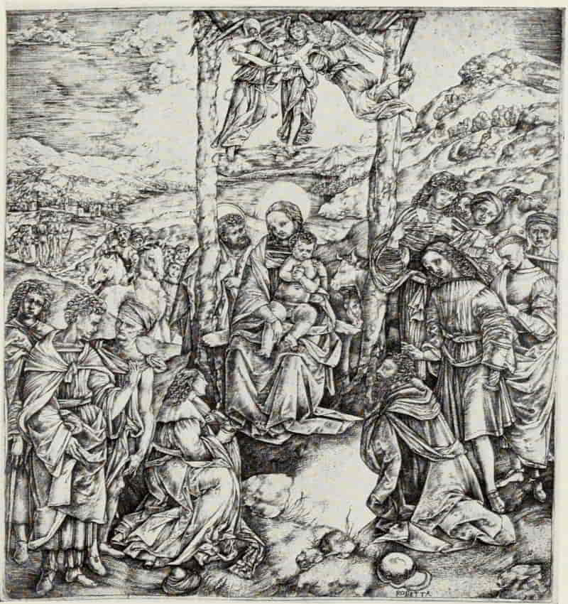
CRISTOFANO ROBETTA. ADORATION OF THE MAGI
Size of the original engraving, 11⅝ × 11 inches
In the Museum of Fine Arts, Boston
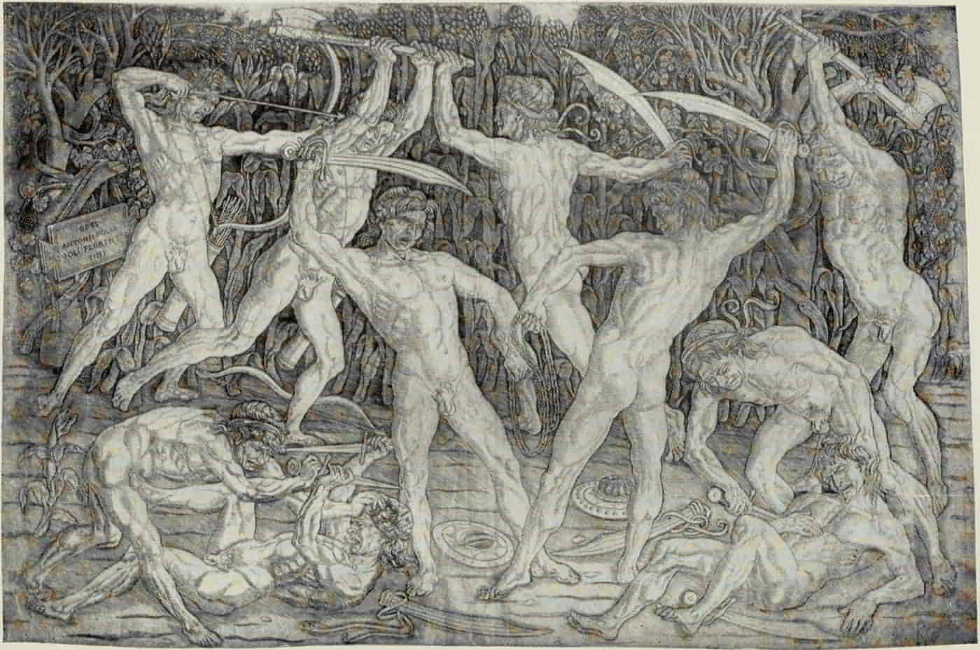
ANTONIO POLLAIUOLO. BATTLE OF NAKED MEN
Size of the original engraving, 15¾ × 23½ inches
In the Museum of Fine Arts, Boston
(If supported click figure to enlarge.)
Hercules and the Hydra and Hercules and Antæus show so markedly the influence of Pollaiuolo that we may conclude them to have been taken from the two small panels in the Uffizi; though, in the case of the first named, Pollaiuolo’s original sketch, now in the British Museum, may also have served Robetta.
Whether Pollaiuolo based his technical method upon that of Mantegna and his School, or whether Mantegna’s own engravings were inspired by his Florentine contemporary, is an interesting, but thus far unanswered, question. Pollaiuolo’s one print, the Battle of Naked Men, is engraved in the Broad Manner, somewhat modified by the use of a light stroke laid at an acute angle between the[Pg 90] parallels. The outlines of the figures are strongly incised; while the treatment of the background lends color to the supposition that, in his youth, Pollaiuolo engraved in niello, as well as furnished designs to be executed by Finiguerra and his School. In this masterpiece the artist has summed up his knowledge of the human form, and has expressed, in a more convincing and vigorous measure than has any other engraver in the history of the art, the strain and stress of violent motion and the fury of combat.
“What is it,” asks Bernhard Berenson, “that makes us return to this sheet with ever-renewed, ever-increased pleasure? Surely it is not the hideous faces of most of the figures and their scarcely less hideous bodies. Nor is it the pattern as decorative design, which is of great beauty indeed, but not at all in proportion to the spell exerted upon us. Least of all is it—for most of us—an interest in the technique or history of engraving. No, the pleasure we take in these savagely battling forms arises from their power to directly communicate life, to immensely heighten our sense of vitality. Look at the combatant prostrate on the ground and his assailant, bending over, each intent on stabbing the other. See how the prostrate man plants his foot on the thigh of his enemy and note the tremendous energy he exerts to keep off the[Pg 91] foe, who, turning as upon a pivot, with his grip on the other’s head, exerts no less force to keep the advantage gained. The significance of all these muscular strains and pressures is so rendered that we cannot help realizing them; we imagine ourselves imitating all the movements and exerting the force required for them—and all without the least effort on our side. If all this without moving a muscle, what should we feel if we too had exerted ourselves? And thus while under the spell of this illusion—this hyperæsthesia not bought with drugs and not paid for with cheques drawn on our vitality—we feel as if the elixir of life, not our own sluggish blood, were coursing through our veins.”[6]
[6] Florentine Painters of the Renaissance. By Bernhard Berenson. New York: Putnam’s Sons. 1899. pp. 54-55.
Pollaiuolo is the one great original engraver Florence produced, and with him we bring to a close our all too brief study of Florentine engraving.
[Pg 92]
ITALIAN ENGRAVING: THE FLORENTINES
BIBLIOGRAPHY
Le Peintre Graveur. By Adam Bartsch. 21 volumes. Vienna: 1803-1821. Volume 13, Early Italian Engravers.
The Drawings of the Florentine Painters. By Bernhard Berenson. 2 volumes. 180 illustrations. New York: E. P. Dutton & Company. 1903.
Catalogue of Early Italian Engravings Preserved in the Department of Prints and Drawings in the British Museum. By Arthur Mayger Hind. Edited by Sidney Colvin. 20 illustrations. London: The Trustees. 1910.
———. Illustrations to the Catalogue ... 198 plates. London: The Trustees. 1909.
Some Early Italian Engravers Before the Time of Marcantonio. By Arthur Mayger Hind. 22 illustrations. The Print-Collector’s Quarterly, Vol. 2, No. 3, pp. 253-289. Boston. 1912.
Sulle origini dell’incisione in rame in Italia. By Paul Kristeller. 4 illustrations. Archivio Storico dell’Arte, Vol. 6, p. 391-400. Rome. 1893.
Le Peintre-Graveur. By J. D. Passavant. 6 volumes. Leipzig: Rudolph Weigel. 1860-1864. Volumes 1 and 5, Early Italian Engravers.
Des Types et des manières des maitres graveurs ... en Italie, en Allemagne, dans les Pays-Bas et en France. By Jules Renouvier. 2 volumes. Montpellier: Boehm, 1853-1855. Volume 1, Engravers of the Fifteenth Century.
Lives of the Most Eminent Painters, Sculptors, and Architects. By Giorgio Vasari. Translated by Mrs. Jonathan Foster. With commentary by J. P. Richter. 6 volumes. London: George Bell & Sons. 1890-1892.
Finiguerra, Maso (1426-1464)
A Florentine Picture-Chronicle; being a Series of Ninety-nine Drawings Representing Scenes and Personages of Ancient History, Sacred and Profane; reproduced from the Originals in the British Museum. Edited by Sidney Colvin. 99 reproductions and 117 text illustrations. London: B. Quaritch. 1898.
Sandro Botticelli. By Herbert P. Horne. 43 plates. London: George Bell & Sons. 1905. pp. 77-86.
The Planets (c. 1460)
The Seven Planets. By Friedrich Lippmann. Translated by Florence Simmonds. 43 reproductions. London. 1895. (International Chalcographical Society. 1895.)
The Otto Prints (c. 1465-1470)
Florentinische Zierstücke aus dem XV. Jahrhundert. Edited by Paul Kristeller. 25 reproductions. Berlin: Bruno Cassirer. 1909. (Graphische Gesellschaft. Publication 10.)
[Pg 93]
Delle ‘Imprese amorose’ nelle più antiche incisione fiorentine. By A. Warburg. Rivista d’Arte, Vol. 3 (July-August). Florence. 1905.
Engravings in Books (1477-1481)
Works of the Italian Engravers in the Fifteenth Century; Reproduced ... with an Introduction. By George William Reid. 20 reproductions on 19 plates. First Series: Il Libro del Monte Sancto di Dio, 1477; La Divina Commedia of Dante; and the Triumphs of Petrarch.
Illustrations of the Divina Commedia, Florence, 1481
Sandro Botticelli. By Herbert P. Horne. 43 plates. London: George Bell & Sons. 1908. pp. 75-77, 190-255.
Zeichnungen von Sandro Botticelli zu Dante’s Goettlicher Komoedie nach den Originalen im K. Kupferstichkabinet zu Berlin. Edited by Friedrich Lippmann. 20 reproductions of engravings bound with text. With portfolio of 84 reproductions of the drawings.
Supplemented by—Die acht Handzeichnungen des Sandro Botticelli zu Dantes Göttlicher Komödie im Vatikan. Edited by Josef Strzygowski. With portfolio of 8 reproductions.
Triumphs of Petrarch (c. 1470-1480)
Pétrarque; ses études d’art, son influence sur les artistes, ses portraits and ceux de Laure, l’illustration de ses écrits. By Victor Masséna, Prince d’Essling, and Eugène Muntz. 21 plates and 191 text illustrations. Paris: Gazette des Beaux-Arts. 1902.
Études sur les Triomphes de Pétrarque. By Victor Masséna, Prince d’Essling. 6 illustrations. Gazette des Beaux-Arts. 2 parts. Part I. Vol. 35 (second period). pp. 311-321. Part II. Vol. 36 (second period). pp. 25-34. Paris. 1887.
Petrarch; His Life and Times. By H. C. Hollway-Calthrop. 24 illustrations. London: Methuen & Co. 1907.
Broad Manner Plates (c. 1470-1480)
Sandro Botticelli. By Herbert P. Horne. 43 plates. London: George Bell & Sons. 1908. pp. 288-291.
The Tarocchi Prints (c. 1467)
Die Tarocchi; zwei italienische Kupferstichfolgen aus dem XV. Jahrhundert. Edited by Paul Kristeller. 100 reproductions on 50 plates. Berlin: Bruno Cassirer. 1910. (Graphische Gesellschaft. Extraordinary Publication 2.)
Der venezianische Kupferstich im XV. Jahrhundert. By Paul Kristeller. 6 illustrations. Mitteilungen der Gesellschaft für vervielfältigende Kunst, Vol. 30, No. 1. Vienna. 1907.
Origine des cartes à jouer. By R. Merlin. About 600 reproductions. Paris: L’auteur. 1869.
[Pg 94]
The Tarocchi Prints. By Emil H. Richter. 13 illustrations. The Print-Collector’s Quarterly, Vol. 6, No. 1, pp. 37-89. Boston. 1916.
Catalogue of Playing and Other Cards in the British Museum. By William Hughes Willshire. 78 reproductions on 24 plates. London: The Trustees. 1876.
Pollaiuolo, Antonio (1432-1498)
Florentine Painters of the Renaissance. By Bernhard Berenson. New York: Putnam’s Sons. 1899. pp. 47-57.
Antonio Pollaiuolo. By Maud Cruttwell. 51 illustrations. London: Duckworth and Company. 1907.
Note su Mantegna e Pollaiuolo. By Arthur Mayger Hind. 2 illustrations. L’Arte, Vol. 9, pp. 303-305. Rome. 1906.
[Pg 95]
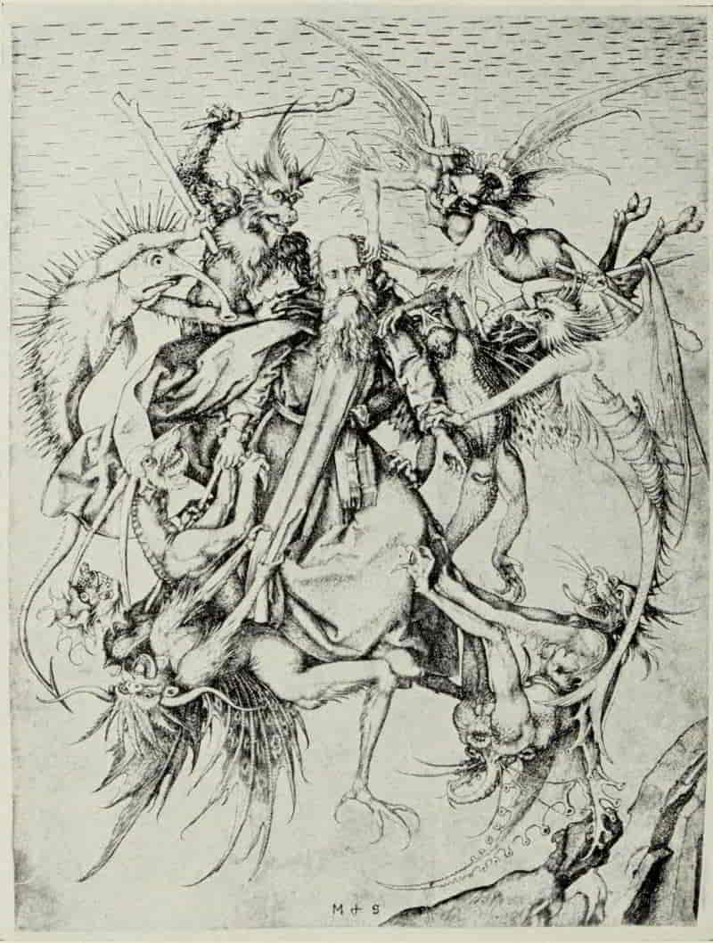
GERMAN ENGRAVING: THE MASTER OF
THE AMSTERDAM CABINET AND
ALBRECHT DÜRER
WITH the exception of Martin Schongauer, none of Dürer’s immediate predecessors better repays a thorough study, or exerts a more potent fascination, than the Master of the Amsterdam Cabinet. The earlier writers, from Duchesne to Dutuit, were united in their opinion that this engraver was a Netherlander; but Max Lehrs, following the track opened up by Harzen, has proved conclusively that the Master of the Amsterdam Cabinet (so called because the largest collection of his engravings—eighty subjects out of the eighty-nine which are known—is preserved in the Royal Print Rooms in Amsterdam) was not a Netherlander but a South German, a native of Rhenish Suabia—the very artist, in fact, who designed the illustrations of the Planets and their influences and the various arts and occupations of men, for the so-called “Medieval House Book” in the collection of Prince von Waldburg-Wolfegg.
In subject-matter he owes little to his predecessors, and in technique he is an isolated phenomenon.[Pg 96] St. Martin and the Beggar and St. Michael and the Dragon show that he was acquainted with the work of Martin Schongauer; the Ecstasy of St. Mary Magdalen is obviously based upon a similar engraving by the Master E. S. of 1466; but for the most part he stands alone. He seems to have worked entirely in dry-point upon some soft metal—lead or pewter, perhaps—and the ink which he used, of a soft grayish tint, combines with the breadth and softness of the lines to impart to his prints much of the character of drawings in silver-point.
The Master of the Amsterdam Cabinet has treated a wide range of subjects, his preference being for scenes of everyday life. His prints show appreciation of the beauties of landscape, his skill in the treatment of wide spaces is masterly, and there is a beauty and sweetness in the expression of his faces which makes him a worthy rival of Martin Schongauer himself. He has left us no purely ornamental designs, such as might serve in the decoration of vessels used in the church, and we may infer, from the character of his engravings, that he was a painter, who used the dry-point as a diversion, rather than a professional engraver, pursuing his craft as a means of livelihood. In power of composition he can hardly rank with Martin Schongauer, and in range of intellect he [Pg 99]falls short of the heights reached by Albrecht Dürer; but his very limitations, perhaps, render him a more companionable personage, and his modernity makes an immediate appeal to us all.
MASTER OF THE AMSTERDAM CABINET. ECSTASY
OF ST. MARY MAGDALEN
Size of the original engraving, 7⅝ × 5¼ inches
In the Royal Print Room, Amsterdam
MASTER OF THE AMSTERDAM CABINET. CRUCIFIXION
Size of the original engraving, 6 × 5¼ inches
In the Royal Print Room, Amsterdam
The Ecstasy of St. Mary Magdalen is one of his earliest plates and is a free translation of the same subject by the Master E. S. It would seem as though his dry-point was the immediate original of Dürer’s woodcut. The position of the Magdalen’s hands is the same in both compositions, but Dürer has added a landscape which, admirable though it be, detracts from the main interest of his print.
The Master of the Amsterdam Cabinet, in a second rendering, herewith reproduced, has eliminated all superfluous or distracting details and imparted a surprising degree of grace and purity to the lovely design. Anything like a chronological arrangement of the master’s work would be difficult, but one may safely assume that this beautiful engraving belongs to the latest and most mature period of his art, to which period we also may assign the Two Lovers.
As a rule, his least successful engravings are those dealing with religious themes. At times, however, as in the Crucifixion, he rises to heights of dramatic intensity, and Dürer may be indebted more than we realize to this rendering of the divine tragedy. Aristotle and Phyllis and Solomon’s Idolatry [Pg 100]are satirical illustrations of the follies of sages in love. Both plates are illumined by a truly modern sense of humor, while the arrangement of the figures within the spaces to be filled is admirable.
Such subjects as The Three Living and the Three Dead Kings and Young Man and Death are variations upon a theme which was uppermost in the minds of many men at this time, when the Ars Moriendi and the Dance of Death were constant reminders of man’s mortality. In agreeable contrast is the dry-point of Two Lovers—a little masterpiece—one of his most charming designs. “The sweet shyness of the maiden, the tender glances of the lover and the soft pressure of their hands are rendered with an inimitable grace, and the work is altogether of such exceptional quality that we may count this delightful picture as one of the rarest gems of German engraving in the fifteenth century.”[7]
[7] The Master of the Amsterdam Cabinet. By Max Lehrs. International Chalcographical Society, 1893 and 1894. p. 7.
The Stag Hunt is filled with the spirit of outdoor life, the exhilaration of the chase, and the joy of the hounds in pursuing their quarry. No other engraver of the fifteenth century has left us any such truthful rendering of a hunting scene, and the life-enhancing quality of this little dry-point [Pg 103]makes even Dürer’s rendering of animal forms seem cold and relatively lifeless.
MASTER OF THE AMSTERDAM CABINET. STAG HUNT
Size of the original engraving, 3⅝ × 6¾ inches
In the Royal Print Room, Amsterdam
(If supported click figure to enlarge.)
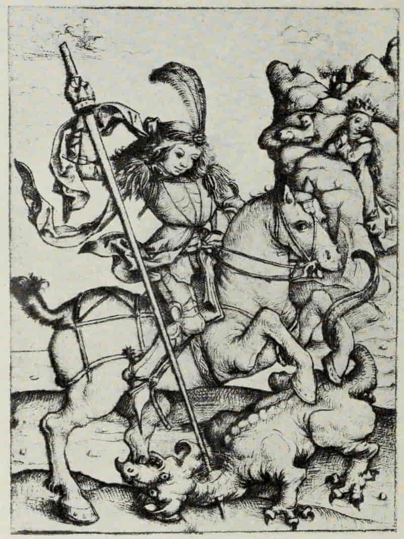
MASTER OF THE AMSTERDAM CABINET. ST. GEORGE
Size of the original engraving, 5⅝ × 4⅛ inches
In the British Museum
The master’s knowledge of the anatomy of the horse, and his treatment of that noble beast, unfortunately fall far short of his rendering of the dogs and stags in the Stag Hunt. The figure of St. George is sufficiently graceful and convincing, but the horse (seemingly of the rocking-horse variety) can hardly be proclaimed a complete success. In spite of this obvious defect it is one of the artist’s finest plates, remarkable for its exceptional force and animation. The unique proof, of which the British Museum is the fortunate possessor, is in splendid condition and rich in burr.
And now, with some trepidation of spirit, we approach Albrecht Dürer and his engraved work. His many-sidedness foredooms to failure any attempt at an adequate and comprehensive treatment. His compositions, as Max Allihn justly says, may fittingly be likened to the Sphinx of the old legend; for “they attack everyone who, either as critic, historian or harmless wanderer, ventures in the realm of art, and propose to him their unsolvable riddles.”
Of his own work Dürer says: “What beauty may be I know not. Art is hidden in nature and whosoever can tear it out has it,” and his life-long quest of knowledge, his truly German reverence for fact,[Pg 104] hangs like a millstone around his neck. “Of a truth,” writes Raphael, “this man would have surpassed us all if he had had the masterpieces of art constantly before him,” Raphael himself—“Raphael the Divine”—hardly paralyzed æsthetic criticism for a longer period than has Dürer, and in studying his engravings, if the student would see them for what they are, as works of art, and not through the enchanted, oftentimes stupefying, maze of metaphysics, he must be prepared for the gibes and verbal brick-bats of his contemporaries, who hold in reverence all that has the sanction of long-continued repetition by authority after authority.
“If you see it in a book it’s true; if you see it in a German book it’s very true,” applies with only too telling a force to a considerable share of Dürer speculation. For better or worse I cannot but think that Dürer’s prime intention in his engravings was an artistic one, though obviously this intention was often overlaid with a desire to supply an existing demand and to introduce, into otherwise simple compositions, traditional moralistic motives which should render his engravings more marketable at the fairs, where mostly they were sold. So many and so fascinating are the facets of Dürer’s personality, so interesting is he as a man in whose mind meet, and sometimes blend, the ideas of the Middle Ages with those almost of our own time,[Pg 105] that if we are to study, even in the briefest and most cursory fashion, his engraved work, we must perforce confine ourselves strictly to the artistic content of his plates and not be seduced into the by-ways of speculation which lead anywhere—or, more often, nowhere.
Earliest of his authenticated engravings, without monogram and without date, crude in handling, possibly suggested by the work of some earlier master, and in all probability executed before his first journey to Venice (that is to say, before or in the year 1490) is the Ravisher, susceptible of as many and as varied interpretations as there are authorities; from a man using violence, to the struggle for existence. It has even been connected in some way with a belief in witchcraft! The Holy Family with the Dragonfly, to which Koehler gives second place in his chronological arrangement of Dürer’s engravings, shows an astonishing advance in technique and in composition. It is undated, but the monogram is in its early form. The galley and the two gondolas, in the distant water to the right, would seem to indicate that it was engraved in or about the year 1494, upon Dürer’s return from Venice, and it is probably his first plate after his return to Nuremberg. There is a sweetness and an attractiveness in the face of the Virgin which points to an acquaintance with Schongauer’s engraving,[Pg 106] the Virgin with a Parrot. The poise of the head and the flowing hair lend color to this supposition.
To how great an extent not only the engravings, but the theories, of Jacopo de’ Barbari may have influenced Dürer in such plates as St. Jerome in Penitence, the Carrying Off of Amymone, Hercules, or the Four Naked Women, is difficult to determine. It may have been considerable, though, at times, one cannot help wondering whether the theory of proportion of the human body, of which Jacopo spoke to Dürer, but concerning which he refused (or was unable) to give him further detailed particulars, may not have been more or less of a “bluff,” since there is no record of Jacopo having committed the results of his studies to writing, and in his engravings there is little evidence of any logical theory of proportion. That a potent influence was at work shaping Dürer’s development is clear, and the figure of St. Jerome undoubtedly owes a good deal to Jacopo. The landscape is all Dürer’s own, the first of a long series finely conceived and admirably executed. The long, sweeping lines in the foreground recall the manner of Jacopo de’ Barbari, but otherwise the engraving owes little technically to that artist.
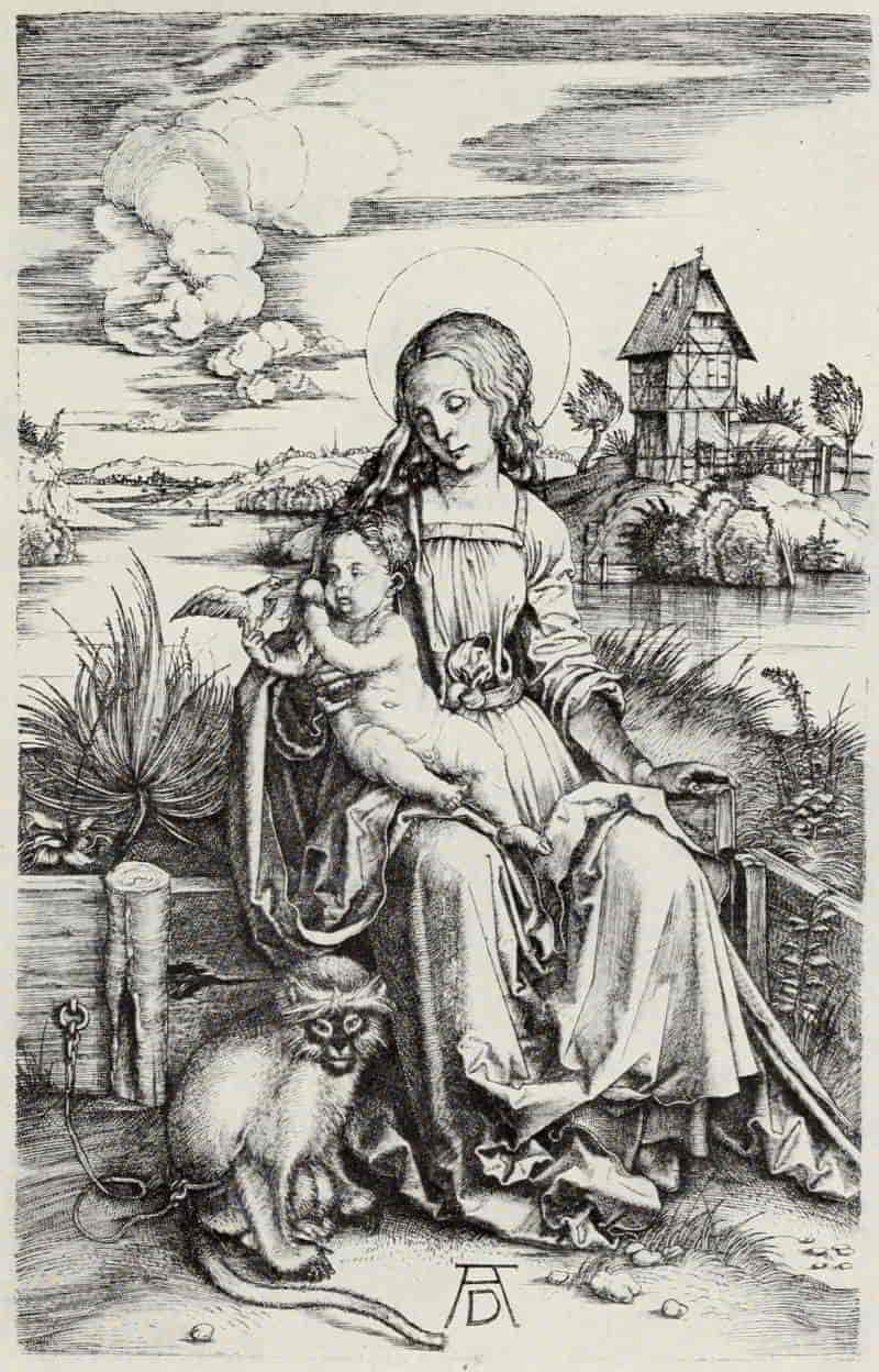
ALBRECHT DÜRER. VIRGIN AND CHILD WITH THE
MONKEY
Size of the original engraving, 7½ × 4¾ inches
In the Museum of Fine Arts, Boston
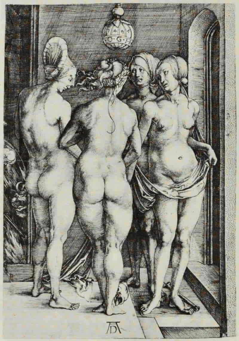
ALBRECHT DÜRER. FOUR NAKED WOMEN
Size of the original engraving, 7½ × 5¼ inches
In the Museum of Fine Arts, Boston
The Virgin and Child with the Monkey is the most brilliant of Dürer’s engravings in his earlier period. In the opinion of many students it is, likewise, the [Pg 109]most beautiful and dignified, not only in the figures of the Virgin and Child, but also in the breadth and richness of the landscape. The loveliness of the background was early recognized, and several Italian engravers, including Giulio Campagnola, availed themselves of it. When Dürer’s drawings and water-colors are more generally known, he will be acclaimed one of the masters of landscape. There is a freshness, a breeziness, an “out-of-doors” quality in his water-color of the Weierhaus which will surprise those who hitherto have known him only through his engraved work, wherein the landscape undergoes a certain formalizing process.
The Virgin and Child with the Monkey is so beautiful in simplicity of handling, so delightful in arrangement of black and white, that it is hard to reconcile oneself to the comparatively coarse line work, the insensitiveness to beauty of form, the disregard of anatomy, shown in Four Naked Women of 1497—Dürer’s first dated plate—especially the woman standing to the left, who combines the slackness of Jacopo de’ Barbari at his worst with the heaviness and puffiness possible only to a Northerner unacquainted with the classic ideals of the Italian Renaissance.
Speculation is again rife as to the meaning, if it has a meaning, of the skull and bone on the ground, and the devil emerging from the flames at[Pg 110] the left. The engraving seems to be a straightforward, naturalistic study of the nude, with these accessories thrown in to give the subject a moralizing air which would make it palatable to the artist’s contemporaries. There could hardly be a greater contrast to this frankly hideous treatment of the human form than Hercules (called also the Effects of Jealousy, the Great Satyr, etc.). In this plate we are able, as in few others—the one notable exception being the Adam and Eve of 1504—to follow out, step by step, Dürer’s upbuilding of the composition. The figures are, in this case, idealized according to the canons of classical beauty, rather than realistically rendered. Incidentally, the landscape is quite the most beautiful which appears in any of Dürer’s engravings. Its spaciousness instantly commands our admiration, and the gradation from light to dark, to indicate differing planes in the trees, is managed in a masterly manner.
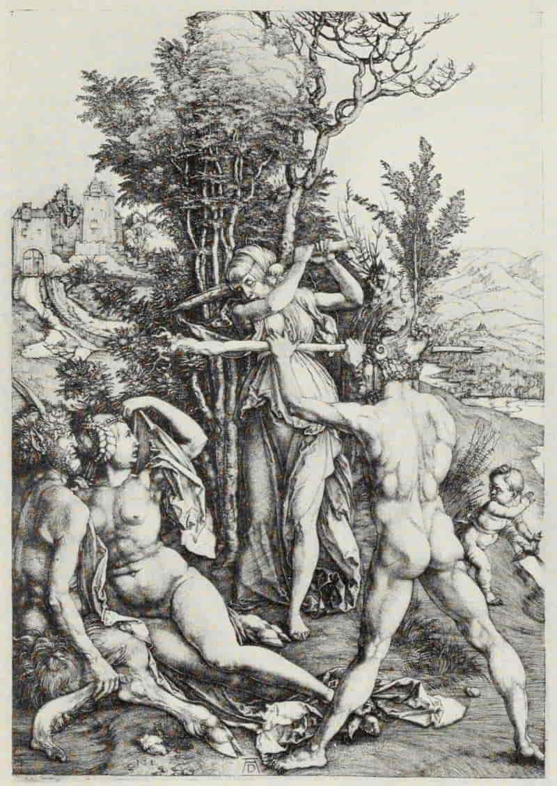
ALBRECHT DÜRER. HERCULES
Size of the original engraving, 13¾ × 8¾ inches
In the Museum of Fine Arts, Boston

ANONYMOUS NORTH ITALIAN, XV CENTURY. DEATH OF
ORPHEUS
Size of the original engraving, 5¾ × 8⅜ inches
In the Kunsthalle, Hamburg
(If supported click figure to enlarge.)
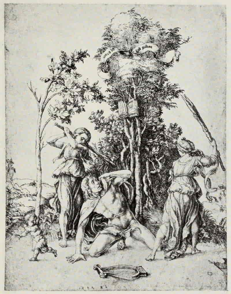
ALBRECHT DÜRER. DEATH OF ORPHEUS
Size of the original drawing, 11⅜ × 8⅞ inches
In the Kunsthalle, Hamburg
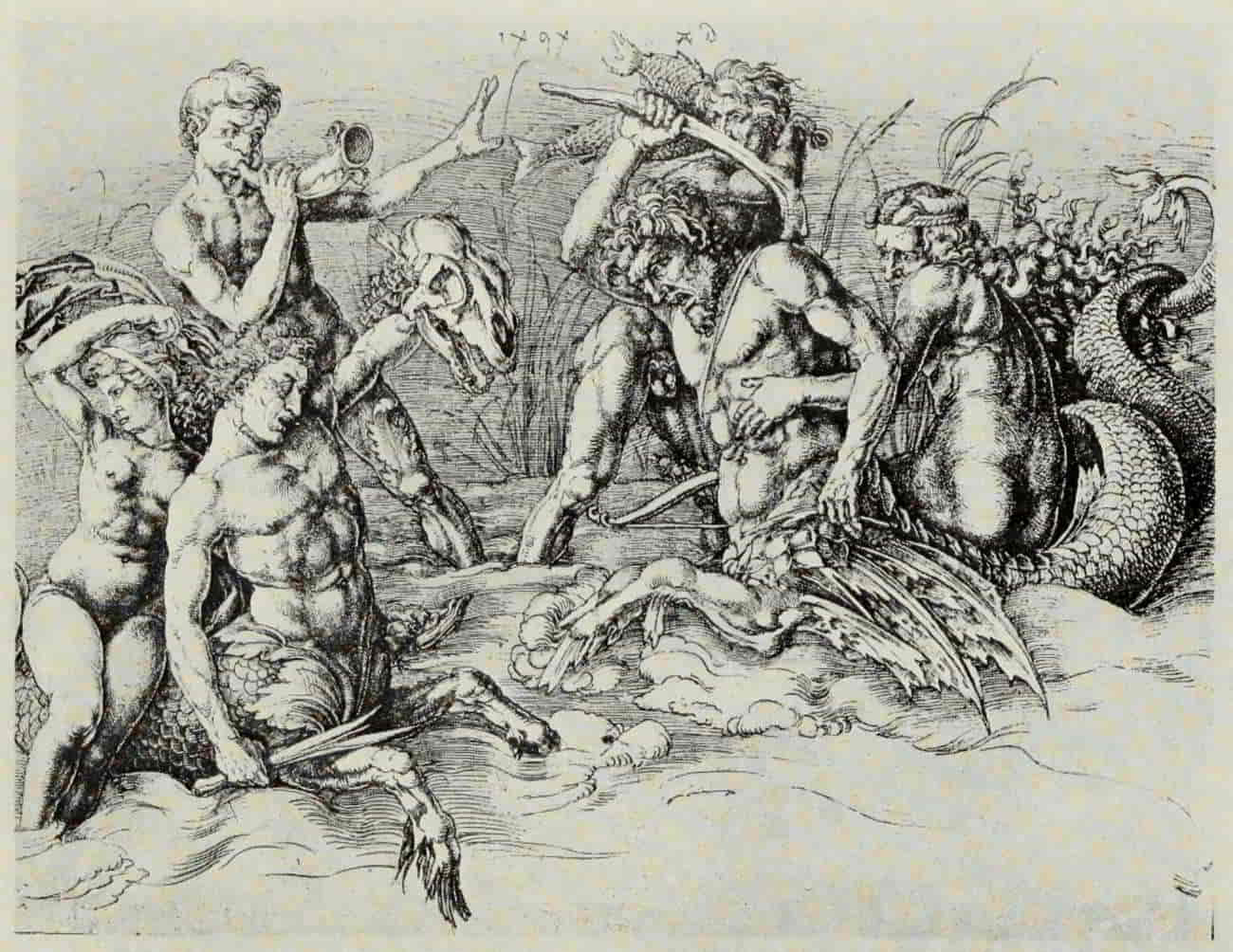
ALBRECHT DÜRER. BATTLE OF THE SEA-GODS. (After Mantegna)
Size of the original drawing, 11½ × 15¼ inches
In the Albertina, Vienna
(If supported click figure to enlarge.)
Beginning with the Death of Orpheus, engraved by some anonymous North Italian master working in the Fine Manner of the Tarocchi Cards, the next step is Dürer’s pen drawing, dated 1494. The figures of Orpheus and of the two Thracian Mænads remain unchanged, as does also the little child running towards the left. Dürer has, however, changed the lute into a lyre, as being more suited to Orpheus, and has added the beautiful group of trees [Pg 115]which reappears, little changed, in his engraving of Hercules. There is a drawing of the Mantegna School which Dürer may, or may not, have seen; but the face of Orpheus in his drawing shows certain unmistakable Mantegna characteristics, far removed from the North Italian Fine Manner print. From Mantegna’s engraving, the Battle of the Sea-Gods (right-hand portion), Dürer has borrowed the figure of the reclining woman to the left and the Satyr. That he was acquainted with this engraving by Mantegna is attested by a drawing of 1494. The man standing to the right, with legs spread wide apart, wearing a fantastic helmet in the shape of a cock, recalls the work of Pollaiuolo, by whom there exists a similar drawing, now in Berlin. From these various elements Dürer builds up his composition. Its full meaning he alone knew. It has remained an unsolved riddle from his time to our own.
The Carrying Off of Amymone belongs to this same period. Here Dürer has again used the motive taken from Mantegna’s engraving, the Battle of the Sea Gods; but in this instance he follows his original much more closely. Dürer alludes to this print in the diary of his journey to the Netherlands as The Sea Wonder (Das Meerwunder); and although the interpretations given to it are many and various, its true meaning, as in the case of the Hercules, remains a matter of conjecture.
[Pg 116]
By 1503, the year to which belongs the Coat-of-Arms with the Skull, and also, in all probability, the magnificent Coat-of-Arms with the Cock, Dürer seems to have overcome successfully all technical difficulties and is absolute master of his medium. From this time onwards, although his manner undergoes certain modifications in the direction of fuller color and of a more accurate rendering of texture, his language is adequate for anything he may wish to say, and he is free to address himself to the solution of scientific problems, such as are involved in the elucidation of his canon of human proportion, or the still deeper questions which stirred so profoundly the speculative minds of his time.
With the exception of Hercules, Adam and Eve is the only engraving by Dürer of which trial proofs, properly so-called, exist, whereby we can study Dürer’s method. First the outlines were lightly laid in; then the background was carried forward and substantially completed. In the first trial proof Adam’s right leg alone is finished; but in the second trial proof he is completed to the waist. This method of procedure is significant, in view of the endless controversies, based upon an incomplete study of Dürer’s technique, regarding the use of preliminary etching in many plates of his middle and later period.
[Pg 117]
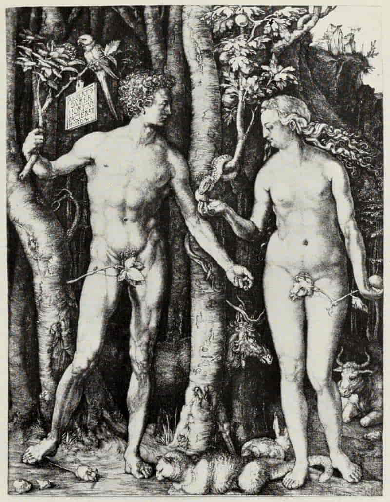
ALBRECHT DÜRER. ADAM AND EVE
Size of the original engraving, 9¾ x 8⅝ inches
In the Museum of Fine Arts, Boston
[Pg 118]
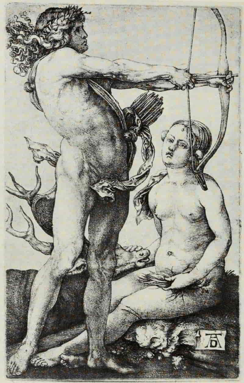
ALBRECHT DÜRER. APOLLO AND DIANA
Size of the original engraving, 4½ × 2¾ inches
In the Museum of Fine Arts, Boston
[Pg 119]
In Adam and Eve Dürer has summed up the knowledge obtained by actual observation and by a series of drawings and studies extending over a number of years, and combined with it his theoretical working out of the proportions of the human figure, male and female. In no other plate has he lavished such loving care upon the representation of the human form. The flesh is, so to speak, caressed with the burin, as though, once and for all, the artist wished to prove to his contemporaries that the graver sufficed for the rendering of the most beautiful, the most subtle and scientific problems. That Dürer himself was satisfied with the result of his labors at this time is made manifest by the detailed inscription, ALBERTUS DURER NORICUS FACIEBAT, on the tablet, followed by his monogram and the date 1504. This plate proclaimed him indisputably the greatest master of the burin of his time; and along the lines which he laid down for himself it remains unsurpassed until our own day.
Adam and Eve is followed by a group of prints which, though interesting in treatment and charming in subject, such as the Nativity, Apollo and Diana, and the first four plates of the Small Passion, reveal nothing new in Dürer’s development as an artist or a man. In the year 1510, however, is made his first experiment in dry-point. Of the very small[Pg 120] plate of St. Veronica with the Sudarium two impressions only have come down to us, neither of them showing much burr. The Man of Sorrows, dated 1512, likewise must have been very delicately scratched upon the copper, all existing impressions being pale and delicate in tone. Whether Dürer’s desire was to produce engravings which should entail less labor and be more quickly executed than was possible by the slower and more laborious method of the burin, or whether, as seems much more likely, he was influenced by an acquaintanceship with the dry-point work of the Master of the Amsterdam Cabinet, cannot be asserted with any degree of assurance. Dürer’s third dry-point, the St. Jerome by the Willow Tree (like the Man of Sorrows dated 1512), is treated in so much bolder and more painter-like a manner, is so rich in burr and so satisfying as a composition, that one can hardly account for such remarkable development unaided by any outside influence or stimulation. The British Museum’s impression of the first state, before the monogram,—the richest impression known—yields nothing in color effect even to Rembrandt. Thausing is inclined to think that Rembrandt must have been inspired by this plate to himself take up the dry-point—an interesting speculation and one which would do honor to both of these great masters.
[Pg 121]
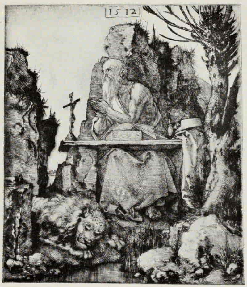
ALBRECHT DÜRER. ST. JEROME BY THE WILLOW TREE
(First State)
Size of the original dry-point 8⅛ × 7 inches
In the British Museum
[Pg 122]
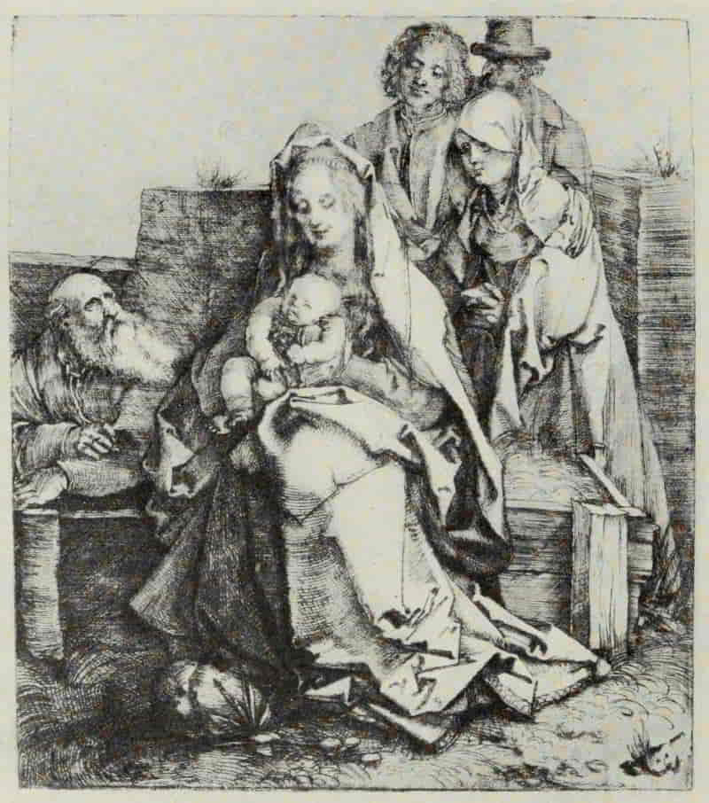
ALBRECHT DÜRER. HOLY FAMILY
Size of the original dry-point, 8¼ × 7¼ inches
[Pg 123]
The Holy Family, though without monogram and undated, belongs so unmistakably, from internal evidence, to this period, that we may safely assign it to the year 1512. The background and landscape to the left are indicated in outline only. Did Dürer intend to carry the plate further? We can never know. It is his fourth and, unfortunately, his last dry-point. There is a beauty in St. Jerome by the Willow Tree and in this Holy Family which leads us to read in these two masterpieces certain Italian influences. There is the largeness of conception of the Venetian School, and both St. Jerome and St. Joseph show strong traces of such a master as Giovanni Bellini.
With the brief space at our disposal, what shall we say of the crowning works of those two wonderful years, 1513-1514—Knight, Death and the Devil, Melancholia, and St. Jerome in his Study? Are they three of a proposed series of the four temperaments? Should they be considered as parts of a group—or is each masterpiece complete in itself? One thing at least they have in common: they are truly “Stimmungsbilder”—that is, the lighting is so arranged, in each composition, as directly to affect the mind and the mood of the beholder, and “the sombre gloom of the Knight, Death and the Devil, the weird, unearthly glitter of the Melancholia, with its uncertain, glinting lights, the soft, tranquil[Pg 124] sunshine of the St. Jerome, are all in accordance with their several subjects. These, whether or not originally intended to represent ‘classes of men’ or ‘moods,’ certainly call up the latter in the mind of the beholder—the steady courage of the valiant fighter for the right, undismayed by darkness and dangers; the brooding, leading well-nigh to despair, over the vain efforts of human science to lift the veil of the eternal secret; and the calm content of the mind at peace with itself and the world around it.”[8]
[8] A Chronological Catalogue of the Engravings, Dry-Points and Etchings of Albert Dürer, as exhibited at the Grolier Club. By Sylvester R. Koehler. New York; The Grolier Club. 1897. p. 65.
Dürer, unfortunately, sheds no light upon the inner and deeper meaning of the Knight, Death and the Devil. He speaks of it simply as “A Horseman.” The many and various titles invented for it since his time carry us very little further forward than where we began. The letter S, which precedes the date, the dog which trots upon the further side of the horse, even the blades of grass under the hoof of the right hind leg of the horse, have all been matters of speculation and controversy, and we choose the part of wisdom if, disregarding the swirling currents of metaphysical interpretation, we enjoy this masterpiece of engraving for its æsthetic content primarily, and for its potential meanings afterwards.
[Pg 125]
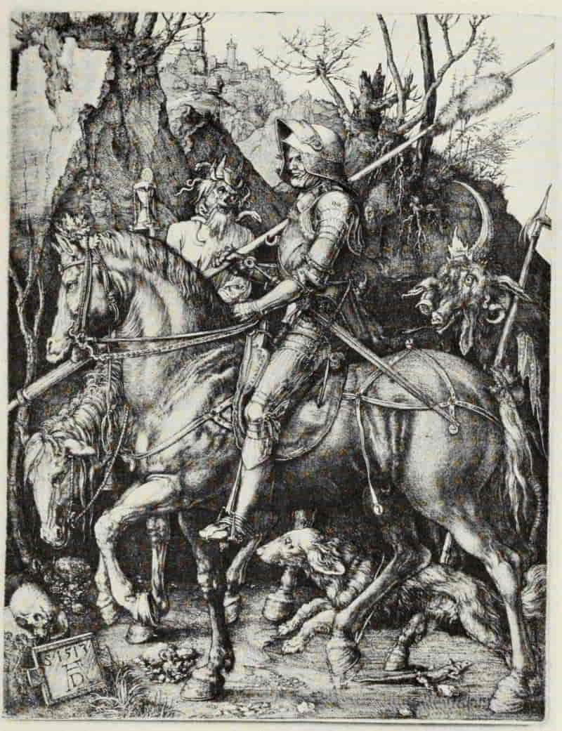
ALBRECHT DÜRER. KNIGHT, DEATH AND THE DEVIL
Size of the original engraving, 9⅝ × 7⅜ inches
In the Museum of Fine Arts, Boston
[Pg 126]
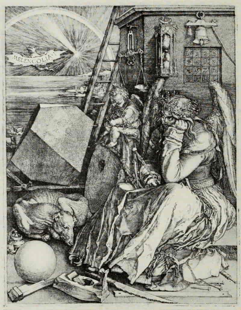
ALBRECHT DÜRER. MELANCHOLIA
Size of the original engraving, 9⅛ × 7¼ inches
In the Museum of Fine Arts, Boston
[Pg 127]
Melancholia favors an even wider range of speculation than the Knight, Death and the Devil. This woman, who wears a laurel wreath and who, seated in gloomy meditation, supports her cheek in her left hand, while all the materials for human labor, for art, and for science lie scattered about her—does she symbolize human Reason in despair at the limits imposed upon her power? Or does the plate have a more personal and intimate meaning, reflecting Dürer’s deep grief at the death of his mother—the mother to whom he so often refers in his letters, always with heartfelt affection?
The so-called “magic square” lends color to the latter interpretation. Dürer’s mother died on May 17, 1514. The figures in the diagonally opposite corners of the square can be read as follows, 16 + 1 and 13 + 4, making 17, the day of the month; as do the figures in the center read crosswise, 10 + 7 and 11 + 6, and also the middle figures at the sides read across, 5 + 12 and 8 + 9. The two middle figures in the top line, 3 + 2, give 5, the month in question, and the two middle figures in the bottom line give the year, 1514.
Artistically the plate suffers from the multiplicity of objects introduced, and the loving care which Dürer has lavished upon them. He has wished to tell his story—whatever it may be—with absolute completeness in every particular, and in so doing[Pg 128] he has weakened and confused the effect of his plate. It were idle to speculate upon what might have happened had so sensitive a master as Martin Schongauer possessed adequate technical skill for the interpretation of such a subject. What a masterpiece of masterpieces might have resulted if he had subjected it to that process of simplification and elimination of which he was so splendid an exponent! However this may be, Melancholia has been, and probably will continue to be, one of the signal triumphs in the history of engraving. We may never solve the riddles which she propounds; but is she less fascinating for being only partially understood?
St. Jerome in his Cell, all things considered, may be accounted Dürer’s high-water mark. There is a unity and harmony about this plate which is lacking in Melancholia. Nothing could be finer than the lighting; and, judged merely as a “picture,” it is altogether satisfying from every point of view. The accessories, even the animals in the foreground, take their just places in the composition. It is surprising that, although the plate is “finished” with minute and loving care, there is not the faintest evidence of labor apparent anywhere about it; but this is only one of its many and superlative merits. The light streaming in through the window at the left and bathing in its soft effulgence the [Pg 131]Saint, intent upon his task, and the entire room in which he sits, has been for centuries the admiration of every art lover.
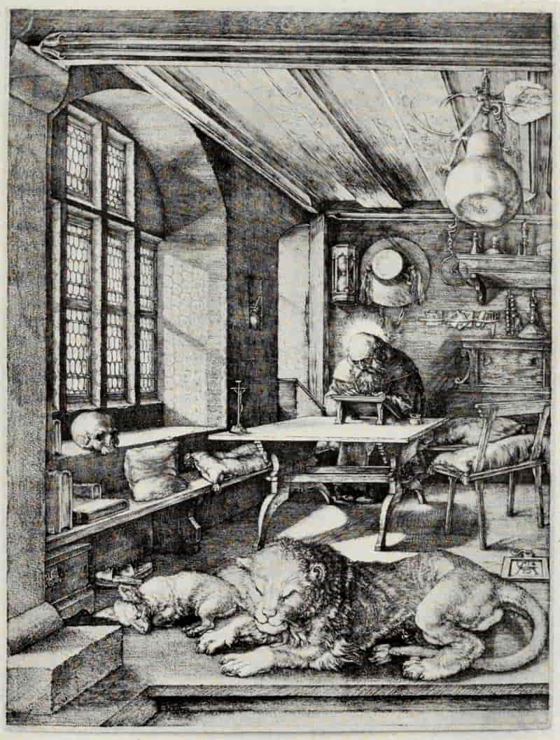
ALBRECHT DÜRER. ST. JEROME IN HIS CELL
Size of the original engraving, 9½ × 7¼ inches
In the Museum of Fine Arts, Boston
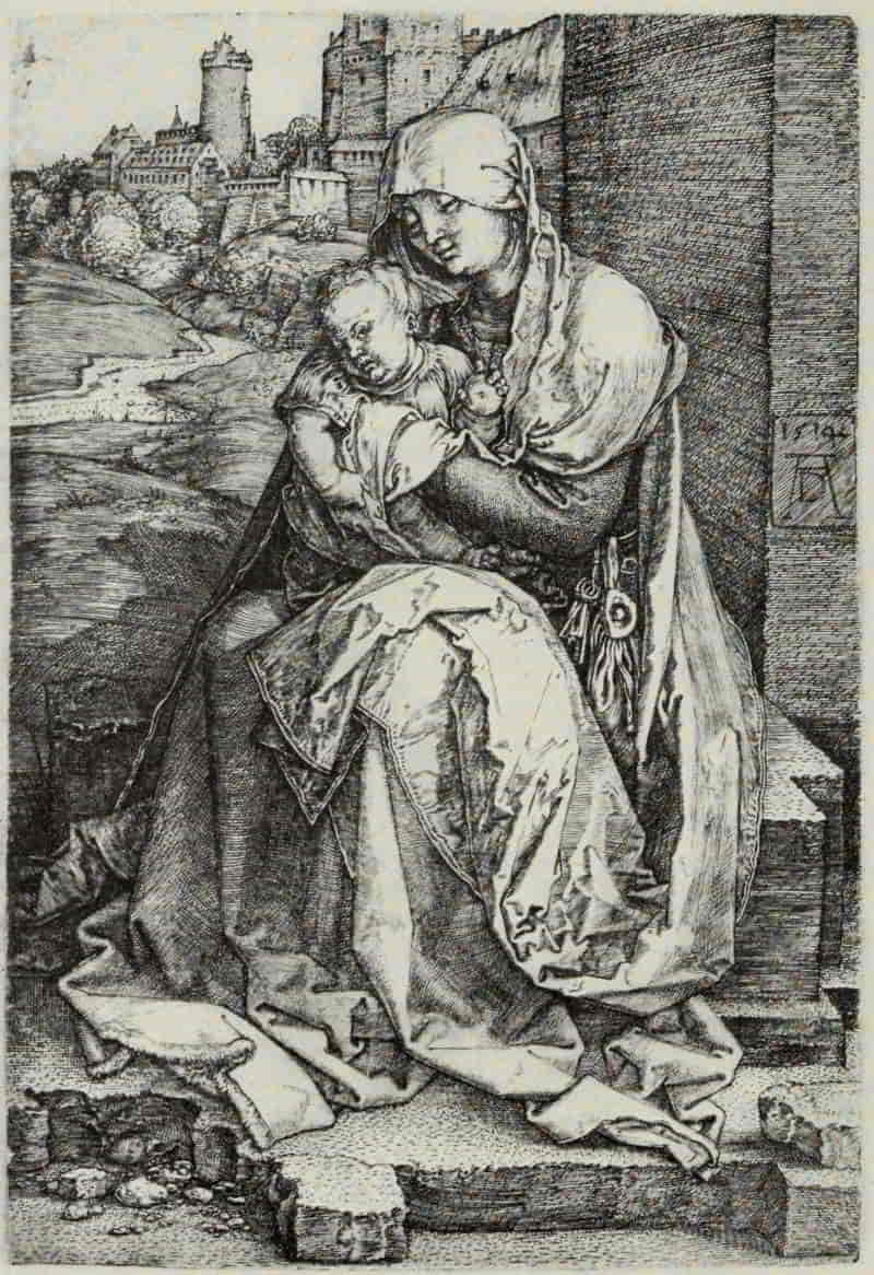
ALBRECHT DÜRER. VIRGIN SEATED BESIDE A WALL
Size of the original engraving, 5¾ × 3⅞ inches
In the Museum of Fine Arts, Boston
To this year, 1514, also belongs the Virgin Seated Beside a Wall, a plate in which the variety of texture has been carried further than in any other engraving by Dürer. The flesh is simply treated, in line for the most part; but the undergarment, the fur-trimmed wrapper, and the scarf which covers the head of the Virgin, hanging down the back and thrown over the knee, are all carefully differentiated. Again, the various planes in the landscape leading up to the fortified city are beautifully handled, as is also the wall to the right. It is hard to say what technical problems remained for Dürer to solve after such a little masterpiece as this.
His growing fame meanwhile had attracted the attention of the Emperor Maximilian, “the last of the Knights,” who in February, 1512, visited Nuremberg. Dürer is commissioned to design the Triumphal Arch, the Triumphal Car, and similar monumental records of the Emperor’s prowess; not to speak of such orders as the decoration of the Emperor’s Prayer-Book, etc. Such distraction absorbed the greater part of the artist’s time and energies, and there was left little opportunity for the development of his work along the lines he had[Pg 132] hitherto followed. It may be that we owe to this fact, and to the quick mode of producing a print such a process offers, the six etchings on iron which bear dates from 1515 to 1518. But, whatever the reason, we are glad that he etched these plates. Discarding, for the moment, the elaborate and detailed method of line work of his engravings on copper, he adopts a more open system, such as would “come well” in the biting—closer work than in his woodcuts, but perfectly adapted to that which he wished to say.
There is a tense and passionate quality in Christ in the Garden which places this etched plate among the noteworthy works even of Dürer, while the wind-torn tree to the left of Christ gives the needed touch of the supernatural to the composition. The Carrying Off of Proserpine—the spirited drawing for which is now in the J. Pierpont Morgan collection—is the working out, with allegorical accessories, of a study of a warrior carrying off a woman. The last of his plates, the Cannon, of 1518, with its charming landscape, was doubtless executed to supply, promptly, a popular demand. It represents a large field piece bearing the Arms of Nuremberg, and the five strangely costumed men to the right, gazing upon the “Nuremberg Field Serpent,” obviously have some relation to the fear of the Turk, then strong in Germany.
[Pg 133]
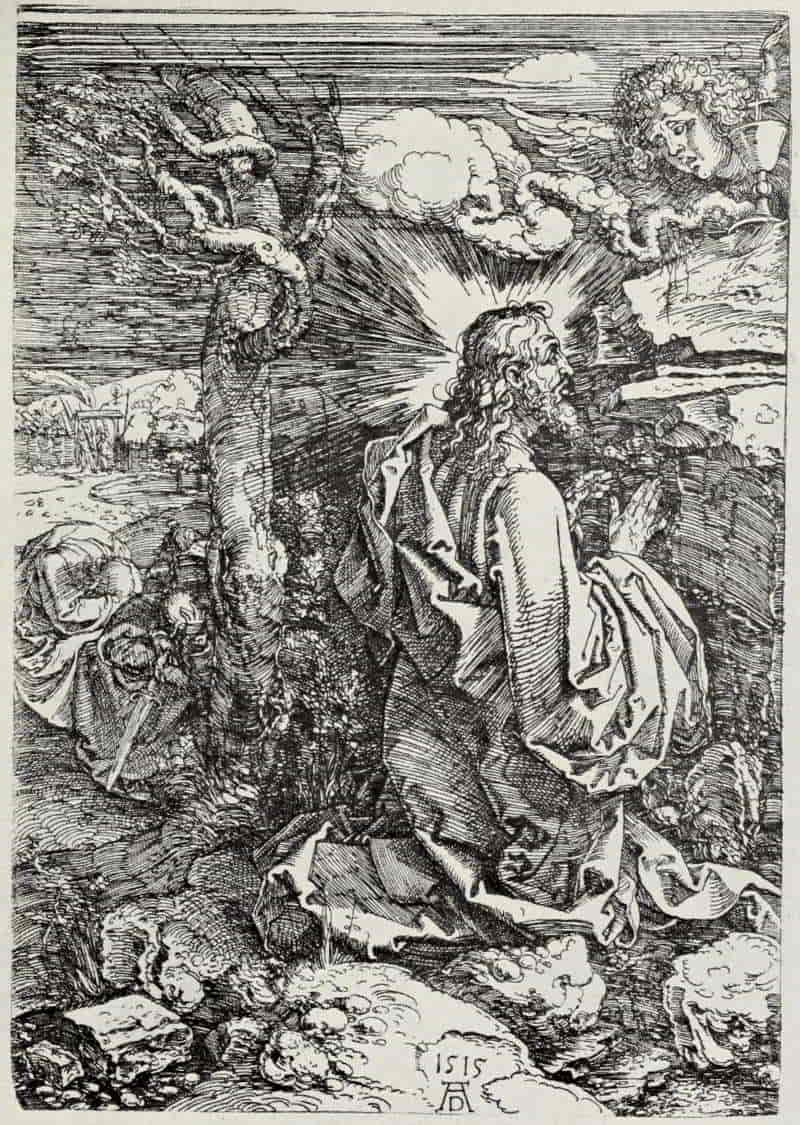
ALBRECHT DÜRER. CHRIST IN THE GARDEN
Size of the original etching, 8¾ × 6⅛ inches
In the Museum of Fine Arts, Boston
[Pg 134]
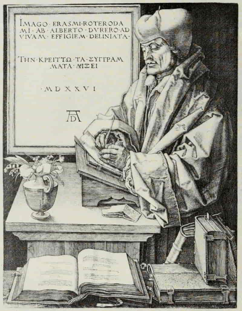
ALBRECHT DÜRER. ERASMUS OF ROTTERDAM
Size of the original engraving, 9⅞ × 7⅝ inches
In the Museum of Fine Arts, Boston
[Pg 135]
In 1519 we have the first of Dürer’s engraved portraits—Albert of Brandenburg, “The Little Cardinal” to distinguish it from the larger plate of 1523. Opinions as to Dürer’s importance as a portrait engraver vary considerably. Some students feel that in these later works the engraver has become so engrossed in the delight of his craft that he has failed to concentrate his attention upon the countenance and character of the sitter, bestowing excessive care upon the accessories and the minor accidents of surface textures—wrinkles and similar unimportant matters. On the other hand, such an authority as Koehler maintains that the Albert of Brandenburg, preeminent for delicacy and noble simplicity among these portrait engravings by Dürer, “will always be ranked among the best portraits engraved anywhere and at any time.”
Frederic the Wise, Elector of Saxony, was one of the earliest patrons of Dürer, founder of the University of Wittenberg and a supporter of the Reformation, although he never openly embraced the doctrines of Martin Luther. Dürer’s drawing in silver-point gives a straightforward and characterful presentation of the man, and, in this instance, translation into the terms of engraving has nowise lessened the directness of appeal.
Erasmus of Rotterdam bears the latest date (1526) which we find upon any engraving by Dürer, and it[Pg 136] well may be his last plate. Here the elaboration and finish bestowed upon the accessories certainly detract from the portrait interest. Erasmus was polite enough, when he saw this engraving, to excuse its unlikeness to himself by remarking that doubtless he had changed much during the five years which had intervened between Dürer’s drawing of 1521 and the completion of the plate. Technically, however, it is a masterpiece, a worthy close to the career of undoubtedly the greatest engraver Germany has produced.
[Pg 137]
GERMAN ENGRAVING: THE MASTER OF THE AMSTERDAM
CABINET AND ALBRECHT DÜRER
BIBLIOGRAPHY
Master of the Amsterdam Cabinet (flourished c. 1467-c. 1500)
Zur Zeitbestimmung der Stiche des Hausbuch-meisters. By Curt Glaser. Monatshefte für Kunstwissenschaft, Vol. 3, pp. 145-156. Leipzig. 1910.
The Master of the Amsterdam Cabinet. By Max Lehrs. 89 reproductions. London. 1894. (International Chalcographical Society. 1893 and 1894.)
Bilder und Zeichnungen Vom Meister des Hausbuchs. By Max Lehrs. 5 illustrations. Jahrbuch der königlichen preussischen Kunstsammlungen, Vol. 20, pp. 173-182. Berlin. 1899.
The Master of the Amsterdam Cabinet and Two New Works by His Hand. By Willy F. Storck. 6 illustrations. The Burlington Magazine. Vol. 18, pp. 184-192. London. 1910.
Dürer, Albrecht (1471-1528)
Le Peintre-Graveur. By Adam Bartsch. Volume 7, pp. 5-197. Albert Durer, Vienna. 1803-1821.
Literary Remains of Albrecht Dürer. By William Martin Conway. 14 illustrations. Cambridge: University Press. 1889.
The Engravings of Albrecht Dürer. By Lionel Cust. 4 reproductions and 25 text illustrations. London: Seeley & Co. 1906. (The Portfolio Artistic Monographs. No. 11.)
Albrecht Dürer; His Engravings and Woodcuts. Edited by Arthur Mayger Hind. 65 reproductions. London and New York: Frederick A. Stokes Company, n. d. (Great Engravers.)
Dürer. By H. Knackfuss. Translated by Campbell Dodgson. 134 illustrations. Bielefeld and Leipzig: Velhagen & Klasing. 1900. (Monographs on Artists.)
Exhibition of Albert Dürer’s Engravings, Etchings and Dry-Points, and of Most of the Woodcuts Executed from his Designs. (Museum of Fine Arts, Boston. November 15, 1888-January 15, 1889.) By Sylvester R. Koehler. Boston: Museum of Fine Arts. 1888.
Chronological Catalogue of the Engravings, Dry-Points and Etchings Of Albert Dürer, as Exhibited at the Grolier Club. By Sylvester R. Koehler. 9 reproductions on 7 plates. New York: The Grolier Club. 1897.
Dürer; des Meisters Gemälde, Kupferstiche und Holzschnitte. Edited by Valentin Scherer. 473 reproductions. Stuttgart and Leipzig: Deutsche Verlags-Anstalt. (Klassiker der Kunst. Vol. 4.)
[Pg 138]
Albert Dürer; His Life and Works. By William B. Scott. Illustrated. London: Longmans, Green & Co. 1869.
Albrecht Dürer; Kupferstiche in getreuen Nachbildungen. Edited by Jaro Springer. 70 plates. Munich: Holbein-Verlag. 1914.
Albert Dürer; His Life and Works. By Moritz Thausing. Translated from the German. Edited by Frederick A. Eaton. 2 volumes. 58 illustrations. London: John Murray. 1882.
Dürer Society. [Portfolios] With Introductory Notes by Campbell Dodgson and Others. Series 1-10 (1898-1908). 311 reproductions. Index of Series 1-10. London. 1898-1908.
———. Publication No. 12. 24 reproductions. London. 1911.
[Pg 139]
ITALIAN ENGRAVING: MANTEGNA TO
MARCANTONIO RAIMONDI
ANDREA MANTEGNA is, both by his art and his influence, the most significant figure in early Italian engraving. His method or viewpoint is a determining feature in much of the best work which was produced during the last quarter of the fifteenth century, until the influence of Raphael, transmitted through Marcantonio, with a technical mode based upon the manner of Albrecht Dürer, completely changed the current of Italian engraving, seducing it from what might have developed into an original creative art, and condemned it to perpetual servitude as the handmaid of painting.
Andrea Mantegna, born in 1431, at Vicenza, and consequently Pollaiuolo’s senior by one year, was adopted, at the age of ten, by Squarcione, in Padua. Squarcione appears to have been less a painter than a contractor, undertaking commissions to be executed by artists in his employ. He was likewise a dealer in antiquities, and in his shop the young Mantegna must have met many of the leading humanists who had made Padua famous as a seat of classical learning. From them he drew in and[Pg 140] absorbed that passion for imperial Rome which was to color his life and his art. His dream was of forms more beautiful than those of everyday life, built of some substance finer and less perishable than the flesh of frail humanity; and as years went by his work takes on, in increasing measure, a grander and more majestic aspect. Fortunate for us is it that in his mature period, when his style was fully formed, he himself was impelled, by influences of which later we shall speak, to take up the graving tool and with it produce the seven imperishable masterpieces which, beyond peradventure, we may claim as his authentic work.
The Virgin and Child, the earliest of his engravings, can hardly have been executed before 1475, and maybe not until after 1480, when Mantegna had reached his fiftieth year. Mr. Hind points out that there is a simplicity and directness about it which recalls quite early work, similarly conceived, such as the Adoration of the Kings of 1454; but the reasons which he advances are of equal weight in assigning it to a later date, and I am convinced that the intensity of mother-love expressed in the poise and face of the Virgin betokens a deeper feeling, a broader humanity, than one normally would expect in a youth of twenty-three, even though he be illumined with that flame of genius which burned so brightly in Mantegna.
[Pg 141]
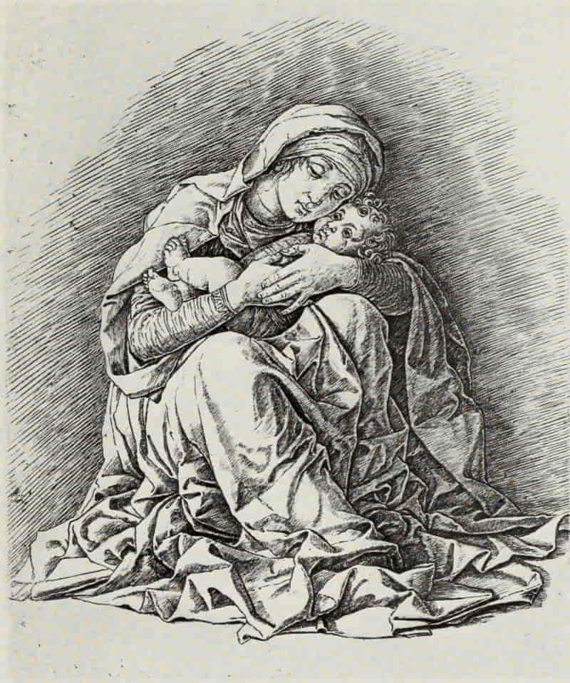
ANDREA MANTEGNA. VIRGIN AND CHILD
Size of the original engraving, 9¾ × 8⅛ inches
In the British Museum
[Pg 142]
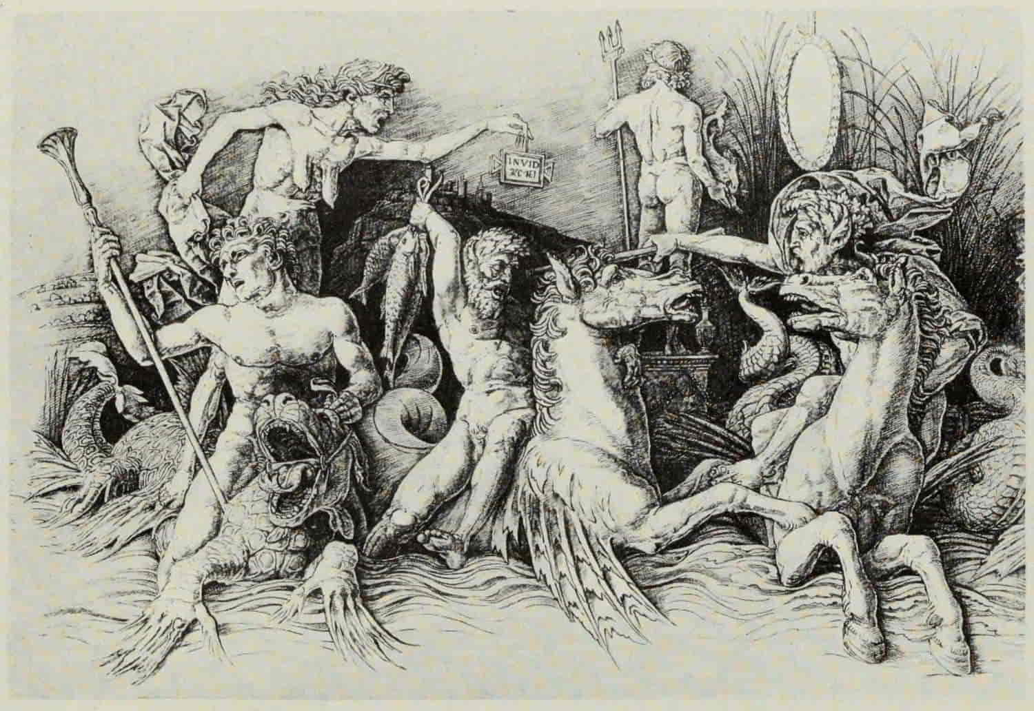
ANDREA MANTEGNA. BATTLE OF THE SEA-GODS
Size of the original engraving, 11⅝ × 17 inches.
In the Museum of Fine Arts, Boston
(If supported click figure to enlarge.)
[Pg 143]
Technically, the plate plainly shows the hand of an engraver not yet master of his medium. It is marked with all the characteristics which we associate with Mantegna’s work: the strong outline, ploughed with repeated strokes of a rather blunt instrument into a plate of unbeaten copper or some yet softer metal; the diagonal shade lines widely spaced; and the light strokes blending all into a harmonious whole. In an impression of the first state, in the British Museum, there is a tone, similar to sulphur-tint, over portions of the plate, noticeably in the faces of the mother and child. How it was produced is still a matter of conjecture, but that it adds much to the beauty of the print is beyond question.
The Bacchanalian Group with Silenus and the Bacchanalian Group with a Wine-Press (which, like the Battle of the Sea-Gods, may be joined together so as to form one long, horizontal composition) show greater skill on the part of the engraver. Mantegna’s increasing passion for the antique is reflected in the standing figure to the left, who with his left hand reaches up towards the wreath with which he is about to be crowned, while resting his right hand upon a horn of plenty. This figure is obviously inspired by the Apollo Belvedere, while the standing faun, at the extreme right, filled with the sheer delight of mere animal existence, is a[Pg 144] delightful creation in Mantegna’s happiest mood.
The two plates of the Battle of the Sea-Gods may be assigned, on technical grounds, to about the same period as the two Bacchanals. The drawing which Durer made of the right-hand portion, as also of the Bacchanalian Group with Silenus, both dated 1494, conclusively prove that these engravings antedate the completion of the Triumph of Cæsar. Though Mantegna borrowed his material from the antique, he has so shaped it to his ends, so stamped upon it the impress of his own personality, as to make of it not an echo of classic art, but an original creation of compelling force and charm. “These are not the mighty gods of Olympus but the inferior deities of Nature, of the Earth and the Sea, who acknowledge none of the higher obligations and who display unchecked their wanton elemental nature, giving a loose rein to all the exuberance of their joy in living.... These creatures of the sea frolic about in the water, turbulent and wanton as the waves.... The combat with those harmless-looking weapons is probably not meant to be in earnest; a vent for their superfluous energy is all they seek.”[9]
[9] Andrea Mantegna. By Paul Kristeller. London; Longman’s Green & Co. 1901. p. 395.
To a somewhat later period belongs the Entombment. There is nothing of the meek spirit of the[Pg 145] Redeemer in this passionate plate. The hard, lapidary landscape is in accord with the figures, which might, not unfittingly, find a place upon some triumphal arch. Three crosses crown the distant hill. At the right stands St. John, a magnificent figure, giving utterance to his unspeakable grief, while the Virgin, sinking in a swoon, is supported by one of the holy women.
Here is none of that tenderness which we associate with the divine tragedy, none of that grace and beauty which inheres in the work of many of the Italian painters of the Renaissance. All is stark and harsh. It is not food for babes, but it is superb.
The Risen Christ Between Saints Andrew and Longinus is Mantegna’s last engraving. Christ towers above the two subsidiary figures, with a form and bearing which would better befit a Roman Emperor returning in triumph. In this plate, above all others, Mantegna’s technique shines forth as not only adequate, but as beyond question the best—perhaps the only one—to convey his message. Translated into another mode, one feels that it would lose much of its appeal. It has been suggested that the engraving was made as a project for a group of statuary—perhaps for the high altar of S. Andrea, in Mantua, raised above the most precious relic possessed by the city, the Blood of Christ, brought to Mantua by Longinus—a supposition[Pg 146] borne out by the statuesque impressiveness of the group and by the fact that Christ gazes downwards, as though from a height.
Although 1480 is the earliest date to which we can assign the first of Mantegna’s original engravings, there were in existence, at least five years before that time, engravings by other hands after designs by the master, and it may have been either to protect himself from unauthorized and fraudulent copyists, or as an artistic protest against the incapacity of his translators, that Mantegna was compelled to take up the graver. There has come down to us a letter, dated September 15, 1475, addressed by Simone di Ardizone, of Reggio, to the Marquis Lodovico, of Mantua, complaining to the prince of Mantegna’s behavior towards him. His story was that “Mantegna, upon his arrival in Mantua, made him splendid offers, and treated him with great friendliness. Actuated by feelings of compassion, however, towards his old friend, Zoan Andrea, a painter in Mantua, from whom prints (stampe), drawings, and medals had been stolen, and wishing to help in the restoration of the plates, he had worked with his friend for four months. As soon as this came to Mantegna’s knowledge he proceeded to threats, and one evening Ardizone and Zoan Andrea had been assaulted by ten or more armed men and left for dead in the square.”
[Pg 147]
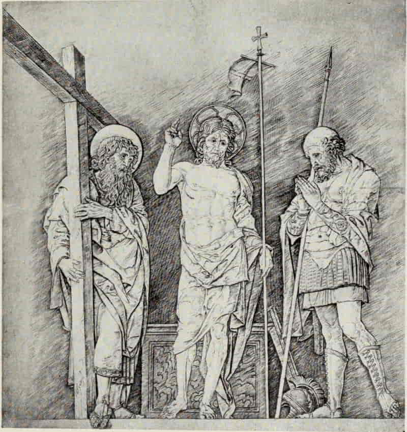
ANDREA MANTEGNA. THE RISEN CHRIST BETWEEN
SAINTS ANDREW AND LONGINUS
Size of the original engraving, 15½ × 12¾ inches
In the Museum of Fine Arts, Boston
[Pg 148]
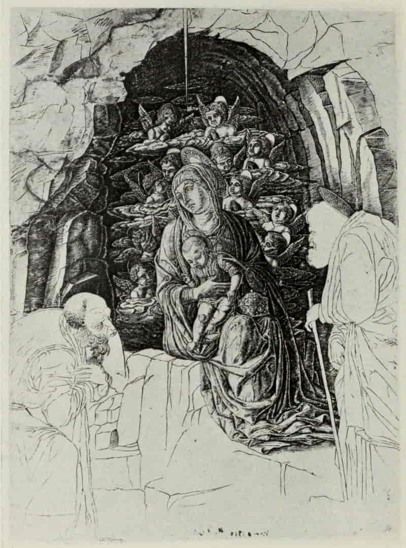
SCHOOL OF ANDREA MANTEGNA. ADORATION OF THE MAGI
Size of the original engraving, 15⅛ × 10¾ inches
In the Museum of Fine Arts, Boston
[Pg 149]
The letter is “proof that, in Mantua, in the year 1475, two professional engravers, one of whom clearly designates himself as such, were at work.... It is clear that Mantegna had a very special interest in the engravings and drawings which had been stolen from Zoan Andrea, and which Ardizone, ‘out of compassion,’ helped to restore, since he sought by force to impede the engraver’s work. His anger can also be explained by the supposition that Zoan Andrea’s engravings were facsimiles of his own drawings which the former had succeeded in obtaining possession of and had used as designs for his engravings; and that being unable to win Ardizone’s assistance in his work Mantegna thought himself obliged to protest, by violent means, against this infringement of his artistic rights.”[10]
[10] Andrea Mantegna By Paul Kristeller. London. 1901. pp. 381-384.
It is probable that to this drastic and effectual method of protecting against piracy his own artistic property we owe the two renderings, both incomplete, of the Triumph of Cæsar. One may well be the series upon which Zoan Andrea and Ardizone were working when Mantegna brought their labors to an untimely close; whereas the second series, although authorized by Mantegna himself, may have seemed to him, not without just cause, so to[Pg 150] misinterpret his original drawings as to impel him to abandon the project and, in future, engrave his own designs. The Triumph series naturally remained incomplete, since, like every great artist, Mantegna would hardly feel disposed to repeat, in another medium, a subject which he had already treated. Of the Triumph plates, the Elephants approximates most closely Mantegna’s undoubted work; but the drawing lacks distinction, and there is a feeling of “tightness” throughout the whole plate, which makes it impossible to attribute the engraving to Mantegna’s own hand. The plate which immediately follows—Soldiers Carrying Trophies—was left unfinished. The subject is repeated in the reverse sense and with the addition of a pilaster to the right. This pilaster is probably Mantegna’s original design for the upright members dividing the nine portions of the painted Triumphs, since the procession is supposed to pass upon the further side of a row of columns, the figures and animals being so arranged as to extend over one picture to the next, with a sufficient space between them for the introduction of the pilaster.
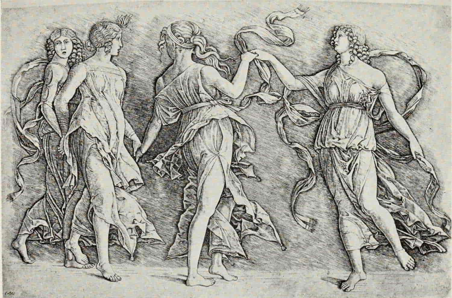
ZOAN ANDREA (?). FOUR WOMEN DANCING
Size of the original engraving, 8⅞ × 13 inches
In the Museum of Fine Arts, Boston
(If supported click figure to enlarge.)
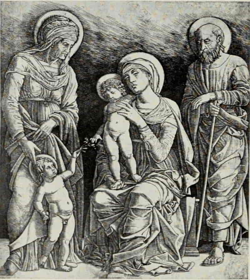
GIOVANNI ANTONIO DA BRESCIA. HOLY FAMILY WITH
SAINTS ELIZABETH AND JOHN
Size of original engraving, 11⅞ × 10⅛ inches
In the Museum of Fine Arts, Boston
The Adoration of the Magi, which for some reason likewise remained unfinished, is taken directly from the central portion of the triptych in the Uffizi. The engraving, aside from its intrinsic beauty, is of especial interest as affording an example of the[Pg 153] method adopted by Mantegna and his School. The structural lines are deeply incised, in many cases by repeated strokes of the graver. The diagonal shading is then added and the plate carried forward and completed, bit by bit. This engraving, at one time accounted an original work by the master himself, has received of recent years more than its merited share of harsh criticism. It obviously falls far short, in beauty, of Mantegna’s painting; but, for all that, it preserves many of the essential qualities of its immediate original, and one cannot but admire the manner in which an engraver, certainly not of the first rank, has captured the spirit of humility and adoration, eloquent in every line of the king at the left, humbly bending to receive the benediction of the Christ Child.
By an engraver of the Mantegna School, perhaps Zoan Andrea, working in Mantegna’s manner and after his design for the Parnassus in the Louvre, is Four Women Dancing—one of the most charming and graceful prints of the period. It differs in many particulars from the painting (assigned to the year 1497) and almost certainly translates Mantegna’s drawing, rather than the painting itself.
To Giovanni Antonio da Brescia, of whose life, apart from what we may learn from a study of his work, we know substantially nothing, may be attributed the Holy Family with Saints Elizabeth and[Pg 154] John, based upon a design by Mantegna, of about 1500, and probably engraved at a date prior to Mantegna’s death, September 13, 1506. At a later period, Giovanni came under the influence of Marcantonio Raimondi, whose style he imperfectly assimilated.
In the British Museum there is a unique impression of a Profile Bust of a Young Woman, which has been ascribed, with some show of reason, to Leonardo da Vinci. Its intrinsic beauty might lend some color to this attribution, were it not that, even in its re-worked condition, the texture and flow of the young woman’s abundant tresses, the treatment of the flowing ribbons, and the delicate shading in the face and upon the garment, betray the hand of the trained engraver.
Nicoletto Rosex da Modena was working from about 1490 to 1515. He engraved almost a hundred plates, the majority of them being presumably from his own designs, though in the Adoration of the Shepherds the influence of Schongauer is markedly apparent, and in Fortune and St. Sebastian the inspiration of Mantegna is clearly to be seen.
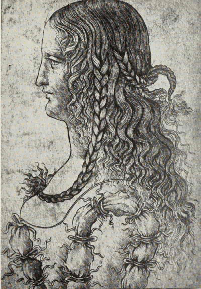
SCHOOL OF LEONARDO DA VINCI. PROFILE BUST OF A
YOUNG WOMAN
Size of the original engraving, 4⅛ × 3 inches
In the British Museum
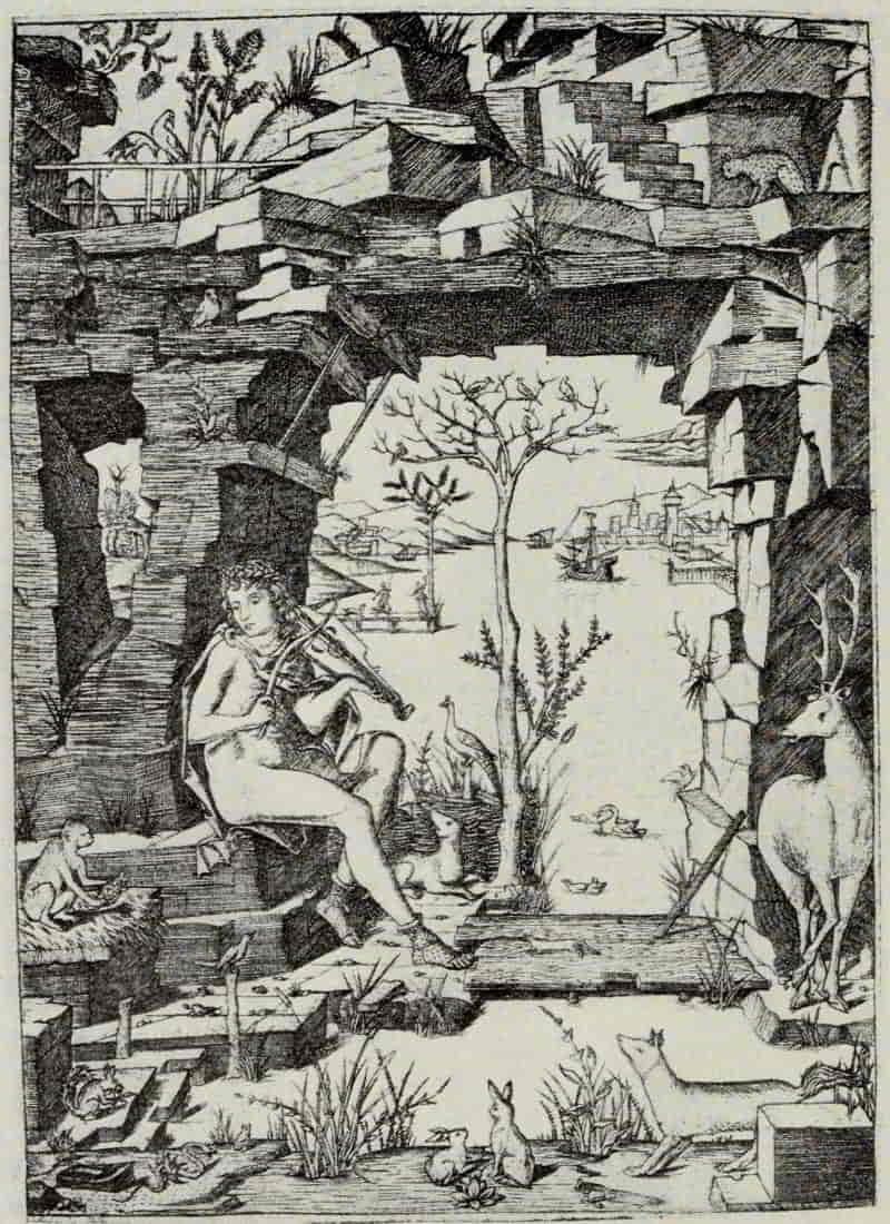
NICOLETTO ROSEX DA MODENA. ORPHEUS
Size of the original engraving, 9⅞ × 6¾ inches
In the British Museum
The group of trees in the Fate of the Evil Tongue is borrowed from Dürer’s print of Hercules, while the Turkish Family and the Four Naked Women—the last-named being dated 1500—are copies of Dürer’s engravings. Vedriani, writing of Nicoletto [Pg 157]as a painter, speaks of him as “chiefly distinguished in perspective,” and among the most charming of his plates in which this quality is seen is Orpheus. The bare tree is suggestive of Martin Schongauer, while the birds and beasts, including a dog, a peacock, a weasel, a monkey playing with a tortoise, a squirrel, a snake, a piping bird, two rabbits, a fox, and a stag, not to speak of the ducks and swans in the water, though not copied from northern originals, have all the charm and life-like quality which we find in the work of German engravers such as The Master of St. John the Baptist and The Master E. S. of 1466.
Concerning Jacopo de’ Barbari there is a wealth of biographical material, in contrast with the meagerness of our knowledge concerning the earlier Italian engravers. Born at Venice, between 1440 and 1450, he is known to have worked between 1500 and 1508 for the Emperor and various other princes in different towns of Germany. He was at Nuremberg in 1505, and in 1510 he was in the service of the Archduchess Margaret, Regent of the Netherlands, while, in the inventory of the Regent’s pictures of 1515-1516, he is referred to as dead.
Not one of the thirty engravings by Jacopo is signed with his name, initials, or any form of monogram, nor does any of them bear a date. His emblem is the caduceus, which appears on the greater[Pg 158] number of his prints; and those upon which it is lacking can readily be identified by his individual style. This style undergoes certain modifications with the passing years. In the early period, the shading, for the most part, is in parallel lines, which follow the contour of the figure, the figure itself being long and sinuous. In his middle and later period he indulged more freely in cross-hatching, and the faces are modelled with greater delicacy.
Stress has been laid upon the influence exerted by Jacopo upon Dürer’s engraving; but with the exception of the Apollo and Diana this influence is theoretical rather than artistic. Dürer, in one of the manuscript sketches, dated 1523, for his book The Theory of Human Proportions, writes: “Howbeit, I can find none such who hath written aught about how to form a canon of human proportion, save one man—Jacopo by name, born at Venice, and a charming painter. He showed me the figures of a man and a woman, which he had drawn according to a canon of proportions, so that, at that time, I would rather have seen what he meant than be shown a new kingdom.... Then, however, I was still young and had not heard of such things before. Howbeit, I was very fond of art, so I set myself to discover how such a canon might be wrought out.” Dürer undoubtedly refers to the period of his first visit to Venice, and it is, accordingly, [Pg 161]in Dürer’s earliest plates that we see most clearly the influence of the older master on his technical method. Dürer soon outstripped Jacopo in everything that pertains to the technical side of engraving and worked out for himself a method which, for his purpose, was substantially perfect.
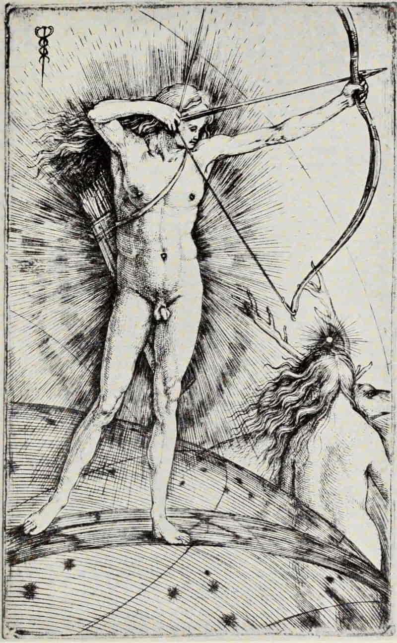
JACOPO DE’ BARBARI. APOLLO AND DIANA
Size of the original engraving, 5¾ × 3⅞ inches.
In the Museum of Fine Arts, Boston
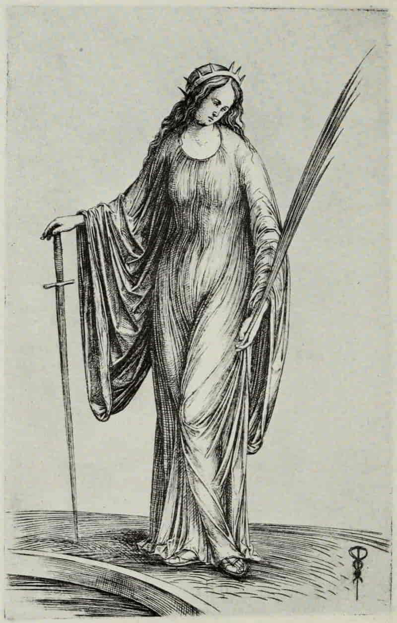
JACOPO DE’ BARBARI. ST. CATHERINE
Size of the original engraving, 7⅛ × 4⅝ inches
In the British Museum
In such plates as Judith and St. Catherine, Jacopo’s love for long, flowing lines finds its fullest expression. There is a grace about these single figures which is not without appealing charm, though obviously they leave something to be desired on the score of solidity and structure.
Girolamo Mocetto, born in Murano before 1458, was living at Venice in 1514, where he died after 1531. According to Vasari, Mocetto was, at some time, an assistant to Giovanni Bellini, whose influence may be traced in his work. His engravings are unpleasing in style and often clumsy in draughtsmanship. He owes such merit as he may possess to the originals which he interpreted. There is a compelling power in Judith, after Mantegna’s design, which atones for even so shapeless a member as Judith’s right hand. The grandeur of the plate is, however, derived from Mantegna. Mocetto has done little more than traduce it; but, even so, the engraving is noteworthy, inasmuch as it preserves for us a noble composition, of which otherwise we might remain in ignorance. The Baptism of Christ[Pg 162] is adapted, with some modifications, from Giovanni Bellini’s painting executed between 1500 and 1510. In the engraving, the landscape, which differs radically from that in Bellini’s painting, may possibly be original with Mocetto, though it recalls the work of Cima, whose Baptism, in S. Giovanni in Bragora, Venice, was painted in 1494.
Benedetto Montagna was, like Mocetto, painter as well as engraver. His earliest engravings are executed in a large, open manner, which can be seen to advantage in the Sacrifice of Abraham. The outline is strongly defined and the shading chiefly in parallel lines. Where cross-hatching is used, it is laid generally at right angles. Later, Montagna modifies his style and adopts the finer system of cross-hatching perfected by Dürer, whose influence, especially in the backgrounds, is clearly to be traced, and whose Nativity, of the year 1504, Montagna copied in reverse. St. Jerome Beneath an Arch of Rock belongs to this later period, and the plate is probably based upon a painting by Bartolommeo Montagna, the engraver’s father.
Giulio Campagnola, born at Padua about 1482, is known to have been working in Venice in 1507 and is assumed to have died shortly after 1514. According to contemporary accounts, he was a youth of marvellously precocious and varied gifts and promise. To his musical and literary accomplishments, [Pg 165]he added those of painter, miniaturist, engraver, and sculptor.
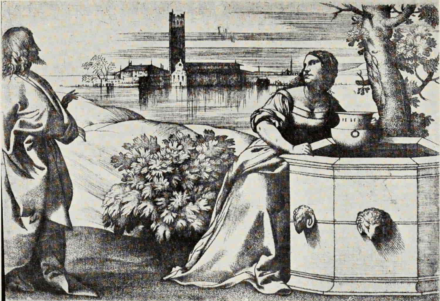
GIULIO CAMPAGNOLA. CHRIST AND THE WOMAN OF SAMARIA
Size of the original engraving, 5⅛ × 7¼ inches
In the Museum of Fine Arts, Boston
(If supported click figure to enlarge.)
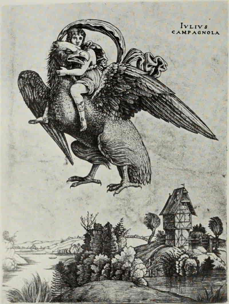
GIULIO CAMPAGNOLA. GANYMEDE (First State)
Size of the original engraving, 6⅜ × 4⅞ inches
In the Museum of Fine Arts, Boston
His engravings betray markedly the influence of Giorgione, and his manner of engraving may have been an attempt to imitate the rich softness of that master’s painting. He worked out and perfected a technical system all his own. In his earliest manner he works in pure line, as in his copies of Dürer’s engravings and in such plates as the Old Shepherd and St. Jerome.
In the Young Shepherd, the Astrologer, and Christ and the Woman of Samaria, the composition is first engraved in simple, open lines, with little cross-hatching. The plate is then carried forward and completed by a system of delicate flicks, so disposed as to produce a harmonious result, obliterating substantially all trace of the preliminary line work. In the third group, to which two prints belong—Naked Woman Reclining and The Stag—no lines at all are used, and the plate is carried out, from first to last, in flick work.
Only one of Campagnola’s plates is dated—the Astrologer, of 1509. In this he shows himself ripe, both as artist and as craftsman. To an earlier period would seem to belong the Ganymede, in which the landscape is a faithful copy of Dürer’s engraving of the Virgin and Child with a Monkey. The place which, in the original engraving, was[Pg 166] occupied by the Virgin, is now filled by a clump of trees.
St. John the Baptist is, all things considered, Campagnola’s masterpiece. The figure is unquestionably based upon a drawing by Mantegna, and has all the largeness and grandeur of style which characterizes the work of that master. The landscape background may be original with the engraver but it clearly shows the influence of Giorgione. In this superb plate Campagnola’s method of combining line work with delicate flick work can be studied at its best. The Young Shepherd, known in two states—the first in pure line, the second completed with flick work—is as charming and graceful as St. John the Baptist is monumental. It justly deserves the reputation and popularity which it enjoys among print lovers.
Christ and the Woman of Samaria is treated in a more open manner than either of the two preceding engravings. The beautiful landscape, as also the hill to the left, is entirely in line, while the flick work upon the figures and garments and, even more noticeably, in the foreground to the right, is of a more open character than that which appears in the Young Shepherd. It may belong to the latter part of Campagnola’s career as an engraver. There is an amplitude in the design of the seated woman which suggests Giorgione and Palma, though one cannot [Pg 169]definitely name any painting by either of these masters from which Campagnola has borrowed his figure.
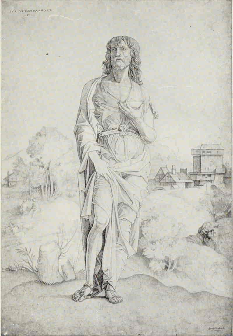
GIULIO CAMPAGNOLA. ST. JOHN THE BAPTIST
Size of the original engraving, 13⅝ × 9½ inches
In the Museum of Fine Arts, Boston
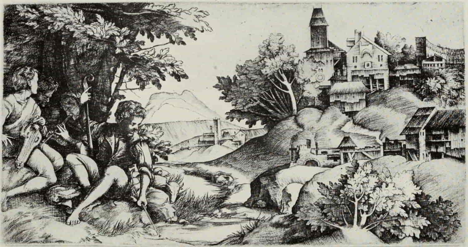
GIULIO AND DOMENICO CAMPAGNOLA. SHEPHERDS IN A LANDSCAPE
Size of the original engraving, 5¼ × 10⅛ inches
In the Museum of Fine Arts, Boston
(If supported click figure to enlarge.)
The last of Campagnola’s plates, left unfinished at his death and completed by Domenico Campagnola, is Shepherds in a Landscape or, as it is sometimes called, the Musical Shepherds. The original drawing, in reverse, for the right-hand half of this print is in the Louvre. It is unquestionably by Giulio Campagnola; but, equally without question, the left-hand portion of the engraving itself is by Domenico. Whether Domenico was a close relative or merely a pupil of Giulio’s has not been determined; but the Shepherds in a Landscape conclusively proves that he was at least the artistic heir of the older master. Domenico’s style is in marked contrast to that of Giulio. Flick work is almost absent from his engravings, which are executed in rather open lines, more in the mode of an etcher than of an engraver working according to established tradition. The skies, in particular, have a romantic quality which is all their own, and which can be seen to advantage in the Shepherd and the Old Warrior, dated 1517.
Marcantonio Raimondi, born in Bologna about 1480, for over three centuries enjoyed a reputation eclipsing that of any other Italian master. Of recent years, however, upon insufficient grounds, he[Pg 170] has been somewhat pushed aside and belittled as a “reproductive engraver,” his critics wilfully forgetting the fact that, with the exception of Pollaiuolo and Mantegna, the Italian School is, in the main, derivative, and cannot boast of any original engravers of world-wide fame, such as Schongauer or Dürer. But Marcantonio was far from being a mere translator of alien works. “He is like some great composer who borrows another’s theme only to make it his own by the originality of his setting.”[11]
[11] Marcantonio Raimondi. By Arthur M. Hind. The Print-Collector’s Quarterly, Vol. 3, No. 3. p. 276.
The earliest influence which we may trace in Marcantonio’s work is that of the famous goldsmith and painter, Francesco Francia, with whom Marcantonio served his apprenticeship. Certain nielli, among them Pyramus and Thisbe and Arion on the Dolphin, have been assigned to the young Marcantonio and attributed to this period of his life.
St. George and the Dragon is strongly reminiscent of the niello technique, with its dark shadows, against which the figures stand out in relief. The landscape is clearly borrowed or adapted from engravings in Dürer’s earlier period, the trees at the left, in particular, recalling the Hercules.
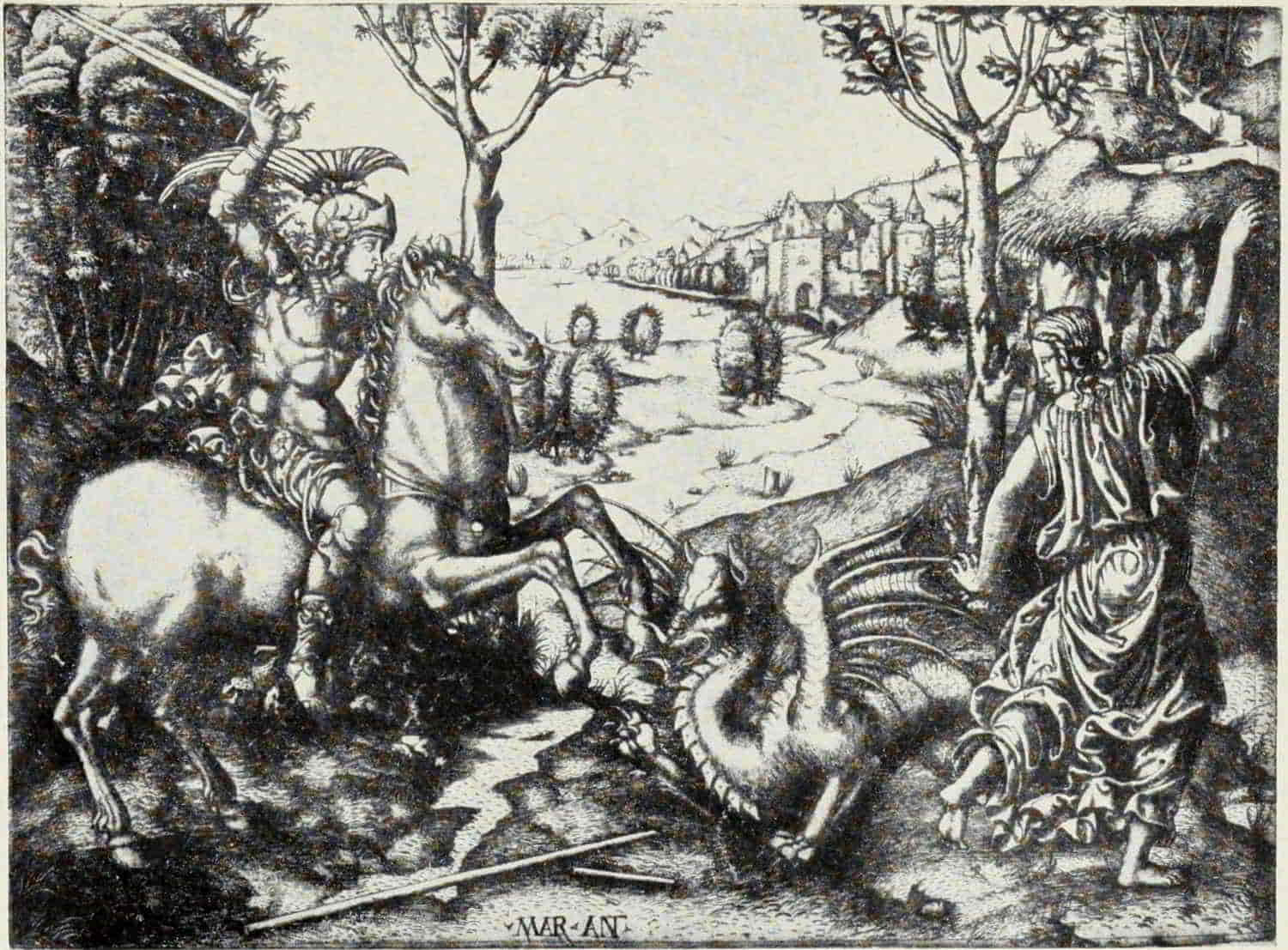
MARCANTONIO RAIMONDI. ST. GEORGE AND THE DRAGON
Size of the original engraving, 11⅞ × 8¾ inches
In the British Museum
(If supported click figure to enlarge.)
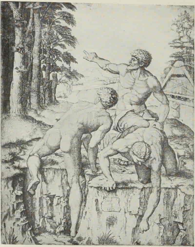
MARCANTONIO RAIMONDI. BATHERS
Size of the original engraving, 11¼ × 9 inches
In the Museum of Fine Arts, Boston
MARCANTONIO RAIMONDI. ST. CECILIA
Size of the original engraving, 10¼ × 6⅛ inches
In the Museum of Fine Arts, Boston
MARCANTONIO RAIMONDI. DEATH OF LUCRETIA
Size of the original engraving, 8½ × 5¼ inches
In the Museum of Fine Arts, Boston
To this early period likewise belongs Pyramus and Thisbe, which bears the earliest date—1505—which we find upon any of his engravings. It may [Pg 175]well have been executed during his residence in Venice, between 1505 and 1509.
The Bathers, of 1510, is an artistic record of Marcantonio’s visit to Florence, on his way to Rome. The figures are taken from Michelangelo’s cartoon of the Battle of Pisa; but the landscape, including the thatched barn to the right, is a faithful copy, in reverse, of Lucas van Leyden’s plate of Mahomet and the Monk Sergius; for Marcantonio, like all great artists, freely borrowed his material wherever he found it, shaping it to his own ends.
According to Vasari, it was the Death of Lucretia, engraved shortly after Marcantonio’s arrival in Rome, about 1510, after a drawing by Raphael, which attracted the attention of that master and showed him how much he might benefit by the reproduction of his work. One would be inclined to think that the Death of Dido rather than the Death of Lucretia might have been the means of bringing about this artistic collaboration; for, if Vasari is correct, the immediate result of Raphael’s personal influence upon Marcantonio was harmful rather than helpful, the Lucretia by general consent being the finer plate of the two.
It is significant that none of Marcantonio’s engravings interprets any existing painting by Raphael. We may infer that the engraver worked entirely after drawings supplied to him by Raphael—either drawings made for the purpose of being[Pg 176] interpreted in terms of engraving, or the original studies for paintings, which, in their elaboration, were subjected to many modifications and changes.
Among his most interesting engravings are Saint Cecilia, which may be compared, or rather contrasted, with the famous painting in Bologna; the Virgin and Child in the Clouds, which later appears as the Madonna di Foligno; and Poetry, based on a study by Raphael for the fresco in the Camera della Segnatura, in the Vatican.
The Massacre of the Innocents, usually accounted the engraver’s masterpiece, is one of several subjects of which two plates exist. Authorities disagree as to which is the “original,” but some familiarity with both versions leads one to think that Marcantonio may well have been his own interpreter. At least one cannot name certainly any other engraver capable of producing either of the two versions of the Massacre of the Innocents, in point of drawing or of technique.
Among Marcantonio’s portrait plates one of the most attractive is that of Philotheo Achillini (“The Guitar Player”), which is in his early manner and probably dates from his Bolognese period. It may be based upon a drawing by Francia, but the trees and distant landscape all show markedly the influence of Dürer.
[Pg 177]
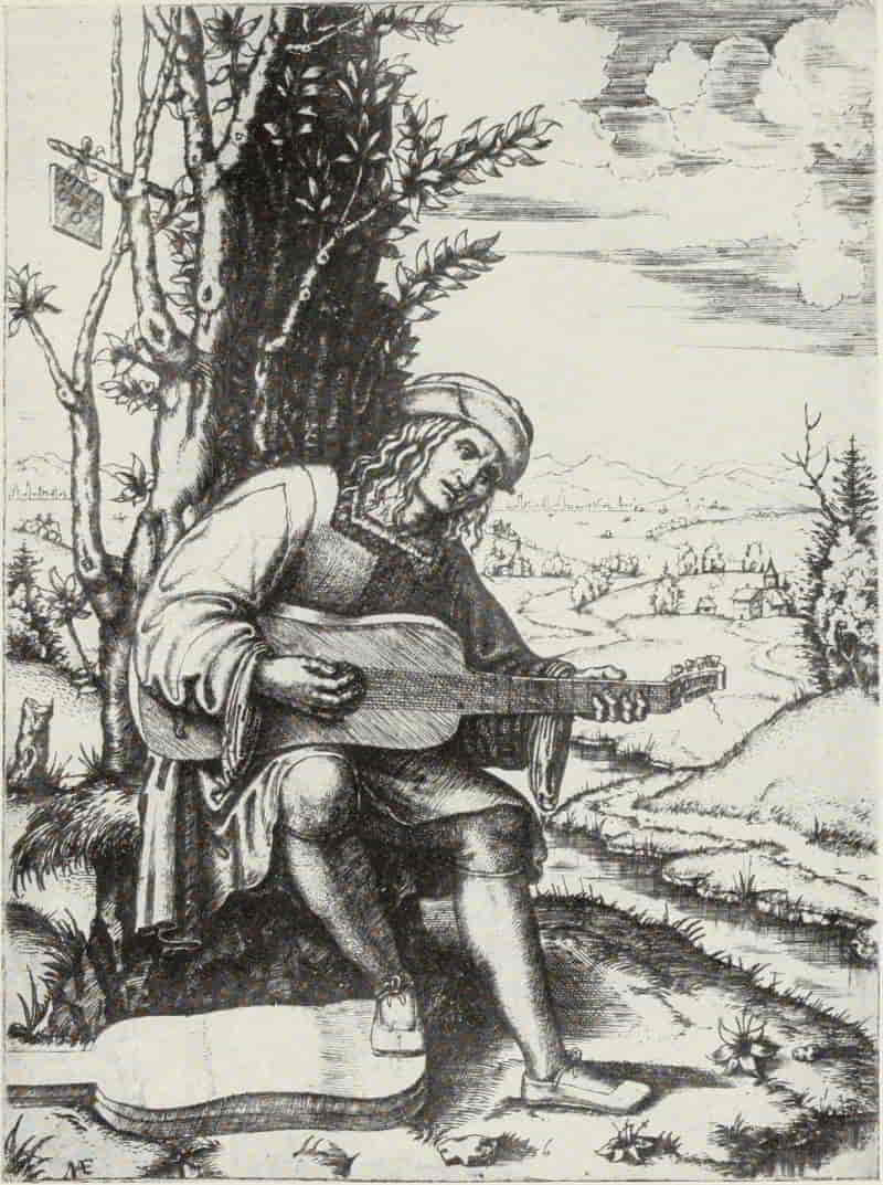
MARCANTONIO RAIMONDI. PHILOTHEO ACHILLINI
(“The Guitar Player”)
Size of the original engraving, 7¼ × 5¼ inches
In the Museum of Fine Arts, Boston
[Pg 178]
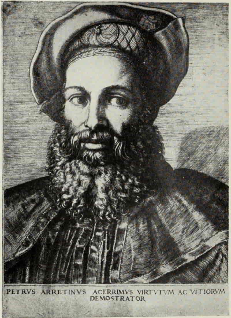
MARCANTONIO RAIMONDI. PIETRO ARETINO
Size of the original engraving, 7⅜ × 5⅞ inches
In the British Museum
[Pg 179]
To a much later period, and engraved in Marcantonio’s most mature manner, belongs the portrait of Pietro Aretino. Vasari refers to this plate as “engraved from life,” but its richness and color would seem to point to an original by Titian or Sebastiano del Piombo.
After the death of Raphael, in 1520, Marcantonio’s engraving undergoes a change—a change for the worse, as might be expected, since a number of his plates are interpretations of designs by Giulio Romano. There is less care in the drawing, less delicacy in the management of the burin, and, although we may pity him for the loss of all that he possessed at the sack of Rome, in 1527, we cannot greatly regret that, as an engraver, Marcantonio’s active life terminates with that date.
[Pg 180]
ITALIAN ENGRAVING: MANTEGNA TO
MARCANTONIO RAIMONDI
BIBLIOGRAPHY
Mantegna, Andrea (1431-1506)
Dürer and Mantegna. By Sidney Colvin. 5 illustrations. The Portfolio, Vol. 8, pp. 54-63. London. 1877.
Andrea Mantegna and the Italian Pre-Raphaelite Engravers. Edited by Arthur Mayger Hind. 75 reproductions. London and New York: Frederick A. Stokes Company, n. d. (Great Engravers.)
Andrea Mantegna. By Paul Kristeller. 26 plates and 162 text illustrations. London: Longmans, Green & Co. 1901. Chapter XI, Mantegna as Engraver.
Mantegna. By H. Thode. 105 illustrations. Bielefeld and Leipzig: Velhagen & Klasing. 1897. (Künstler Monographien. 27.)
Barbari, Jacopo de’ (c. 1440-c. 1515)
Engravings and Woodcuts by Jacopo de’ Barbari. Edited by Paul Kristeller. 33 reproductions and 2 text illustrations. London. 1896. (International Chalcographical Society, 1896.)
Lorenzo Lotto. By Bernhard Berenson. 30 plates. New York: Putnam’s Sons. 1895. pp. 34-50.
Campagnola, Giulio (c. 1482-c. 1514)
Giulio Campagnola; Kupferstiche und Zeichnungen. Edited by Paul Kristeller. 27 reproductions. Berlin: Bruno Cassirer. 1907. (Graphische Gesellschaft. Publication 5.)
Marcantonio Raimondi (c. 1480-c. 1530)
Marc-Antoine Raimondi; étude historique et critique suivie d’un catalogue raisonné des oeuvres du maitre. By Henri Delaborde. 63 illustrations. Paris: Librairie de l’art. 1888.
Marcantonio Raimondi. By Arthur Mayger Hind. 22 illustrations. The Print-Collector’s Quarterly, Vol. 3, No. 3, pp. 243-276. Boston. 1913.
Marcantonio and Italian Engravers and Etchers of the Sixteenth Century. Edited by Arthur Mayger Hind. 65 reproductions. London and New York: Frederick A. Stokes Company. n. d. (Great Engravers.)
[Pg 181]
SOME MASTERS OF PORTRAITURE
YOU will all remember how John Evelyn, writing to Samuel Pepys, advised him to collect engraved portraits—since, in his own words, “Some are so well done to the life, that they may stand comparison with the best paintings.” He then adds: “This were a cheaper, and so much a more useful, curiosity, as they seldom are without their names, ages and eulogies of the persons whose portraits they represent. I say you will be exceedingly pleased to contemplate the effigies of those who have made such a noise and bustle in the world; either by their madness and folly; or a more conspicuous figure, by their wit and learning. They will greatly refresh you in your study and by your fireside, when you are many years returned.” We know by his “Diary” that Pepys became an enthusiastic collector and that he went over to Paris to buy many of Robert Nanteuil’s engraved portraits—at a later date commissioning his wife to secure for him many more, which he strongly desired.
From the time of Evelyn and Pepys in England, and that prince of print-collectors in France, the[Pg 182] Abbé de Marolles—who in 1666 could boast of possessing over 123,000 prints, “and all the portraits extant”—portraits have had, for the student, a peculiar fascination, and it may be interesting to consider briefly the work of some six or eight of the acknowledged masters of the art.
Aside from two unimportant plates by the Master of the Amsterdam Cabinet, which may, or may not, be portraits, the earliest engraver to address himself to portraiture, pure and simple, is the anonymous German master with the monogram . So far as we know, he executed four plates only (c. 1480-1485). In them the characterization is strong, the drawing clear and vigorous. The artist’s technique may have owed something to Martin Schongauer, but it is singularly lacking in the refinement and balance which mark the work of that engraver.
Daniel Hopfer, who, in 1493, was already working in Augsburg, has left us an etching, which certainly cannot be later than 1504, and may have been executed five, or even ten, years earlier. It is a portrait of Kunz von der Rosen, the Jester-Adviser of the Emperor Maximilian I. The etching is upon iron, and the quality of the line is well adapted to the rugged character of the personage. This plate was copied, in reverse, with some modifications, by an anonymous North Italian engraver [Pg 185]and reappears as Gonsalvo of Cordova, who was in Italy, in command of the army of Ferdinand V of Castile, between 1494 and 1504, when Ferdinand’s jealousy caused him to be superseded in the Vice Royalty of Naples.
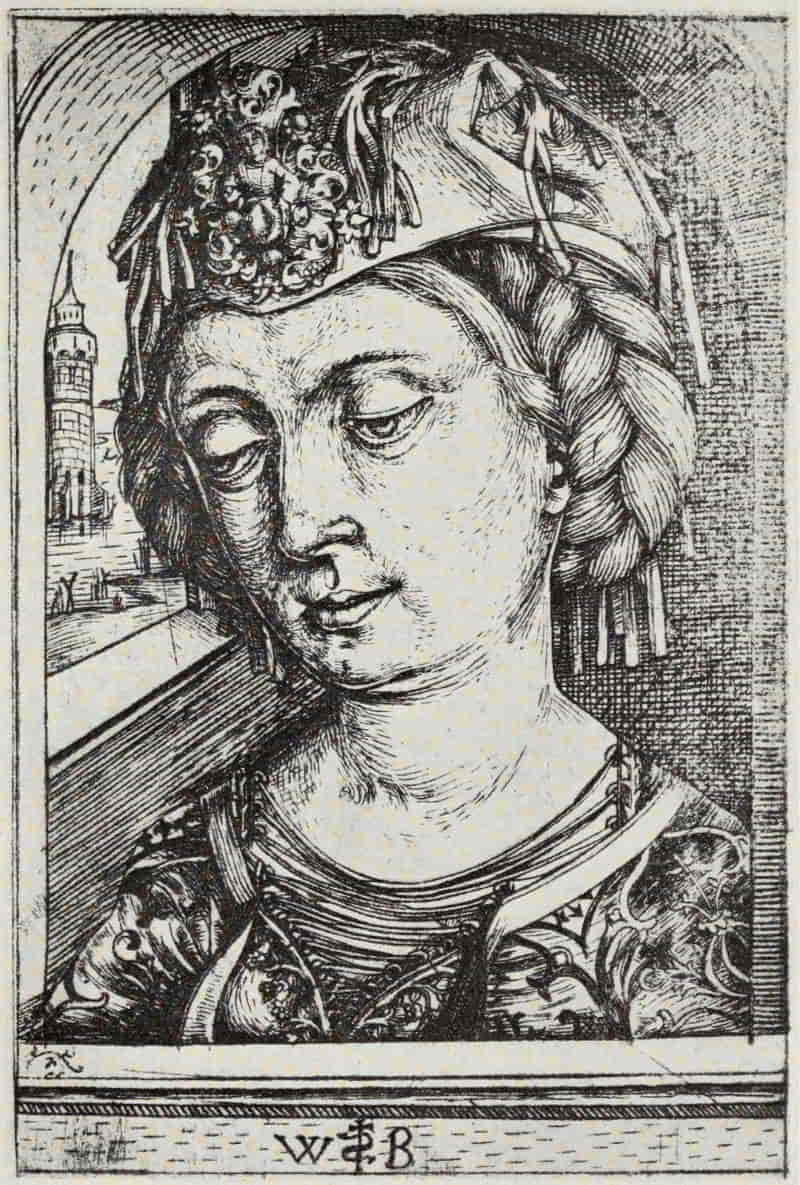
MASTER . HEAD OF A YOUNG WOMAN
Size of the original engraving, 4¾ × 3⅜ inches
In the Royal Print Room, Berlin
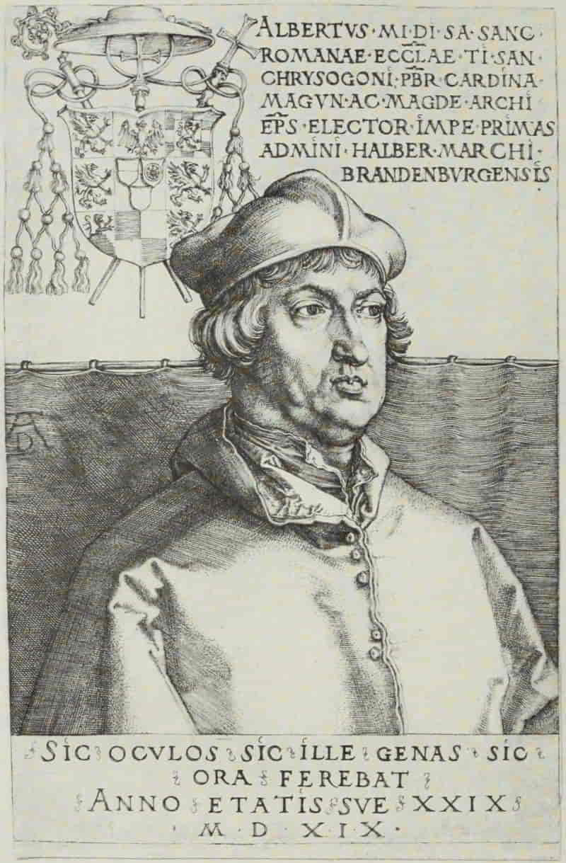
ALBRECHT DÜRER. ALBERT OF BRANDENBURG
Size of the original engraving, 5¾ × 3⅞ inches
In the Museum of Fine Arts, Boston
The earliest in date of Dürer’s engraved portraits is likewise the best. Albert of Brandenburg was twenty-nine years of age, in 1519, when Dürer engraved this plate. There is a concentration upon the purely portrait element lacking in some of the later prints. The burin work is singularly delicate and beautiful. Indeed, nothing better, from a technical standpoint, has ever been done on copper than Dürer’s six portrait plates; and if he at times succumbs to the temptation of rendering each minor detail with the same loving care which he bestows upon the face itself, he remains, notwithstanding, one of the greatest masters of the burin the world has seen.
Dürer engraved a second plate of Albert of Brandenburg, in 1523. The intervening four years had left their mark upon the Cardinal, and neither as a portrait nor as an engraving is it as pleasing as the earlier one. In the following year, 1524, there are two portraits—Frederic the Wise, Elector of Saxony and Wilibald Pirkheimer. The former was one of the earliest patrons of Dürer and likewise one of the most liberal-minded princes of his time.[Pg 186] The plate is executed in Dürer’s painstaking and careful manner, nor does it lack, as a portrait, the directness and immediacy of appeal of the silver-point drawing, which may have served as its original. Wilibald Pirkheimer, the celebrated patrician and humanist, was Dürer’s life-long and most intimate friend, and it is to him that Dürer’s letters from Venice were addressed.
Philip Melanchthon is the simplest in treatment and the most satisfying, in its elimination of unnecessary detail, of Dürer’s portrait engravings, and is the best likeness of the mild reformer. The inscription reads: “Dürer could depict the features of the living Philip, but the skilled hand could not depict his mind.” Here Dürer does himself less than justice, for it is the portrait-like character which makes this engraving still noteworthy after the lapse of four centuries.
To the same year, 1526, belongs Erasmus of Rotterdam. It is a technical masterpiece. Dürer has lavished all his skill upon this plate. It is magnificent; but from a purely portrait standpoint, it is a magnificent failure.
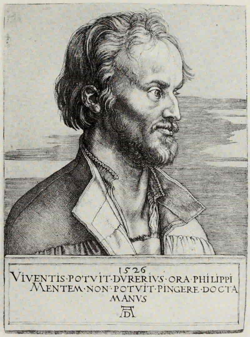
ALBRECHT DÜRER. PHILIP MELANCHTHON
Size of the original engraving, 6⅞ × 5 inches
In the Museum of Fine Arts, Boston
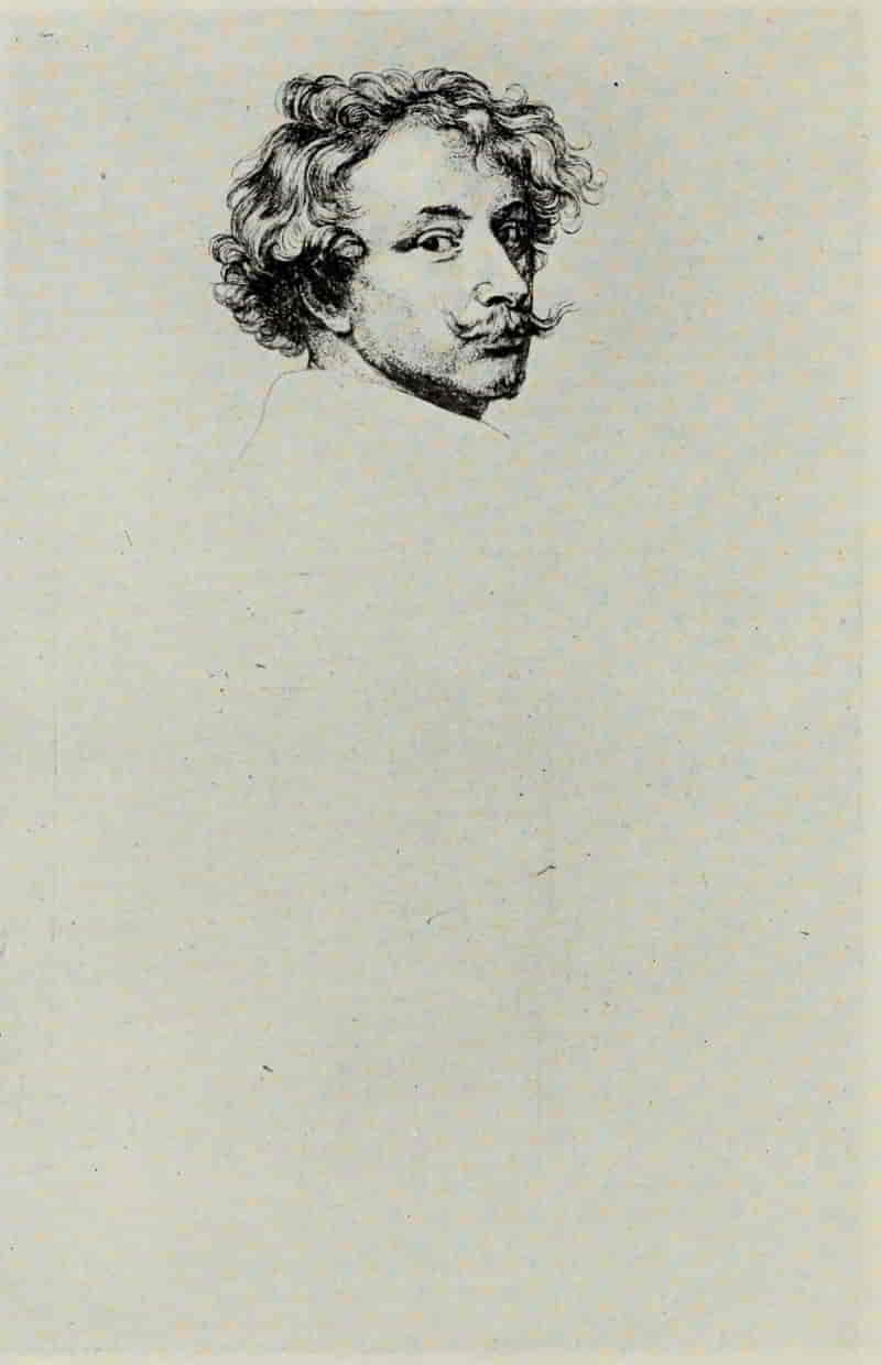
ANTHONY VAN DYCK. PORTRAIT OF HIMSELF (First State)
Size of the original etching, 9½ × 6⅛ inches
In the Museum of Fine Arts, Boston
For a full hundred years we have no portraits of note; then there enters upon the scene one of the great princes of the art—Van Dyck—whose etched portraits vie with those of Rembrandt in vitality, and surpass them in immediacy of appeal. Van [Pg 189]Dyck had not that deep humanity, that profound reading of human character, which raises Rembrandt above all rivals; but upon the purely technical side, working within the truest traditions of etching, with due regard to its possibilities and its limitations, Van Dyck may claim precedence. His fifteen original portrait etchings (together with Erasmus of Rotterdam, after Holbein) undoubtedly belong to the period between his return from Italy to Antwerp, in 1626, and his settlement in London, in 1632. From the very first, Van Dyck seems to have been in possession of all his powers. His etchings show various modes of treatment, according to the character of the sitter, and it would be difficult to speak of the development of his art, since, by the grace of God, he seems to have been a born etcher.
Van Dyck’s Portrait of Himself naturally interests us most, on account of its subject. So far as Van Dyck has seen fit to carry it, it is a perfect work of art, not the least remarkable feature being the splendid placing of the head upon the plate. Unfortunately, the first state is of such excessive rarity that the majority of print students can know this superb portrait only through reproductions (in which much of its delicacy is necessarily lost) or, in the later state, where the plate is finished with the graver by Jacob Neefs—a distressing piece of work, strangely enough, countenanced by Van[Pg 190] Dyck himself; since in the British Museum there is a touched counter-proof of the first state, which proves that Van Dyck directed the elaboration of the plate, no doubt with the intention of using it as a title page to the Iconography, a series of a hundred engraved portraits of his friends and contemporaries.
Of even subtler beauty is Snyders, unfortunately—like the portrait of Van Dyck himself—of the greatest rarity and also, like that plate, finished with the graver by Jacob Neefs. It is perfectly satisfying from every point of view, combining, as it does, the greatest freedom with absolute certainty of hand. The treatment of the face shows a thorough knowledge of all the technical resources of the art, the high lights having been “stopped out” exactly where needed, the etched dots and lines melting into a perfect harmony.
In marked contrast to the delicacy of Snyders is the bolder and more rugged treatment of Jan Snellinx. Fortunately, the plate has remained, until our own day, in essentially the same condition as when it left Van Dyck’s hands, and we can better realize what an artistic treasure-house the Iconography might have been, had the public possessed the intelligence to appreciate, at their true worth, these fine flowerings of Van Dyck’s genius, instead of demanding, as they did, that a plate be absolutely [Pg 193]“finished” to the four corners by the professional engraver.
ANTHONY VAN DYCK. FRANS SNYDERS (First State)
Size of the original etching, 9⅛ × 6⅛ inches
In the Museum of Fine Arts, Boston
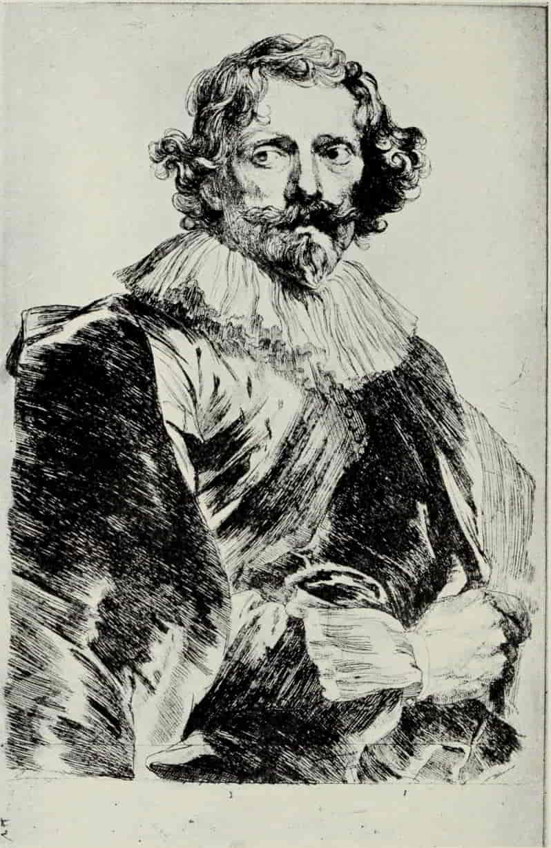
ANTHONY VAN DYCK. LUCAS VORSTERMAN (First State)
Size of the original engraving, 9⅝ × 6⅛ inches
In the Collection of Charles C. Walker, Esq.
Lucas Vorsterman is, in some ways, the most purely pictorial of Van Dyck’s portrait etchings. Even the taste of the time demanded no further elaboration than an engraved background, which, judiciously added, left undisturbed Van Dyck’s original work.
It would be interesting to know whether Rembrandt was acquainted with the etched work of Van Dyck. If so, it is all the more astounding that his work should betray no trace of any outside influence.
Rembrandt’s earliest dated etching is also, seemingly, his first etching—a Portrait of His Mother, of the year 1628—an unsurpassed little masterpiece. In its own mode of simple, direct, open, linear treatment, there is nothing finer, even in the work of Rembrandt himself. Saskia with Pearls in Her Hair, of 1634, as also the Young Man in a Velvet Cap with Books Beside Him, which belongs to the year 1637, are in Rembrandt’s best manner, but the crowning triumph of this period is unquestionably Rembrandt Leaning on a Stone Sill, bearing the date 1639 and showing Rembrandt at the happiest period of his life—successful, prosperous, and perfect master of his medium.
The portrait of an Old Man in a Divided Fur[Pg 194] Cap, of the following year, is likewise admirable—not a line too much and every line full of significance. Jan Cornelis Sylvius, of 1646, shows in a marked degree Rembrandt’s sympathy with, and appreciation of the beauty of old age. The face is treated in a delicate and sensitive manner, and, with the fewest possible strokes, Rembrandt has indicated the texture and growth of the sparse beard of his aged sitter. Sulphur-tint has been used to give additional modelling to the face, while the background and costume are finished in a way which would have won the admiration of Dürer himself. Ephraim Bonus, Jan Asselyn, and Jan Six are Rembrandt’s three portrait etchings for the year 1647. Jan Six is Rembrandt’s masterpiece, so far as elaborate finish is concerned. He has availed himself of all the resources of etching, dry-point, and of the burin—used freely as an etcher may use it—to carry forward this plate. The center of the room is bathed in subdued light, which melts into rich and mysterious shadows in the corners.
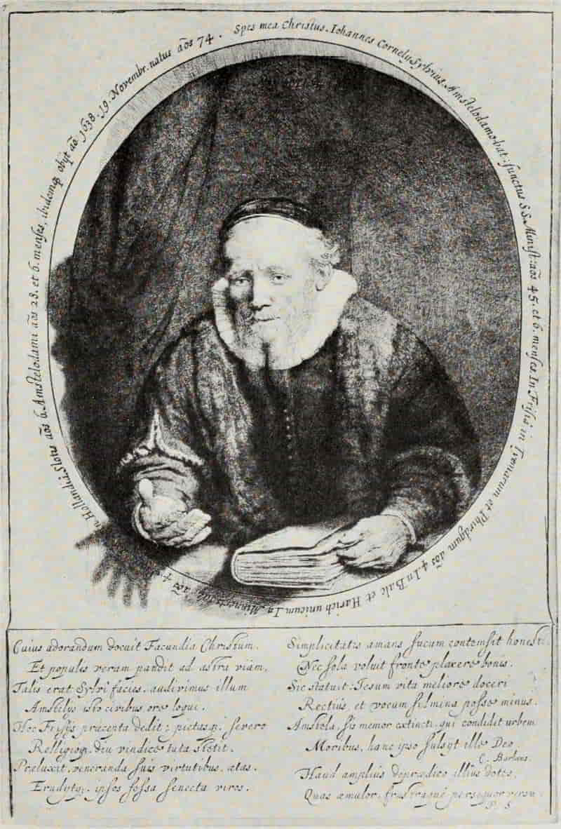
REMBRANDT. JAN CORNELIS SYLVIUS
Size of the original etching, 10⅞ × 7½ inches
In the Museum of Fine Arts, Boston
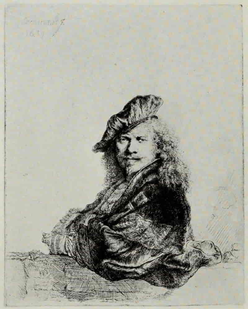
REMBRANDT. REMBRANDT LEANING ON A STONE SILL
Size of the original etching, 8⅛ × 6½ inches
In the Museum of Fine Arts, Boston
REMBRANDT. CLEMENT DE JONGHE (First State)
Size of the original etching, 8⅛ × 6⅜ inches
In the Museum of Fine Arts, Boston
REMBRANDT. JAN LUTMA (First State)
Size of the original etching, 7⅞ × 5⅞ inches
In the Museum of Fine Arts, Boston
Rembrandt Drawing at a Window is one of the most characterful of his portraits. It shows him at the age of forty-two. Years of sorrow have left their mark upon his countenance, but what a strong, resolute face it is! Clement de Jonghe (which should be seen in the first state before the expression of the face was entirely changed) is executed [Pg 199]in Rembrandt’s open, linear manner, without strong contrasts of light and dark. For beauty of drawing and subtlety of observation, it is one of his finest plates. Old Haaring, of 1655, is a magnificent dry-point, in which Rembrandt has built up, with many lines, a completely harmonious picture; but for grip of character and straightforward presentation of the personality of his sitter, it must yield precedence to the unsurpassed Jan Lutma, of the following year. This portrait, in the first state, before the introduction of the window in the background, is one of Rembrandt’s most mature works, in that the method is perfectly adapted to the result desired.
In France there is little of significance in portrait engraving during the sixteenth century. Thomas de Leu and Léonard Gaultier based their style upon the miniature portrait engravers of the Northern School, such as the Wierix. Although their graver work is often quite beautiful, it lacks originality, and when, as frequently happened, they endeavored to interpret the wonderful drawings of the Clouets or Dumonstier, they signally failed in capturing the charm of their originals.
Claude Mellan, who was born at Abbeville in 1598, is, in a sense, the fountain-head of French portrait engraving. His work is characteristically French, in that it is the result of a system carefully[Pg 200] worked out to its logical conclusion. In his desire to keep strictly within the limits of what he considered to be the proper province of engraving, he carried his insistence upon line to a point which borders on mannerism and which, for over two centuries, has militated against his full recognition.
Mellan’s earliest engravings recall the work of Léonard Gaultier, but his first teacher is not known. Dissatisfied with his instruction in Paris, in 1624 he went to Rome where, while studying engraving under Villamena, he came under the influence of the French painter, Simon Vouet, who not only provided his protégé with drawings to engrave, but persuaded him to base all his training upon a thorough ground-work of drawing. It is this severe training as a draughtsman which lies at the foundation of Mellan’s style. His original drawings were executed in pencil, silver-point, or chalk, and in his engravings he preserves all the delicate and elusive charm of his originals.
CLAUDE MELLAN. VIRGINIA DA VEZZO
Size of the original engraving, 4½ × 3 inches
In the Museum of Fine Arts, Boston
CLAUDE MELLAN. FABRI DE PEIRESC
Size of the original engraving, 8⅜ × 5⅝ inches
In the Museum of Fine Arts, Boston
His manner of engraving is peculiar to himself. The inventor of a mode, he so uses it as to exhaust its possibilities and leaves nothing for his successors to do along similar lines. Consequently, although his influence on French portrait engraving was great and far-reaching, he cannot, in any true sense, be considered as the founder of a “school.” Even in his early portrait plates (incidentally, [Pg 203]among the most charming and perfect), such as Virginia de Vezzo, the wife of Simon Vouet, engraved in Rome in 1626, we find his style fully developed. Save for four little spots of deepest shadow, the entire portrait is executed in single, uncrossed lines, indicating, by their direction, the contour of the face, which is delicately modelled, while the flow of the hair is realistically and beautifully expressed. From this simple, linear method, adopted thus early, Mellan, with few unimportant exceptions, never departed; and although he lived and worked until 1688, surviving Morin by twenty-two years and Robert Nanteuil by ten, he held to his own self-appointed course, his work showing no trace whatever of the influence of his two most distinguished contemporaries.
Among his many portraits choice is difficult, but, by general consent, his style is seen at its very best in Fabri de Peiresc, which excels in point of drawing, grip of character, and straightforwardness of presentation. It is dated 1637 and was engraved on his way from Rome to Paris, in which city he settled, enjoying for many years a reputation and success second to none. Of his other portraits mention must be made of Henriette-Marie de Buade Frontenac, of a delightful silvery quality, and of her husband, Henri-Louis Habert de Montmor, the richest toned of all his works. Nicolas Fouquet likewise[Pg 204] is of peculiar interest, inasmuch as in this plate Mellan has departed for once from his invariable method of pure line work and has modelled the face with an elaborate system of dots, in the manner of Morin.
Jean Morin was Mellan’s junior by two years. His style is in the greatest contrast to that of the older master, not only technically, but in that he was always a reproductive engraver, never designing his own portraits, the majority of his plates being after the paintings of Philippe de Champaigne. His plates are executed almost entirely in pure etching, with just sufficient burin work to give crispness and decision. The heads are elaborately modelled, with many minute dots, recalling somewhat Van Dyck’s manner in such a portrait as Snyders.
Antoine Vitré, the famous printer, shows Morin’s method at its richest; its brilliancy and color place it in the forefront of French portraits, though for charm it may not rank with Anne of Austria or Cardinal Richelieu, both after paintings by Philippe de Champaigne.
Cardinal Guido Bentivoglio, after Van Dyck, well deserves the reputation which it has so long enjoyed. It is, furthermore, significant as an example of Morin’s power of concentrating all the attention upon the countenance of his sitter. He was primarily a portrait engraver and never allowed himself [Pg 207]to be seduced, as were such eighteenth century masters as the Drevets, into lavishing his skill upon the purely ornamental accessories, to the detriment of the portrait itself. Fine though Van Dyck’s full-length painting is, Morin is more than justified in taking from it the head and bust only, since thereby he gives to his plate a vivid and compelling quality which otherwise would be lacking.
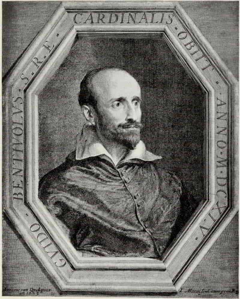
JEAN MORIN. CARDINAL GUIDO BENTIVOGLIO
Size of the original engraving, 11½ × 9¼ inches
In the Museum of Fine Arts, Boston
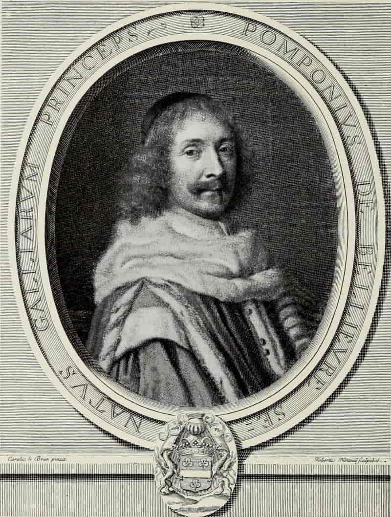
ROBERT NANTEUIL. POMPONE DE BELLIÈVRE
Size of the original engraving, 12⅞ × 9⅞ inches
In the Museum of Fine Arts, Boston
Robert Nanteuil is not only the greatest of French portrait engravers; he is one of the greatest portraitists in the history of French art. In his work the clarity and logic of the French temperament is enriched by a study of the engravers of the Flemish and Dutch schools, though in Nanteuil’s plates color is never sought at the expense of balance. His technique is a fusion of the best elements of Mellan and of Morin. From Mellan he derived his carefully balanced system of open line work, while Morin doubtless suggested to him the use of graver flicks in modelling the face.
The date of Nanteuil’s birth is variously given as 1623, 1625, and 1630, the last-named date, which is accepted by Robert-Dumesnil, corresponding best with what we know regarding the development of his work.
His first portrait plates were done in 1648, the year in which he came to Paris, and from that time onwards he devoted himself almost exclusively to[Pg 208] portraiture, until his death in 1678. His engravings form a gallery illustrating the reign of Louis XIV, from the King himself, whom he engraved no fewer than eleven times, to the Norman peasant and poet, Loret (incidentally, one of Nanteuil’s finest portrait plates), whose “Gazette” satirized each day “the intriguing nobles who were not afraid of bullets, but who were in deadly fear of winter mud.”
An interesting story is told of Nanteuil’s début in Paris. It is said that he received his first order by following some divinity students to a wine-shop, where they were wont to take their meals. There, having chosen one of the portrait drawings he had brought from Rheims, he pretended to look for a sitter whose name and address he had forgotten. It is superfluous to add that the picture was not recognized, but it was passed from hand to hand, the price was asked, the artist was modest in his demands, and before the end of the repast his career had begun.
One of the most interesting portraits, in his early manner, is that of Cardinal de Retz, engraved in 1650. Morin has likewise left us a portrait of this personage, and it is instructive to compare the two engravings. In Nanteuil’s the background is still somewhat stiff, but the costume is treated simply and directly, while the face shows a judicious blending of line and dot work.
[Pg 209]
Nothing could be finer and more reticent than Marie de Bragelogne of 1656. The pale, elderly, and somewhat sad face of this old love of Cardinal Richelieu is treated with the greatest sympathy. For the most part, it is modelled with delicate flick work, and where lines are employed, they are so used as to blend perfectly into a harmonious whole. In contrast to the face, the collar is rendered in long, flowing lines, without cross-hatching, entirely in the manner of Claude Mellan. It is from Nanteuil’s own drawing from life and is perhaps the most beautiful of the eight engraved portraits of women we have from his hand.
Pompone de Bellièvre, of 1657, after Le Brun’s painting, has enjoyed among collectors the reputation of being the most beautiful of all engraved portraits. Fine it undoubtedly is; but it lacks that grip of character which is so conspicuously present in Nanteuil’s engravings from life, and for compelling portrait quality it falls short of Pierre Seguier, engraved in the same year, likewise after Le Brun’s painting. Jean Loret certainly does not owe its fame to the beauty of the personage portrayed. It is one of Nanteuil’s most convincing and vital plates. The modelling of the face and the means employed are absolutely adequate. This engraving alone would explain why, in his day, Nanteuil’s greatest fame rested upon the surprisingly life-like quality[Pg 210] of his work, whether it be pastel, drawing, or engraving.
To the year 1658 also belongs Basile Fouquet, brother of Nicolas Fouquet, the famous Superintendent of Finance. Not less beautiful than Pompone de Bellièvre, there is a vitality about the Basile Fouquet lacking in the better-known plate.
Three years later, in 1661, Nanteuil engraved the portrait of Nicolas Fouquet—one of his masterpieces of characterization. Nothing could be finer than the way in which he has portrayed the great finance minister, whose ambition it was to succeed Mazarin as virtual ruler of the kingdom. It is a historical document of prime importance, of the greatest beauty, and preserves for all time the features of the then most powerful man in France, gazing out upon the world with a half quizzical expression, totally unaware of the sensational reversal of Fortune already drawing near.
A plate not less admirable in its way—a little masterpiece—is François de la Mothe le Vayer, who was regarded as the Plutarch of his time for his boundless erudition and his mode of reasoning. Nanteuil’s engraving shows him at the age of seventy-five, in full possession of all his intellectual powers and in the enjoyment of that good health which lasted until his death, eleven years later, at the ripe age of eighty-six.
[Pg 211]
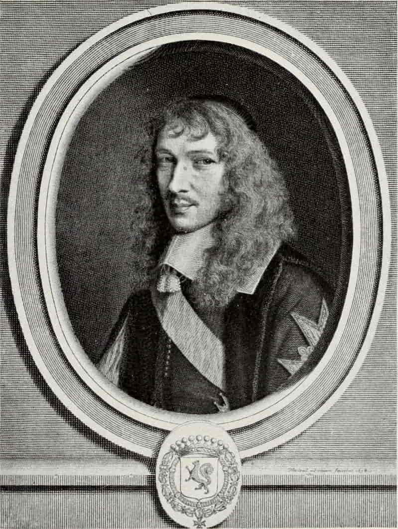
ROBERT NANTEUIL. BASILE FOUQUET
Size of the original engraving, 12⅞ × 9⅞ inches
In the Museum of Fine Arts, Boston
[Pg 212]
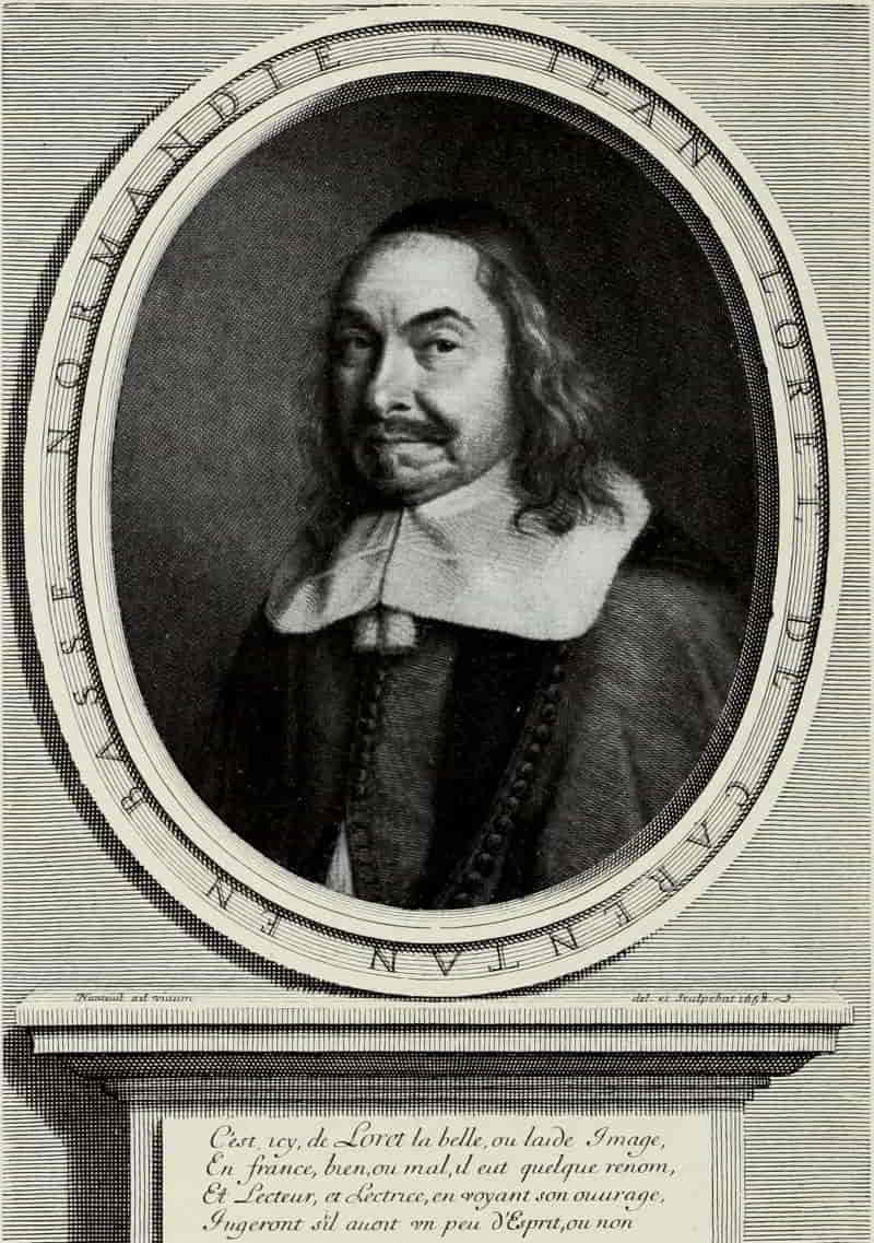
ROBERT NANTEUIL. JEAN LORET
Size of the original engraving, 10⅛ × 7⅛ inches
In the Museum of Fine Arts, Boston
[Pg 213]
The masterly portrait of Turenne, engraved in 1663, after a painting by Philippe de Champaigne, is one of the engraver’s most vigorous plates, of a size somewhat larger than had hitherto been his wont. From this period date the life-size portraits, thirty-six of which were completed before he died in 1678, the last four years of his life being devoted entirely to these large plates—seven of them of the King himself. They were obviously intended to be framed and hung above the high wainscots used in those times, and although they do not show Nanteuil at his best, and—in the majority of cases—are, in part, the work of assistants, they are a remarkable performance.
Nanteuil established the tradition of portrait engraving in France once and for all, and although his successors, profiting by his example, have left us many superbly engraved plates, none of them were able to combine the qualities of great engraver with great portraitist, which make Nanteuil supreme in the history of portrait engraving.
The nineteenth century has produced three master portrait etchers. Of what previous century can we say as much? Other portraits may possess more charm, but none have a greater measure of dignity than those by Alphonse Legros. He has been called a “belated old master,” and in his portrait plates are combined the qualities which prove him[Pg 214] to be a master indeed—not old, in the sense of out of touch with his time, but displaying the same qualities which make the portraits of Rembrandt or Van Dyck so compelling and of such continuing interest.
Cardinal Manning—the triumph of spirit over flesh—simple, austere; G. F. Watts, in which the gravity and beauty of old age is portrayed as no one since Rembrandt has portrayed it, are plates which will assure his artistic immortality.
Mr. Whistler, when asked which of his etchings he considered the best, is reported to have answered, “All.” Fortunately for us, in the case of his portraits he has indicated his preference. “One of my very best” is written beneath a proof of Annie Haden, now in the Lenox Library; and Whistler, in the course of conversation with Mr. E. G. Kennedy, told him that if he had to make a decision as to which plate was his best, he would rest his reputation upon Annie Haden. It is the culmination of that wonderful series to which belong such masterpieces as Becquet, Drouet, Finette, Arthur Haden, Mr. Mann and Riault, the Engraver. Whistler himself never surpassed this portrait, which for perfect balance, certainty of hand, and sheer charm, is not only one of the most delightful portrait plates in the history of the art, but one of the few successful representations of the elusive charm of young girlhood.
[Pg 215]
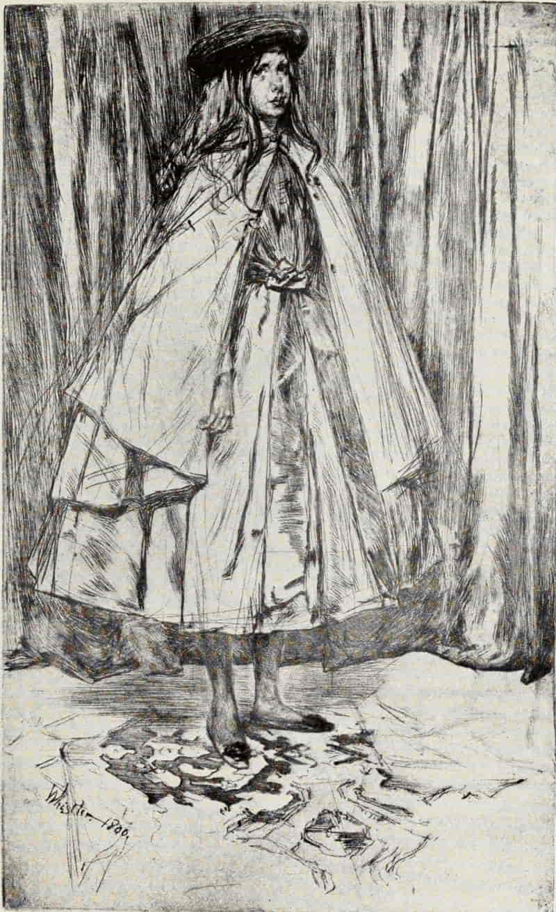
J. A. McN. WHISTLER. ANNIE HADEN
Size of the original dry-point, 13⅞ × 8⅜ inches
In the Collection of Howard Mansfield, Esq.
[Pg 216]
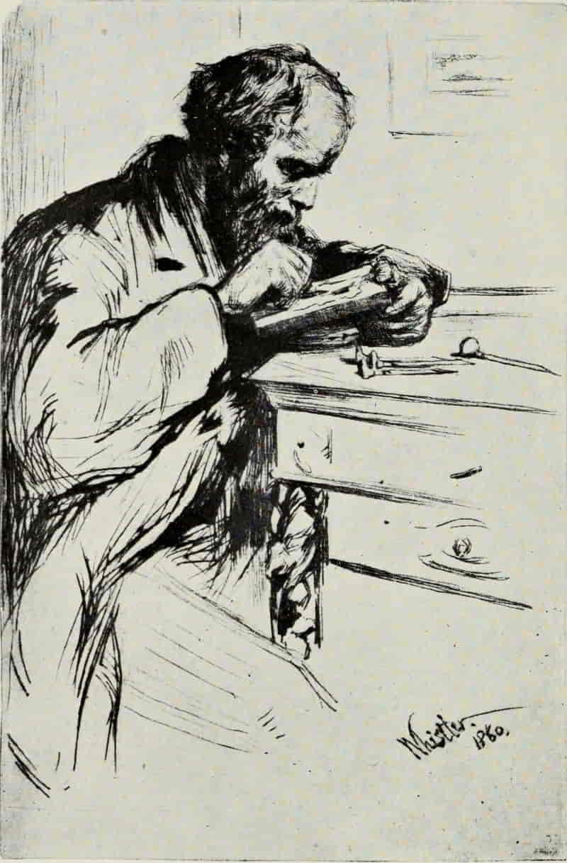
J. A. McN. WHISTLER. RIAULT, THE ENGRAVER
Size of the original dry-point, 8⅞ × 5⅞ inches
In the Collection of Howard Mansfield, Esq.
[Pg 217]
Hardly less beautiful are the portraits of Florence Leyland, standing, holding her hoop in her right hand, every line of the slender figure rhythmic and beautiful; or of Fanny Leyland, seated, the soft flounces of her white muslin dress indicated with the fewest and most delicate lines; or Weary, lying back in her chair, with hair outspread. Weary suggests the Jenny of Rossetti’s poem, but it is a portrait of “Jo”—Joanna Heffernan—whom Whistler painted as The White Girl and La Belle Irlandaise, and of whom, in 1861, two years previously, he had made a superb dry-point.
Of Whistler’s portraits of men, Riault is assuredly one of the finest, both in execution and in portrayal of character. The concentration of the wood-engraver on his task is expressed with convincing power, and those who mistakenly attribute to Whistler grace at the expense of strength could hardly do better than study this dry-point.
Could there be a greater contrast than the work of Whistler and Zorn? Could anything better illustrate the infinite possibilities of the art, the pliability of the medium to serve the needs of etchers as dissimilar in method as in point of attack? With the fewest possible lines (slashed, one might almost say, into the copper) Zorn evolves a portrait of compelling power, vibrant with life. Mere speed counts for little, and it is of small[Pg 218] significance that a masterpiece such as Ernest Renan is the result of a single sitting of one hour only. It was done in Renan’s studio in Paris, in April, 1892. “His friends,” the artist relates, “came and asked me to make an etching of him. He arranged for a sitting. He was very ill, but I sat studying him for a little while, then took the plate and drew him. I asked him if it was a characteristic pose and he replied, ‘No, I very seldom sit like this.’ But his wife came in and said, ‘You have caught him to perfection, it is himself. When he is not watched he is always like that.’ She was really touched by it.” What is significant in the portrait of Renan, astounding, one might say, is that with lines so few Zorn has given us not only the outer man, but a character study of profound insight. Renan, sunk in his chair, the bulky body topped by the massive head, the hair suggested with a mere handful of lines, was like a bomb-shell to such print-collectors as previously were unacquainted with Zorn’s work. It was, however, only one of a group of masterpieces with which the artist made his début in America, in 1892: Zorn and His Wife, Faure, The Waltz, The Omnibus, Olga Bratt, with its elusive charm, and the piquant Girl with the Cigarette, and Madame Simon, which still remains one of his most powerful portraits.
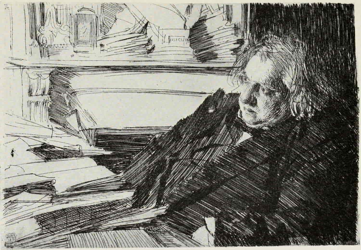
ANDERS ZORN. ERNEST RENAN
Size of the original etching, 9¼ × 13⅜ inches
In the Collection of the Author
(If supported click figure to enlarge.)
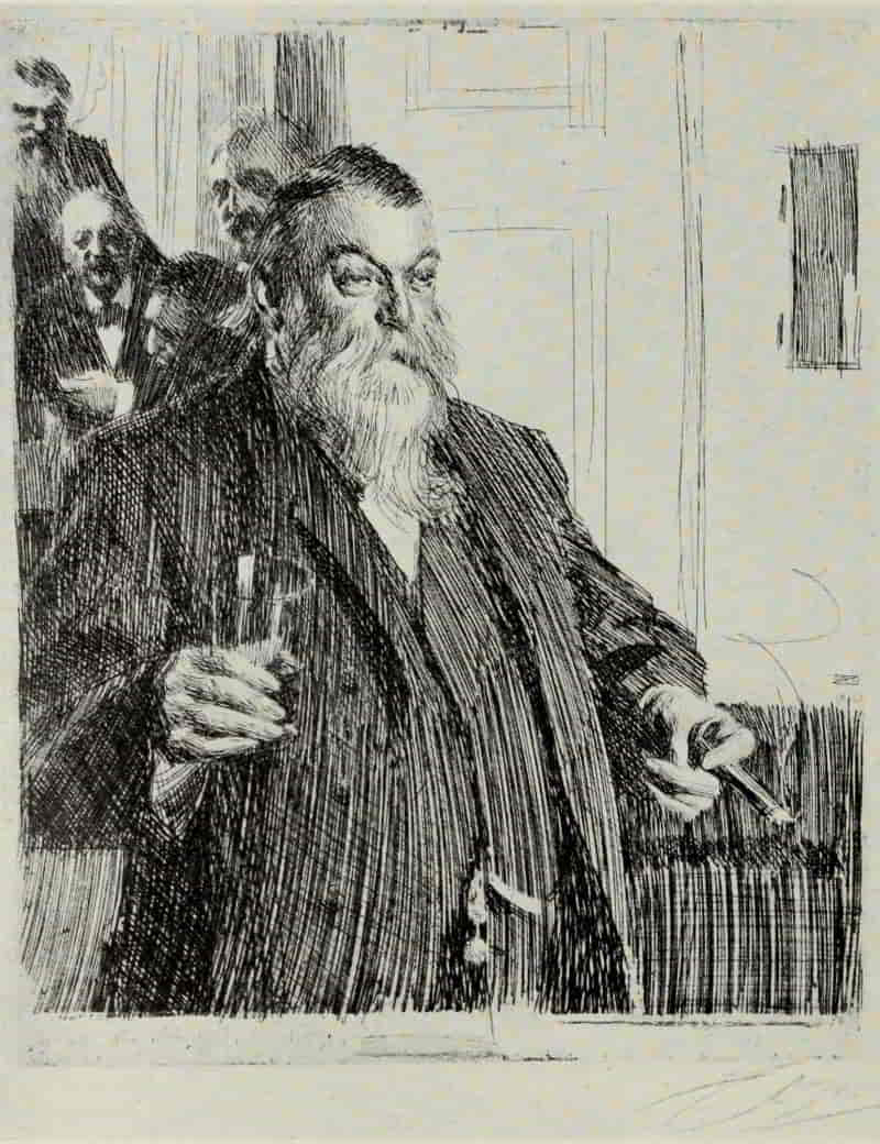
ANDERS ZORN. THE TOAST
Size of the original etching, 12⅝ × 10½ inches
In the Collection of Albert W. Scholle, Esq.
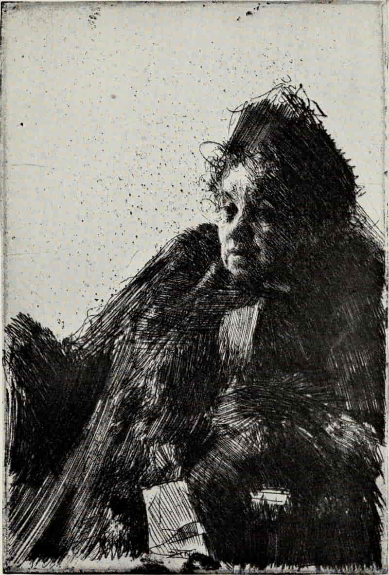
ANDERS ZORN. MADAME SIMON
Size of the original etching, 9⅜ × 6¼ inches
In the Museum of Fine Arts, Boston
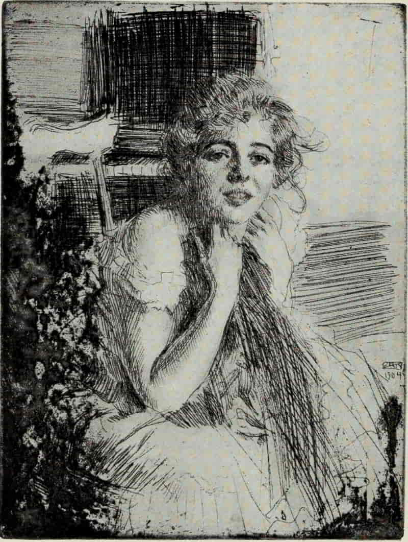
ANDERS ZORN. MISS EMMA RASSMUSSEN
Size of the original etching, 7⅞ × 5⅞ inches
In the Collection of the Author
The Toast is etched from Zorn’s picture painted [Pg 223]by him to celebrate the thirtieth anniversary of the Society of the Idun, a scientific and artistic society in Stockholm. Wieselgren, the President of the Society, a Viking-like figure, is about to propose a toast; beyond him, characterized with the fewest lines, are seen Nordenskjöld, the Arctic explorer; Hildebrand, the archæologist; Axel Key, professor of medicine; and Woern, the Minister of Finance. The plate has all the freshness, all the spontaneity, of an etching done directly from life and at a white heat.
Among his many portraits of women, it is difficult to make a selection. Miss Anna Burnett, seated at the Piano, is charming. Annie, Mrs. Granberg, and Kesti—each, in its own way, fascinates us; but if one were to express a personal preference, it would be for Miss Emma Rassmussen. The blond beauty of her hair, the fair, tender flesh, sparkling eyes, and lips slightly open, showing the firm, small, even teeth, are in perfect harmony. The line is more delicate than is the artist’s wont, and both as a portrait and as an etching it is a lasting delight.
[Pg 224]
SOME MASTERS OF PORTRAITURE
BIBLIOGRAPHY
Prints and Their Makers. Edited by FitzRoy Carrington. 200 illustrations. New York: Century Co. 1912.
Etching and Etchers. By Philip Gilbert Hamerton. 35 original etchings. London: Macmillan & Co. 1868.
——. Same. 6th edition. Boston: Roberts Brothers. 1892.
The Golden Age of Engraving. By Frederick Keppel. 161 illustrations. New York: The Baker and Taylor Company. 1910.
The Best Portraits in Engraving. By Charles Sumner. New York: Frederick Keppel. 1875.
Dürer, Albrecht (see Bibliography under “The Master of the Amsterdam Cabinet and Albrecht Dürer,” page 137).
Van Dyck, Anthony (1599-1641)
Eaux-fortes de Antoine van Dyck; reproduites et publiées par Amand-Durand. Edited by Georges Duplessis. 21 reproductions. Paris: Amand-Durand. 1874.
Van Dyck; His Original Etchings and His Iconography. By Arthur Mayger Hind. 38 illustrations. The Print-Collector’s Quarterly, 2 parts. Part I. Vol. 5, No. 1, pp. 3-37. Part II. Vol. 5, No. 2, pp. 220-253. Boston. 1915.
———. Reprinted in revised form. 36 illustrations. Boston: Houghton Mifflin Company. 1915.
Van Dyck and Portrait Engraving and Etching in the Seventeenth Century. Edited by Arthur Mayger Hind. 65 reproductions. London and New York: Frederick A. Stokes Company, n. d. (Great Engravers.)
Van Dyck. By H. Knackfuss. Translated by Campbell Dodgson. 55 illustrations. Bielefeld and Leipzig: Velhagen & Klasing. 1899. (Monographs on Artists.)
Etchings of Van Dyck. Edited by Frank Newbolt. 34 reproductions. London: George Newnes. n. d.
Etchings by Van Dyck. By Walter H. Sparrow. With an introduction by H. Singer. 23 reproductions of the first states. London: Hodder & Stoughton. 1905.
L’Iconographie d’Antoine van Dyck, d’après les recherches de H. Weber. By Friedrich Wibiral. 1 reproduction and 6 plates of watermarks. Leipzig: A. Danz. 1877.
Rembrandt Harmensz van Rijn (1606-1669)
The Etched Work of Rembrandt; a Monograph (Written as Introduction to the Burlington Club Exhibition, 1877) with an Appendix
[Pg 225]Respecting Appropriation of the Foregoing in Middleton’s Descriptive Catalogue. By Francis Seymour Haden. London: Macmillan & Co. 1879.
The Etchings of Rembrandt. By Philip Gilbert Hamerton. 4 reproductions and 36 text illustrations. London: Seeley & Co. 1902. (Portfolio Monographs.)
Rembrandt’s Etchings; an Essay and a Catalogue, with Some Notes on the Drawings. By Arthur Mayger Hind. London: Methuen & Co. 1912. Volume 1, Text (with 34 plates illustrating the drawings). Volume 2, Illustrations (330 reproductions).
Etchings of Rembrandt. Edited by Arthur Mayger Hind. 62 reproductions. London and New York: Frederick A. Stokes Company. 1907. (Great Engravers.)
Rembrandt. By H. Knackfuss. Translated by Campbell Dodgson. 159 illustrations. Bielefeld and Leipzig: Velhagen & Klasing. 1899. (Monographs on Artists.)
Rembrandt’s Amsterdam. By Frits Lugt. 27 illustrations and map. The Print-Collector’s Quarterly, Vol. 5, No. 2, pp. 111-169. Boston. 1915.
Rembrandt; His Life, His Work, and His Time. By Emile Michel. Translated by Florence Simmonds. Edited by Frederick Wedmore. 2 volumes. 317 illustrations. London: William Heinemann. 1895.
L’oeuvre gravé de Rembrandt; Reproductions des planches dans tout leurs états successifs, avec un catalogue raisonné. By Dmitri Rovinski. 1000 reproductions. St. Petersburg: L’Académie Impériale des Sciences. 1890. Volume 1, Text. Volumes 2-4, Reproductions.
——— ———. Supplement. Collected by D. Rovinski. Arranged and described by N. Tchétchouline. 94 reproductions. St. Petersburg: S. N. Kotoff, and Leipzig: Karl W. Hiersemann. 1914.
Kritisches Verzeichnis der Radierungen Rembrandts, zugleich eine Anleitung zu deren Studium. By Woldemar von Seidlitz. Leipzig: E. A. Seemann. 1895.
Rembrandt; des Meisters Radierungen in 402 Abbildungen. Edited by Hans Wolfgang Singer. Stuttgart and Leipzig: Deutsche Verlags-Anstalt. 1906. (Klassiker der Kunst. Vol. 8.)
Portrait Engraving in France
De la gravure du portrait en France. By Georges Duplessis. Paris: Rapilly. 1875.
Le peintre-graveur français; un catalogue raisonné d’estampes gravées par les peintres et les dessinateurs de l’école française, ouvrage faisant suite au Peintre-graveur de M. Bartsch. By A. P. F. Robert-Dumesnil. 11 volumes. (Vol. 11. Supplement by Georges Duplessis.) Paris: Mme. Huzard. 1835-71.
Le Peintre-graveur français continué ... ouvrage faisant suite au Peintre-Graveur Français de Robert-Dumesnil. By Prosper de Baudicour. Paris: Mme. Bouchard-Huzard. 1859-1861. 2 volumes.
[Pg 226]
French Portrait Engraving of the Seventeenth and Eighteenth Centuries. By T. H. Thomas. 39 illustrations. London: George Bell & Sons. 1910.
Mellan, Claude (1598-1688)
Claude Mellan. By Louis R. Metcalfe. 13 illustrations. The Print-Collector’s Quarterly, Vol. 5, No. 3, pp. 258-292. Boston. 1915.
Catalogue raisonné de l’oeuvre de Claude Mellan d’Abbeville. By Anatole de Montaiglon. Biography by P. J. Mariette. Abbeville: P. Briez. 1856.
Morin, Jean (before 1590(?)-1650)
Jean Morin. By Louis R. Metcalfe. 11 illustrations. The Print-Collector’s Quarterly, Vol. 2, No. 1, pp. 1-30. Boston. 1912.
Nanteuil, Robert (1623(25?)-1678)
Robert Nanteuil. By Louis R. Metcalfe. 12 illustrations. The Print-Collector’s Quarterly, Vol. 1, No. 5, pp. 525-561. Boston. 1911.
Nanteuil; sa vie et son oeuvre. By Abbé Porrée. Rouen: Cagniard. 1890.
The Drawings and Pastels of Nanteuil. By T. H. Thomas. 15 illustrations. The Print-Collector’s Quarterly, Vol. 4, No. 4, pp. 327-361. Boston. 1914.
Legros, Alphonse (1837-1911)
Alphonse Legros. By Elisabeth Luther Cary. 10 illustrations. The Print-Collector’s Quarterly, Vol. 2, No. 4, pp. 439-457. Boston. 1912.
Catalogue raisonné de l’œuvre gravé et lithographié de M. Alphonse Legros, 1855-77. By Paul Auguste Poulet-Malassis and A. W. Thibaudeau. 3 plates. Paris: J. Baur. 1877.
Whistler, James Abbott McNeill (1834-1903) (see Bibliography under “Landscape Etching,” p. 277).
Zorn, Anders (1860- )
Das radierte Werk des Anders Zorn. By Fortunat von Schubert-Soldern. Illustrated. Dresden: Ernst Arnold. 1905.
Anders Zorn. By Loys Delteil. 328 reproductions. Paris: L’auteur. 1909. (Le Peintre-graveur illustré, XIXᵉ et XXᵉ siècles. Vol. 4.)
Anders Zorn. By Mrs. Schuyler Van Rensselaer. 5 illustrations. The Century, Vol. 24, p. 582 (New Series). New York. 1893.
Anders Zorn: Painter-Etcher. By J. Nilsen Laurvik. 18 illustrations. The Print-Collector’s Quarterly, Vol. 1, No. 5, pp. 611-637. Boston. 1911.
[Pg 227]
LANDSCAPE ETCHING
IN landscape, as in portraiture, we are greeted on the threshold by Albrecht Dürer. From his many drawings, water-colors, and the beautifully engraved backgrounds in a number of his plates, we know him to have been a profound student of natural forms and of atmospheric effects, sensitive to the character of the country he portrays; and it is a matter of regret that The Cannon is the only plate in which the landscape element outweighs in interest the figures. The Cannon, which is dated 1518, is etched upon an iron plate, not necessarily because Dürer was unacquainted with a suitable mordant for copper, but rather, one is inclined to believe, because, etching having been used in the decoration of arms and armor, iron would naturally suggest itself as the most appropriate metal for the purpose. Although the cannon (“The Nuremberg Field Serpent”), to the left, and the five Turks, to the right, are the main motives of the composition, they are drawn and bitten with lines of exactly the same weight and character as the landscape itself, and we can, if we will, consider them as accessory figures, concentrating our attention upon the altogether [Pg 228]delightful village, its church spire pointing heavenwards, while in the distance wooded hills rise towards the sombre sky, and to the left a seaport is indicated. Dürer either ignored or was unaware of the effects to be obtained by repeated rebitings, and consequently the plate is of a uniform tone. Within his self-imposed limits he has thoroughly understood the possibilities of the medium and has availed himself of them, adopting an open, linear technique, in marked contrast to his highly elaborate engravings on copper of this period.
Albrecht Altdorfer, who was born in Regensburg about 1480 and died in February, 1538, is notable as one of the earliest interpreters of landscape for its own sake. He has left us ten landscape etchings. None of them is dated, but they clearly belong to his last period. In them he has merely transferred to metal his mode of pen drawing, an excellent style in a way, since it is linear and suggestive, but lacking distinction and that passionate, dramatic quality which is so impressive in the painting, St. George, in the Munich Gallery, the engraving of the Crucifixion; or the Agony in the Garden, a drawing in the Berlin Print Room.
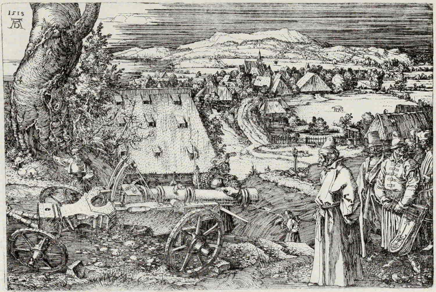
ALBRECHT DÜRER. THE CANNON
Size of the original etching, 8⅝ × 12⅞ inches
In the Museum of Fine Arts, Boston
(If supported click figure to enlarge.)
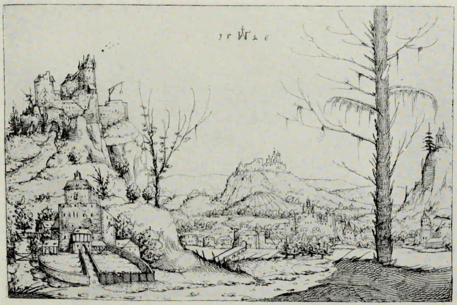
AUGUSTIN HIRSCHVOGEL. LANDSCAPE
Size of the original etching, 5⅝ × 8½ inches
In the Museum of Fine Arts, Boston
(If supported click figure to enlarge.)
The etchings of Augustin Hirschvogel are even simpler in treatment than those by Altdorfer. They bear dates from 1545 to 1549. The more one studies his landscape plates, breathing the spirit of [Pg 231]the true nature lover, the more fascinating do they become. He has eliminated all non-essentials, concentrating his attention upon what were to him the most significant features, and in this respect he may have influenced the work of more than one nineteenth century master.
Hans Sebald Lautensack, who was some twenty years Hirschvogel’s junior, was born in Nuremberg about 1524. The greater number of his landscape plates fall within the years 1551 and 1555. He is neither so simple nor so direct as Hirschvogel, and his plates suffer from over-elaboration. In an attempt to give a complete representation of the scene the value of the line is lost, and, in the majority of cases, the composition is lacking in repose.
For almost a century we have no landscape etchings of prime importance. Then, in 1640, Rembrandt appears on the scene with his View of Amsterdam, the first of a series of twenty-seven masterpieces which, beginning with this plate, comes to an end with A Clump of Trees with a Vista (1652). The View of Amsterdam is, among Rembrandt’s landscapes, comparable to the portrait of himself leaning on a stone sill, inasmuch as it is, in its own simple linear mode, a model of what etching can be at its best.
As in the case of all these etchings, with the exception[Pg 232] of the Three Trees and the Landscape with a Ruined Tower and Clear Foreground, the sky is left perfectly blank, and our imagination must supply the quiet sunshine of a cloudless day or that delicate grayness which makes Holland a perpetual delight to the painter.
The Windmill (1641) is Rembrandt’s first dated etching. It is truly a portrait of a place, not only in its outer aspect, but in that inner spirit which, if it be present, moves us so profoundly, as in the case of Meryon’s etchings of Paris and Piranesi’s plates of ancient Roman edifices; or, if it be absent, leaves us disappointed and cold. In the Windmill, “we feel the stains of weather, the touch of time, on the structure; we feel the air about it and the quiet light that rests on the far horizon as the eye travels over dike and meadow; we are admitted to the subtlety and sensitiveness of a sight transcending our own; and even by some intangible means beyond analysis we partake of something of Rembrandt’s actual mind and feeling, his sense of what the old mill meant, not merely as a picturesque object to be drawn, but as a human element in the landscape, implying the daily work of human hands and the association of man and earth.”[12]
[12] Rembrandt’s Landscape Etchings. By Laurence Binyon. The Print-Collector’s Quarterly. Vol. 2, No. 4, p. 414.
[Pg 233]
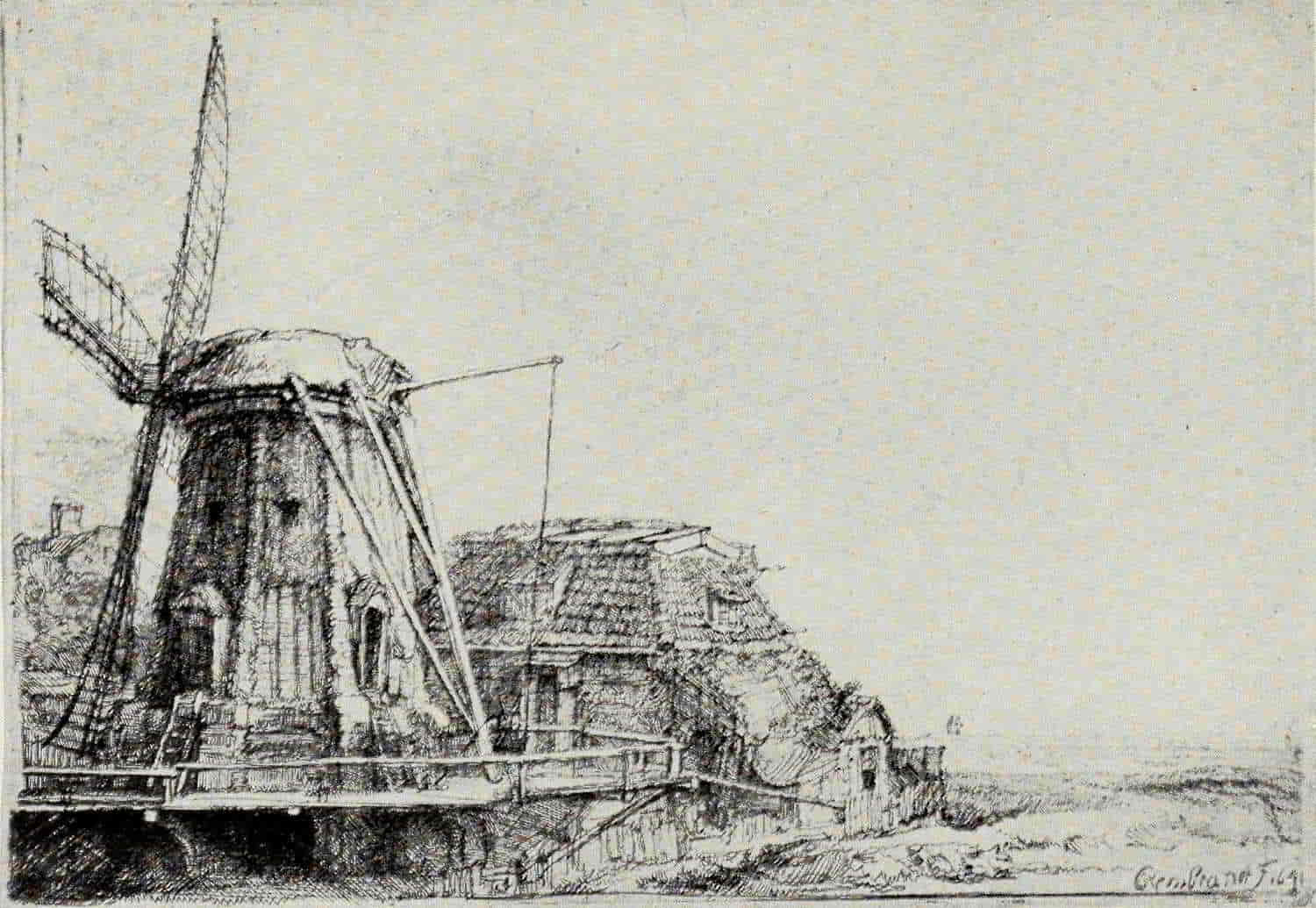
REMBRANDT. THE WINDMILL
Size of the original etching, 5¾ × 8¼ inches
In the Museum of Fine Arts, Boston
(If supported click figure to enlarge.)
[Pg 234]
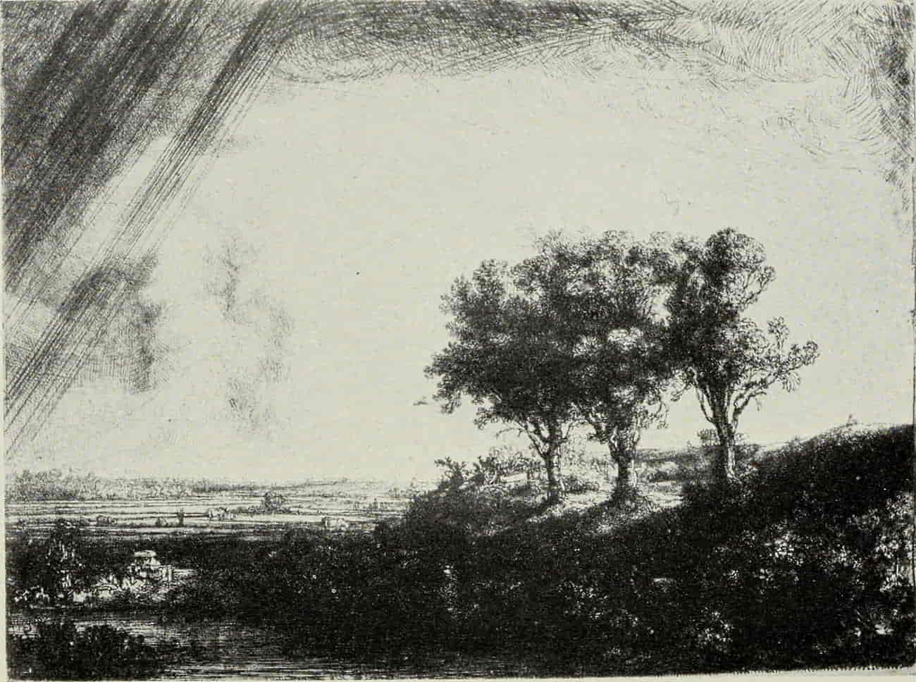
REMBRANDT. THREE TREES
Size of the original etching, 8½ × 11 inches
In the Museum of Fine Arts, Boston
(If supported click figure to enlarge.)
[Pg 235]
To the same year belong the Landscape with a Cottage and Haybarn and Landscape with a Cottage and a Large Tree, two delightfully spacious plates. There is one etching in 1642, the Cottage with a White Paling, in which dry-point is judiciously used to give richness to the shadows.
To the following year, 1643, belongs the Three Trees, the most famous of Rembrandt’s landscape etchings. Note how Rembrandt has suggested the passing of a summer thunder-storm, the rain-charged clouds rolling away to the left, while from the right the returning sunshine bathes the composition in glory, making each freshly washed leaf and blade of grass sparkle in its beams. Even the hard, slanting lines of rain in the upper left portion of the plate have their purpose, affording a needed contrast to the swiftly changing clouds, which the freshening breeze drives before it over the peopled plain and the far-reaching sea in the distance.
In 1645 there are five landscape etchings. If the Three Trees is Rembrandt’s most elaborate plate, Six’s Bridge is, in some ways, his most learned performance. According to tradition, it was etched “against time,” for a wager, at the country house of Rembrandt’s friend, Jan Six, while the servant was fetching the mustard, that had been forgotten, from a neighboring village. There is, however, nothing hasty or incomplete about it. It[Pg 236] is, to use Whistler’s words, “finished from the beginning,” beautifully balanced, not a line wasted, of its kind a perfect work of art.
There are no more landscapes until 1650, a good year, since it gives us eight plates, every one worthy of the most serious consideration. Rembrandt by this time apparently had become dissatisfied with the relatively limited range of light and dark obtainable by the pure etched line, and from now onwards he relies more and more upon dry-point to obtain his effects, at times executing his plates entirely in that medium.
The Landscape with a Haybarn and a Flock of Sheep is one of the loveliest plates of this period. There is a brilliancy in the first state, a quiet harmony in the elaborated second state, which makes a choice difficult. Each, in its way, is of compelling beauty.
Hardly less delightful is the Landscape with a Milkman, with a view of the sea to the right, while at the left the cottages snuggle beneath their protecting trees.
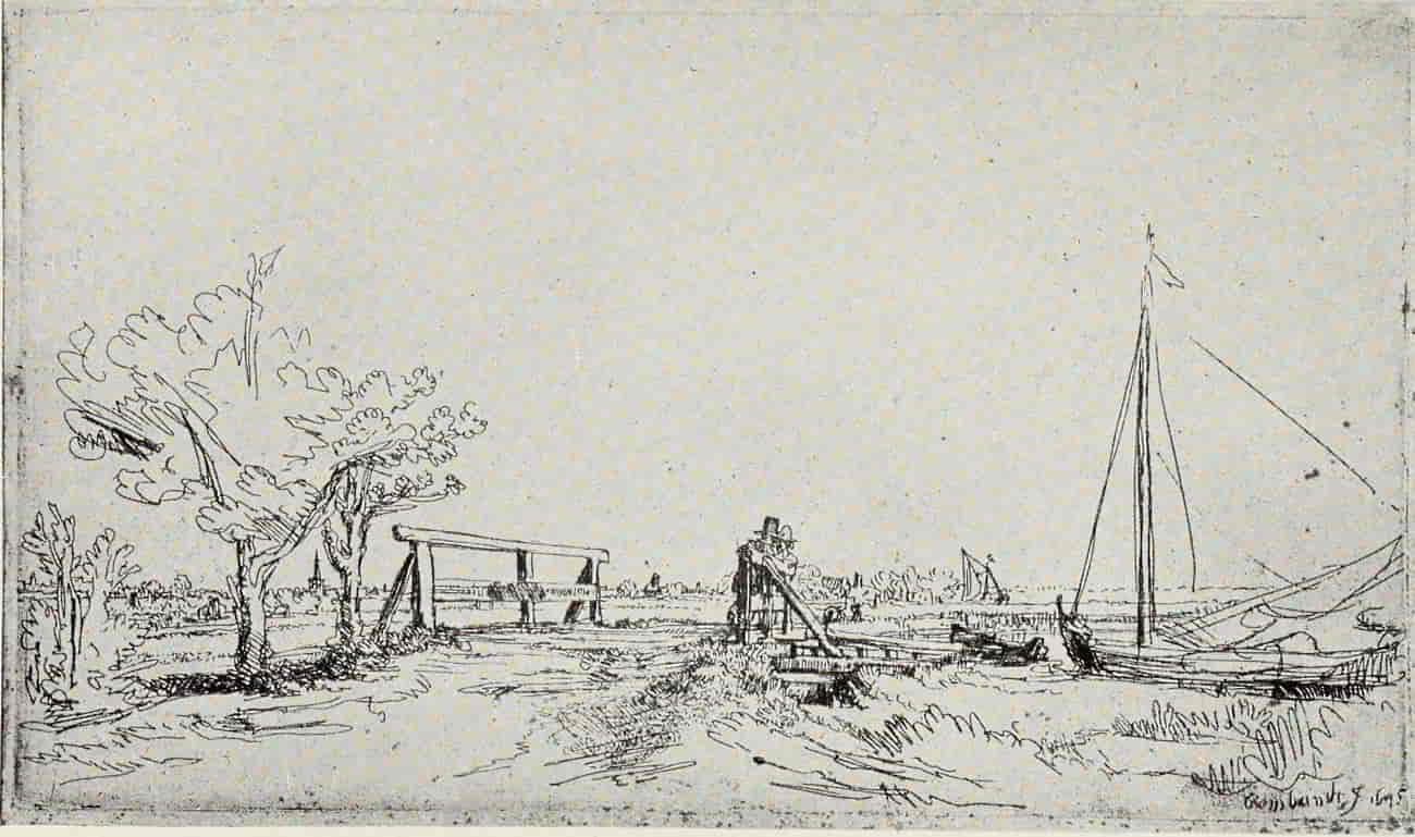
REMBRANDT. SIX’S BRIDGE
Size of the original etching, 5⅛ × 8¾ inches
In the Museum of Fine Arts, Boston
(If supported click figure to enlarge.)
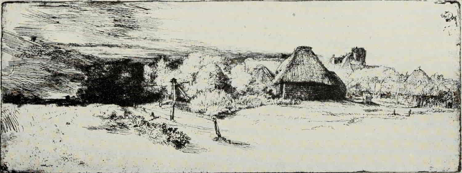
REMBRANDT. LANDSCAPE WITH A RUINED TOWER AND CLEAR FOREGROUND
Size of the original etching, 4⅞ × 12⅝ inches
In the Museum of Fine Arts, Boston
(If supported click figure to enlarge.)
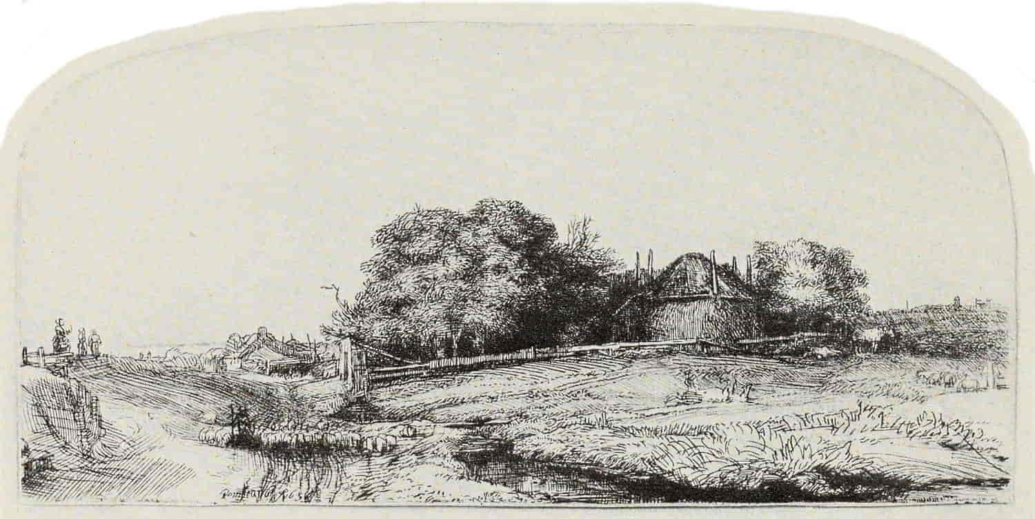
REMBRANDT. LANDSCAPE WITH A HAYBARN AND A FLOCK OF SHEEP
Size of the original etching, 3¼ × 7 inches
In the Museum of Fine Arts, Boston
(If supported click figure to enlarge.)
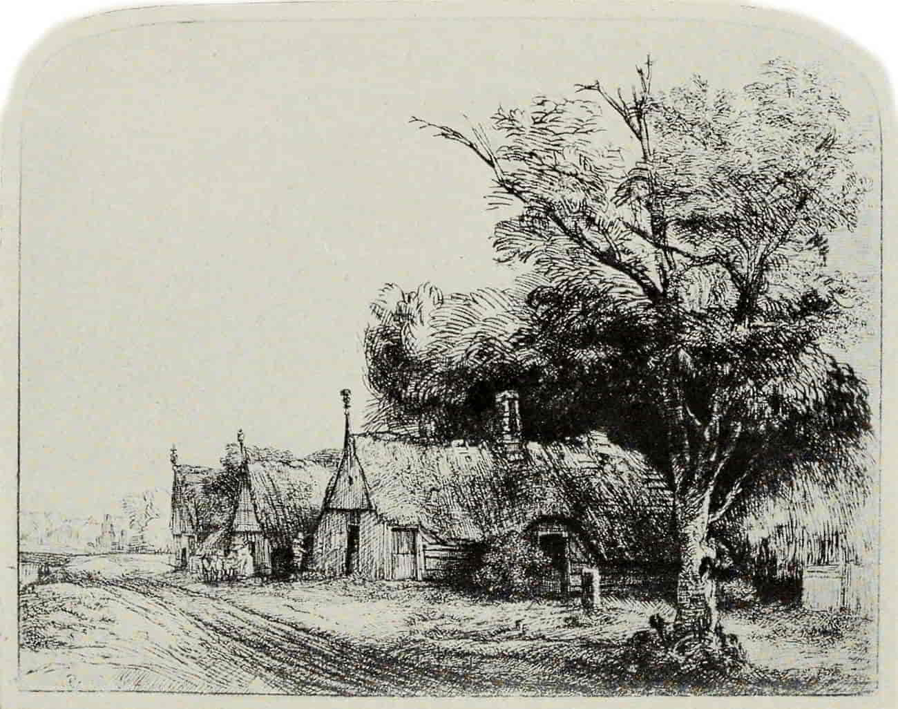
REMBRANDT. THREE COTTAGES
Size of the original etching, 6¼ × 8 inches
In the Museum of Fine Arts, Boston
(If supported click figure to enlarge.)
The Landscape with a Ruined Tower and Clear Foreground is, perhaps, of all these etchings the noblest and the most dramatic. In the sky to the left are piled thunder clouds. A faint breeze, the precursor of a coming storm, gently moves the upper branches of the trees. There is an expectant [Pg 241]hush, a tenseness, and we are made to feel that in a few minutes the first heavy raindrops will be driving through the over-charged air. Otherwise all is still, the sky to the right being yet quiet and undisturbed. With the fewest etched lines Rembrandt has indicated the form and growth of the trees, adding, just where needed to give emphasis and enrichment, touches of dry-point, concentrating his richest blacks on the noble clump which shuts off the road leading toward the left. With such simple means, with black lines and white paper, he has given us by his art a more convincing record of one of Nature’s noblest spectacles than most painters, with a full palette at their command, could achieve in a lifetime of labor.
In the Three Cottages dry-point is used with magnificent effect. Early impressions of this masterpiece have a richness, a bloom, which is unmatched among Rembrandt’s landscape plates. A fine impression of the third state, with the added shading on the gabled end of the first cottage, represents the plate admirably. To be seen at its best, however, it should not be too heavily charged with ink, since the tree forms thereby are confused. Work such as this is so seemingly simple that one may readily overlook the power of analysis and the superb draughtsmanship it displays. Everyone who loves Rembrandt’s landscapes—and who that[Pg 242] knows them does not love them?—must bitterly regret that at about this time, in the very plenitude of his powers, he saw fit to bring his landscape work to a close.
It is true that we have the Goldweigher’s Field of 1651—an unsurpassed masterpiece—and in the following year the Landscape with a Road Beside a Canal and A Clump of Trees with a Vista; but had he treated a landscape motive with the passion which breathes from the Three Crosses, Christ Presented to the People, or the Presentation in the Temple, how much richer and fuller would landscape art have been!
The Goldweigher’s Field, by tradition the country seat of the Receiver General, Uytenbogært, whose portrait Rembrandt had etched in 1639 (The Goldweigher), is, in point of suggestiveness, second to none of Rembrandt’s plates. The eye is gently led from field to fertile field, each with its own individual character and filled with interesting little details, and finally rests upon the quiet sea which stretches to the horizon.
Contemporary with Rembrandt, treating scenes essentially the same, a whole school of etchers produced an enormous number of plates, many of them charming, but none to be classed with the permanently great work in the history of the art.
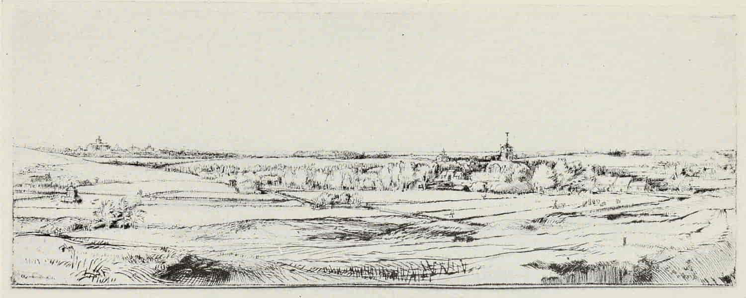
REMBRANDT. GOLDWEIGHER’S FIELD
Size of the original etching, 4¾ × 12⅝ inches
In the Museum of Fine Arts, Boston
(If supported click figure to enlarge.)
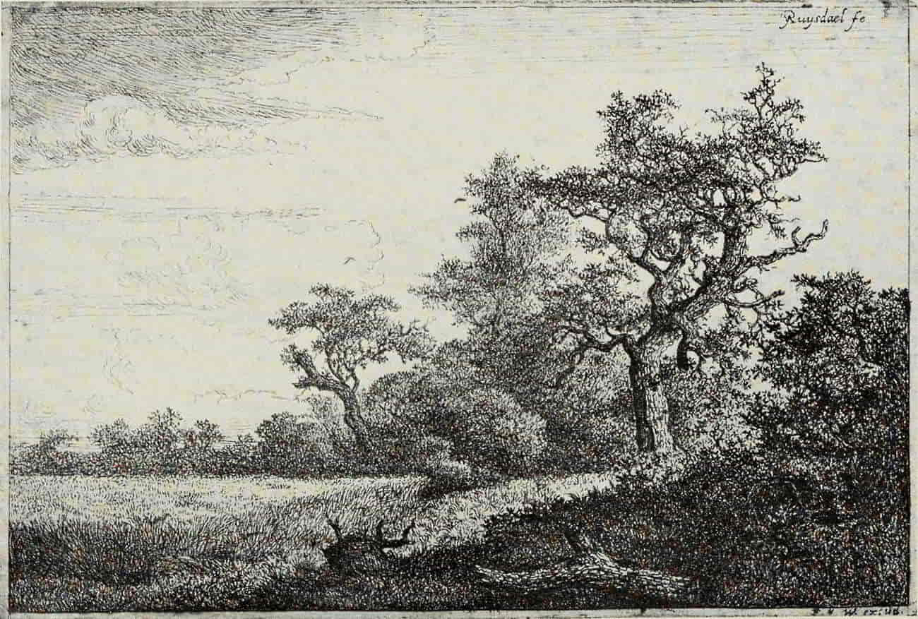
JACOB RUYSDAEL. WHEAT FIELD
Size of the original etching, 4 × 6 inches
In the Museum of Fine Arts, Boston
(If supported click figure to enlarge.)
Hercules Seghers is interesting because of his [Pg 245]choice of wild, rugged mountains for his subject-matter and of his experiments in color printing, but as an etcher he is of historical importance only.
Jacob Ruysdael displays a knowledge of tree forms and an appreciation of their beauty, rare at any time. His work at its best recalls that of the great nineteenth century master, Théodore Rousseau, though the latter’s few plates show a greater economy of means and an equal affection for Nature in her wilder moods. The Wheat Field is one of Ruysdael’s most satisfying plates. The sky, with its rolling clouds, is simply treated and shows a knowledge and reticence in the use of line denied to the greater number of his more laborious contemporaries, who, in the main, when they endeavored to “finish” a plate ended by leaving it fatigued and stiff.
Claude Gellée, called Claude Lorrain, is the one seventeenth century French landscape etcher. Born in the year 1600 in the Diocese of Toul and the Duchy of Lorraine (whence he derives the name by which he is best known), early orphaned, at the age of thirteen, after a varied and picturesque boyhood, journeyed to Rome, thence to Naples, and later to Venice. In 1627 he settled permanently in Rome, where he remained until his death in 1682.
His etchings are the fruit of that indefatigable study of nature which he pursued almost until the[Pg 246] day of his death. Heedless of fatigue, he would spend day after day, from sunrise until nightfall, noting every phase of dawn, the glory of sunrise, or the majesty of the sunset hours. For him the modest nook held no charm and exerted no fascination. He chose for his theme Nature in her more spacious aspects—wide-stretching horizons and deep overarching skies, with clumps of stately trees, between and beyond which are to be seen castle-crowned hills, or a half-ruined temple, the relic of Imperial Rome, a passionate love for which burned with a steady flame in Claude, more Roman than the Romans themselves in his worship of the Eternal City and all that could recall her vanished glory.
Claude’s paintings are to be seen in nearly every European gallery of importance, but his etchings are seldom met with. Really fine impressions (by which alone they can be judged) are unfortunately very rare. His work would seem to divide itself into two periods: 1630 to 1637, and 1662 and 1663. It is to the earlier period that his finest work belongs, the later plates being heavy and stiff in treatment. Claude’s etchings show none of that economy and suggestiveness of line which make of Rembrandt’s most summary sketch a continuous stimulus and delight. They are highly wrought pictures, as carefully and lovingly finished[Pg 247] in all details as are the paintings themselves. Etching, dry-point, the burnisher, and a tone produced by roughening the surface of the plate with pumice-stone or some similar material, all are called into play to produce a harmonious result, and of their kind there is nothing finer.
The Dance Under the Trees shows Claude in his most purely pastoral vein—classic pastoral—seen through Virgilian eyes and interpreted in the spirit of the Eclogues. It is carefully composed and beautifully drawn; and if, to our more modern taste, there seems a little too obvious an “arrangement,” with the two vistas balancing one another at the right and left of the central group of trees, we must remember that landscape, no less than literature or costume, has its fashions, and that, in Claude’s time, balance and proportion were esteemed of greater value than the freedom and spontaneity which we today, more insistent on the individual note, esteem the chief charm of etching.
Le Bouvier, etched in 1636, is accounted Claude’s masterpiece. “For technical quality of a certain delicate kind it is the finest landscape etching in the world. Its transparency and gradation have never been surpassed.”[13] It is the work of a real nature lover and true poet, and sums up in a [Pg 248]few square inches all that is best of Claude’s art when it has shaken itself free from the “set scene” and theatricalities. Technically it is not less admirable. The copper has been caressed, so to speak, with the needle, until it responds by yielding all those elusive half lights and luminous shadows which play among the leaves of the noble trees to the left, while on the right the landscape fairly swims in light and air. For this same quality of sunlight Claude tries again and again in his etchings, in Sunrise with complete success. When he essays to interpret Nature in her sterner moods, as in the Flock in Stormy Weather (his one plate of the year 1651), he is far less happy. The clouds, which should be heavy with rain, are unconvincing, though the suggestion of movement in the trees is excellent, and in no other plate has he treated architecture with a firmer touch or in a more picturesque manner.
[13] Etching and Etchers. By Philip Gilbert Hamerton. London; Macmillan & Co. 1868. p. 178.
After the middle of the seventeenth century, etching, as an original, creative art, is increasingly neglected for almost two hundred years, though it grows in popularity as an easy and expeditious mode of “forwarding” a plate to be finished with the burin.
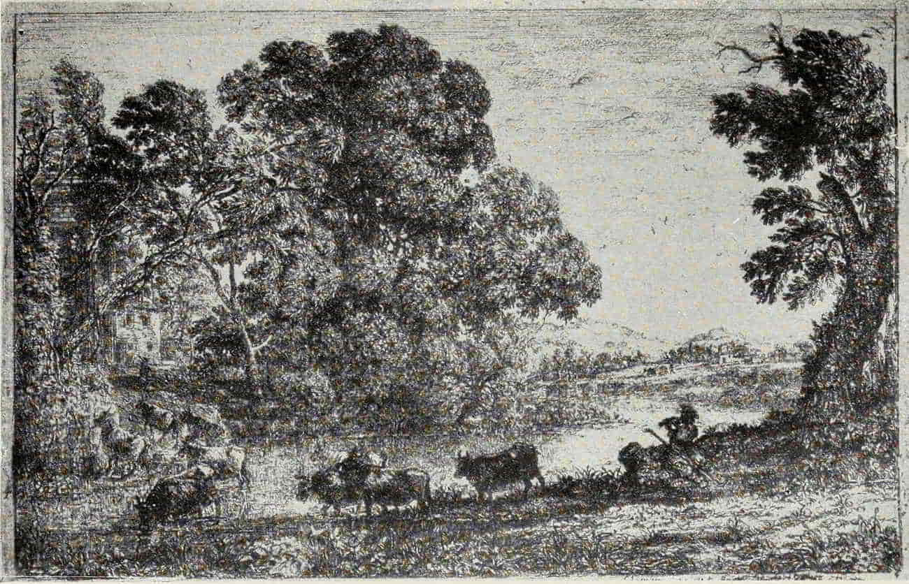
CLAUDE LORRAIN. LE BOUVIER
Size of the original etching, 5⅛ x 7¾ inches
In the Museum of Fine Arts, Boston
(If supported click figure to enlarge.)
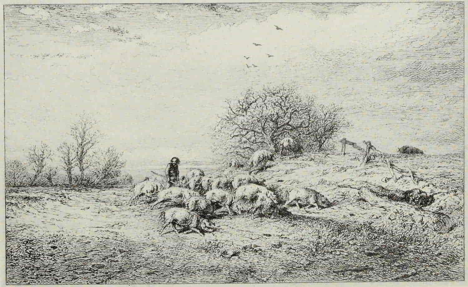
CHARLES JACQUE. TROUPEAU DE PORCS
Size of the original etching, 5⅛ × 8½ inches
In the Museum of Fine Arts, Boston
(If supported click figure to enlarge.)
To Charles Jacque, in the early “forties,” belongs the honor of having restored etching to its proper and legitimate place as a suggestive and [Pg 251]linear art. His method is based on a thorough understanding of its limitations and qualities as exemplified by Rembrandt and his lesser contemporaries in Holland; and both by his work (he has left between five and six hundred plates) and by his influence, he is the father of the nineteenth century revival of etching, not only in France, where its possibilities were appreciated at once by the Romantic group and the “Men of 1830,” but in England, through Seymour Haden and Whistler.
Charles Jacque was born in Paris on May 23, 1813, and to the last (he died at the ripe age of 81, in the year 1894) he retained, in country life, something of the city man’s point of view, the love of the “picturesque,” the anecdotic, in marked contrast to his greater contemporary, Jean-François Millet, whose few etchings form an epic of the soil even more powerful than his paintings. For all that, Jacque is a true etcher, working along the soundest lines and safest traditions. He is unequal: his work suffers at times from a hankering for “finish”; but at his best his little plates are delightfully suggestive, every line being there for a purpose, and not a line too much.
Up to 1848 he had completed some three hundred etchings and dry-points, and it is among this group that many “masterpieces in little” are to be found. It would be hard to find a better model of style[Pg 252] than the Wheat Field. The print is scarcely larger than a visiting card, but it conveys a sense of spaciousness and “out of doors” sadly lacking in many a painting in full color and of a hundred times its size. The Truffle Gatherers is likewise of modest size, but the landscape with its leafless trees is full of air, and the sense of life and movement, as well as the effective composition of the “rooters” accompanied by their herdsman, is, from many points of view, unexcelled.
The Storm—Landscape with a White Horse is one of Jacque’s finest interpretations of wind and rough weather. This dry-point, unfortunately very rare, recalls the work of Rembrandt in his mature period. The sky, slashed with driving showers, the trees swayed this way and that by the gusty wind, the white horse with legs firmly braced, its mane and tail matted by the rain against its neck and flank, all combine to heighten and intensify the effect.
Younger than Jacque by four years (he was born February 15, 1817), Charles-François Daubigny differs from him in that it is the lyric, the spiritual aspect of nature, rather than the incidental and picturesque details of country life, which moved him.
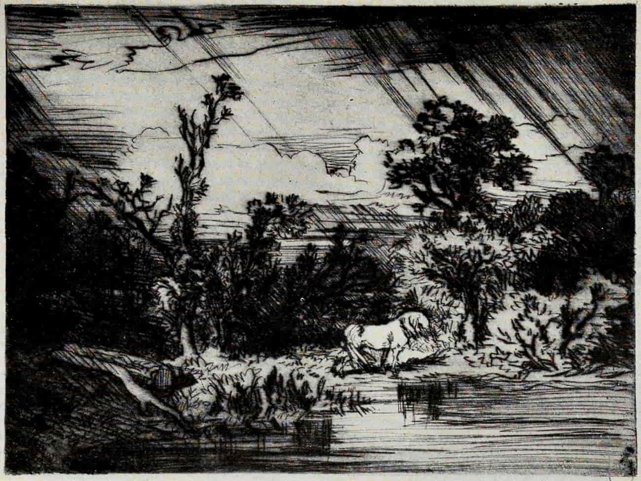
CHARLES JACQUE. STORM—LANDSCAPE WITH A WHITE HORSE
Size of the original dry-point, 6⅜ × 8⅜ inches
In the Museum of Fine Arts, Boston
(If supported click figure to enlarge.)
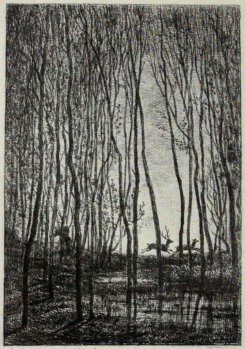
CHARLES-FRANÇOIS DAUBIGNY. DEER IN A WOOD
Size of the original etching, 6⅜ × 4⅜ inches
In the Museum of Fine Arts, Boston
None of the other Barbizon men has so successfully interpreted the freshness of early morning,[Pg 255] the sparkle of sunrise on tender young leaves or dew-bespangled grass, the tranquility of the quiet pool hidden in the depth of the forest. His first plate, etched in collaboration with his friend Meissonier, is dated 1838, and all through the “forties” Daubigny continued to etch either original motives or such as were commissioned by editors for the embellishment of various publications, in many cases poems and songs of a pastoral nature. It is, however, to the following decade that his finest work belongs—a series of little masterpieces which, in their way, remain unequalled. His plates, small in size, are as carefully worked out as those of Claude but with a truer feeling for the elusive charm of still, untroubled places. Later his style grows broader and bolder. Less is actually said, more is suggested. There is a freedom in his line work which these etchings of his middle period had hardly led us to expect but for which, in truth, they were the finest preparation. He has learned to eliminate the non-essential; and in etching the art of omission is the supreme virtue.
One of the most suggestive plates of his middle period is Deer in a Wood. The treatment is perfectly simple and straightforward, truly linear, as all good etching should be, but the spirit of the scene is captured and portrayed in these few, seemingly careless, lines. Deer Coming Down to Drink is another[Pg 256] altogether delightful plate in the same series. The early morning air is vibrant with the glory of sunrise, and the little leaves clap their hands in joy.
“Has it not often occurred to you, in your explorations as a tourist, to see suddenly open before you a break in the landscape, a little valley, calm, in repose, full of elegant and tranquil forms, of discreet and harmonious colors, of softened shadows and lights, bordered by hillsides with rounded and retiring forms and where no step seems to have troubled the poetic silence? A pond, placed there like a mirror, reflects the picture, and bears on its cup-like edge sheaves of rushes, coltsfoot, arrow-heads, water-strawberries and the white and yellow flowers of the water lily, amid which swarm a buzzing world of insects and gnats.... As you approach, some heron, occupied in dressing its plumage, flies off, snapping its beak; the snipe runs away, piping its little cry; then everything falls again into silence, and the valley, welcoming you as its guest, takes up under your eyes its mysterious work.”[14] All this and more Daubigny gives us by his art.
[14] Count Clément de Ris. L’Artiste. June, 1853.
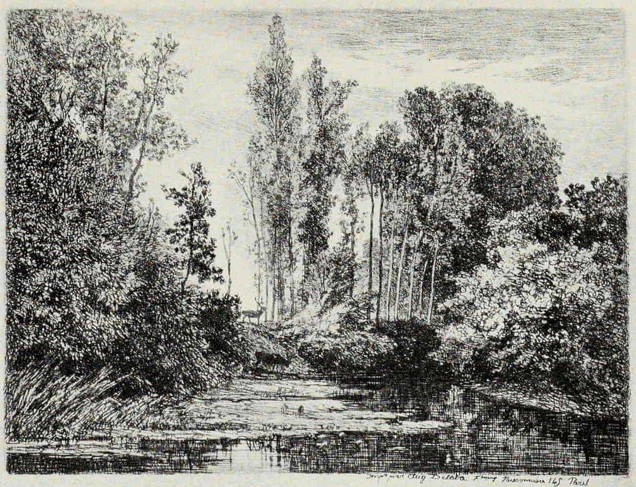
CHARLES-FRANÇOIS DAUBIGNY. DEER COMING DOWN TO DRINK
Size of the original etching, 6⅛ × 4⅝ inches
In the Museum of Fine Arts, Boston
(If supported click figure to enlarge.)
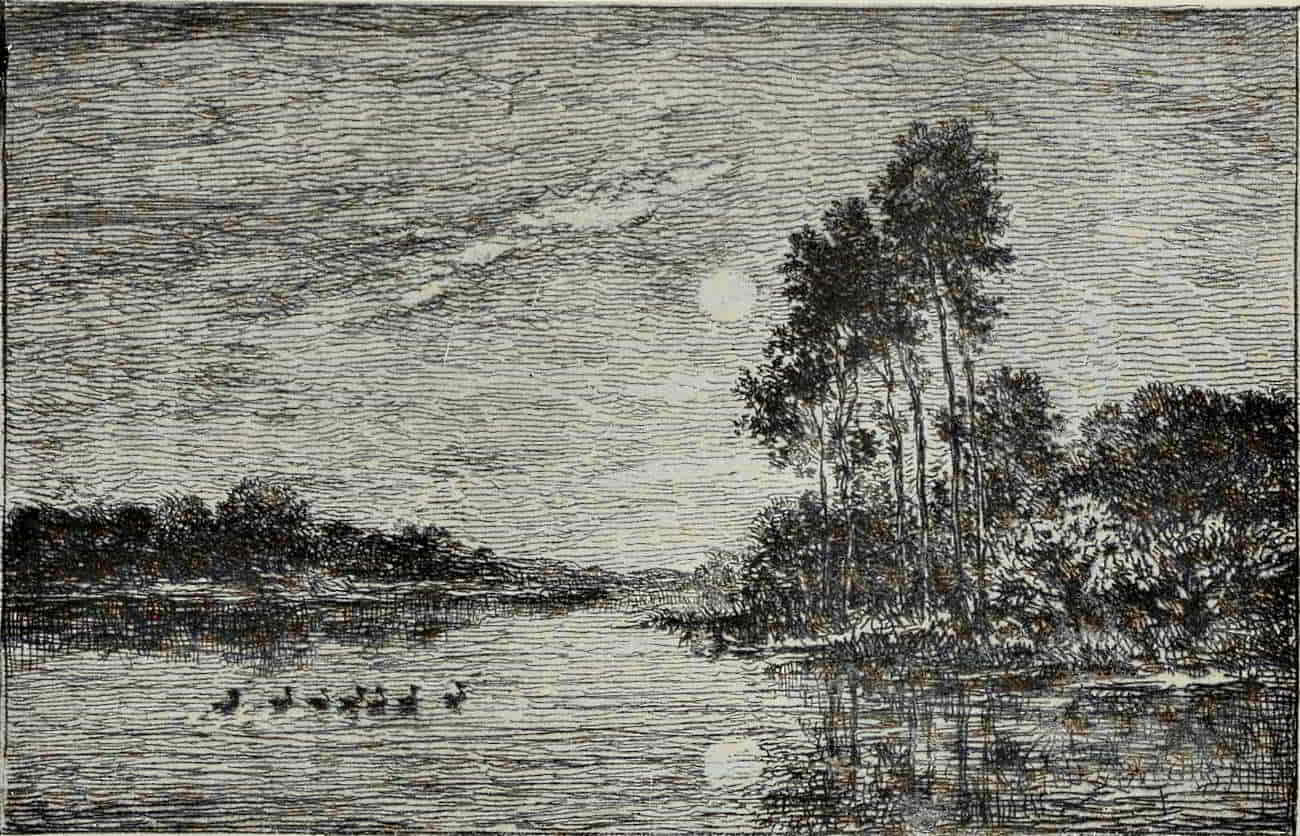
CHARLES-FRANÇOIS DAUBIGNY. MOONLIGHT ON THE BANKS OF THE OISE
Size of the original etching, 4⅜ × 6½ inches
In the Museum of Fine Arts, Boston
(If supported click figure to enlarge.)
Daubigny’s success as a painter, the constantly increasing demand for his work, left him little time, as years went by, for etching. “If only I could paint a picture that wouldn’t sell,” he once said in [Pg 259]sheer desperation, and, momentarily, his superb renderings of the mystery of evening and night accomplished his object, though now they are jealously guarded in some of the world’s finest collections. But to etch night, to suggest moonlight—there was a problem indeed! Whistler in his “Nocturnes” paints, so to speak, on his plate with printer’s ink. Daubigny relies on lines alone, to produce his result. “Night cannot be etched” is the dictum of more than one authority. No, nor sunlight either, nor clouds! None of these things can be pictured so that blind eyes can see them. But to those who will meet the etcher half way, who are content with a suggestion and are capable of reconstructing from it the artist’s mood, these simple linear plates of Daubigny’s last period are a revelation and a delight. Moonlight on the Banks of the Oise measures scant four by six inches, yet what a feeling of space there is in it! Only a born etcher could have succeeded by means so simple, and seemingly inadequate, in capturing the very spirit of such a scene.
Corot’s etched work comprises fourteen plates. It was not until 1845, when he was in his fiftieth year, that he made his first experiment. “Corot took a prepared copper-plate and drew in the outlines and masses of the well-known Souvenir of Tuscany, but did not proceed to the ‘biting in’[Pg 260] process. Some years later Félix Bracquemond discovered the plate in a nail-box at Corot’s studio and begged the master to complete it, offering to take charge of the ‘biting in.’ Corot then took the plate and added the tones and details of the final state.... There was something in the use of mordants and acids that seemed to frighten Corot, and he always called in some good friend such as Bracquemond, Michelin or Delaunay to assist in this delicate process.”[15]
[15] Le Père Corot. By Robert J. Wickenden. The Print-Collector’s Quarterly. Vol. 2, No. 3. p. 382.
In etching his method is as personal as in his painting. He entirely disregards all the accepted canons of the art. Line, as line, hardly exists in his plates; it is scribble, scribble, everywhere. The tree trunks, the rocks, foreground and distance, often the foliage itself, all are as “wrong as wrong can be,” so far as accurate representation is concerned. Yet Corot, great artist and great nature poet, can transgress every rule and still succeed in conveying his message. In the best of his etchings he does succeed admirably. Souvenir of Italy and Environs of Rome of 1865 (Corot was then nearly seventy years of age) are among the most interesting prints of the period. In these plates, and others like them, Corot has given free rein to his poetic and imaginative powers and has drawn upon his memory of the [Pg 263]Italy of his youth. In method, in their disregard of line, form and texture, they are shining examples of what etching should not be. In decorative quality, poetic suggestion, and sentiment they are altogether delightful.
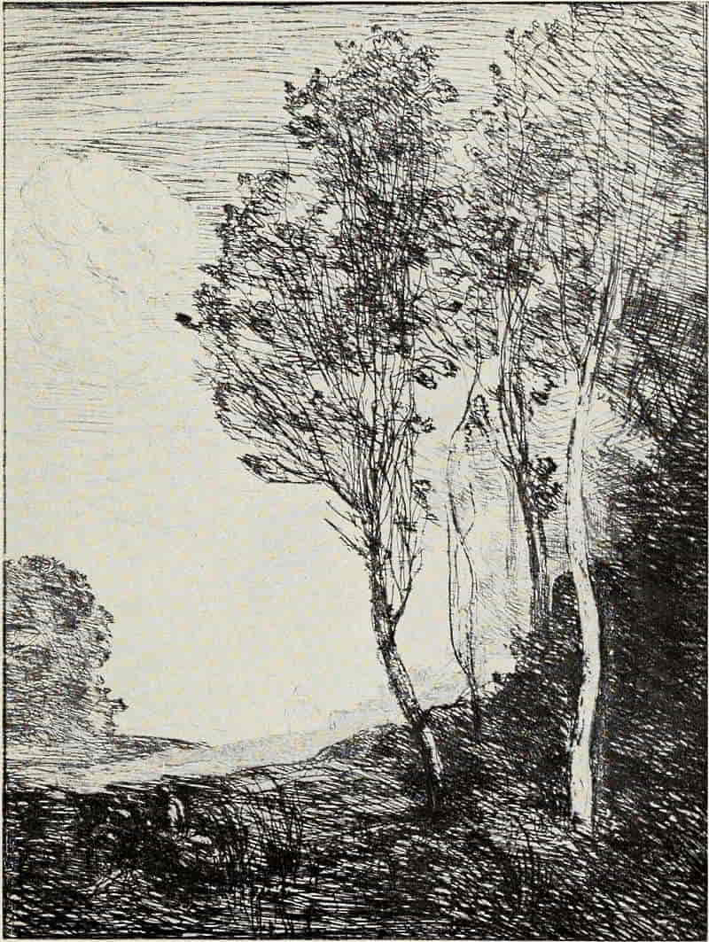
CAMILLE COROT. SOUVENIR OF ITALY
Size of the original etching, 11⅝ × 8⅝ inches
In the Museum of Fine Arts, Boston
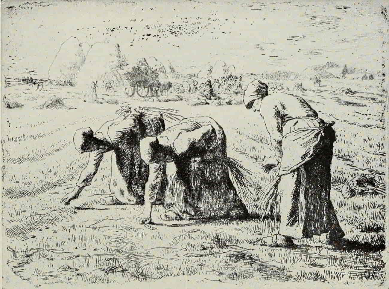
JEAN-FRANÇOIS MILLET. THE GLEANERS
Size of the original etching, 7½ × 10 inches
In the Museum of Fine Arts, Boston
(If supported click figure to enlarge.)
In Millet’s etchings the landscape and the figures are so inter-related as to make any separate study of them unavailing. They are models of significant draughtsmanship and profound feeling, in which nothing is introduced that does not bear directly upon the main theme. Shepherdess Knitting, Peasants Going to Work, Two Men Digging, and above all the Gleaners, have each their perfect setting. The wide-stretching plain, slightly undulating, shimmers in the hot summer sunshine, which bathes in a golden glow the three women gleaning, the harvesters gathering in the rich fruits of their toil, and the little village, snuggling amid its trees in the far distance to the right.
Etchers, like poets, are “born, not made.” But, as also in the case of poets, natural gifts will avail little if they are not reinforced by that capacity for taking infinite pains, through which alone a man may so master his medium as to shape it readily to his artistic needs. The etched work of Seymour Haden is no chance happening. It is the fruit of close and analytical study, by a man of forceful character and scientific attainments, of the best[Pg 264] model of style, the etchings of Rembrandt; supplemented by a familiarity with the work of his contemporaries in France, the land of clear and logical thinking; and in no art is clarity and brevity of speech more essential than in etching. From the beginning, Seymour Haden was in possession of all his powers, both in etching and in dry-point. There is no uncertainty in that which he wishes to say, no fumbling in his manner of saying it. The reticences and half-hesitations of Daubigny are not for him; there is no place for Corot’s scribbled poetry. He will give us a strong man’s interpretation of the lovely English landscape, in which he takes a pride, as in any other personal possession—God’s visible and abounding bounty to a superior people. It is “the bones of things” (his own phrase) that he wishes, above all else, to give. At his best he succeeds magnificently, but in much of his work, structurally fine though it be, it is the frame rather than the spirit that he portrays.
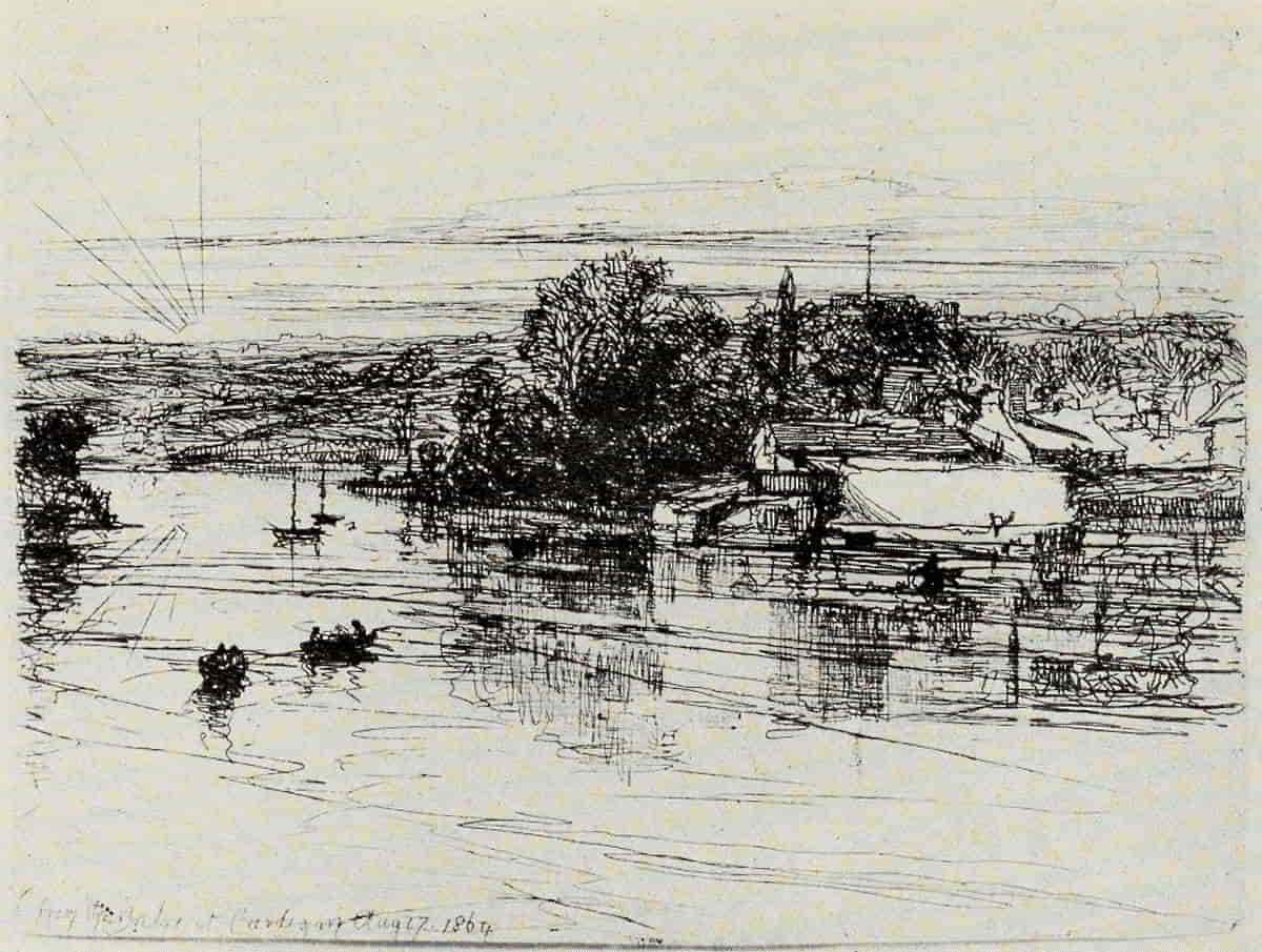
SEYMOUR HADEN. CARDIGAN BRIDGE
Size of the original etching, 4½ × 5⅞ inches
In the Museum of Fine Arts, Boston
(If supported click figure to enlarge.)
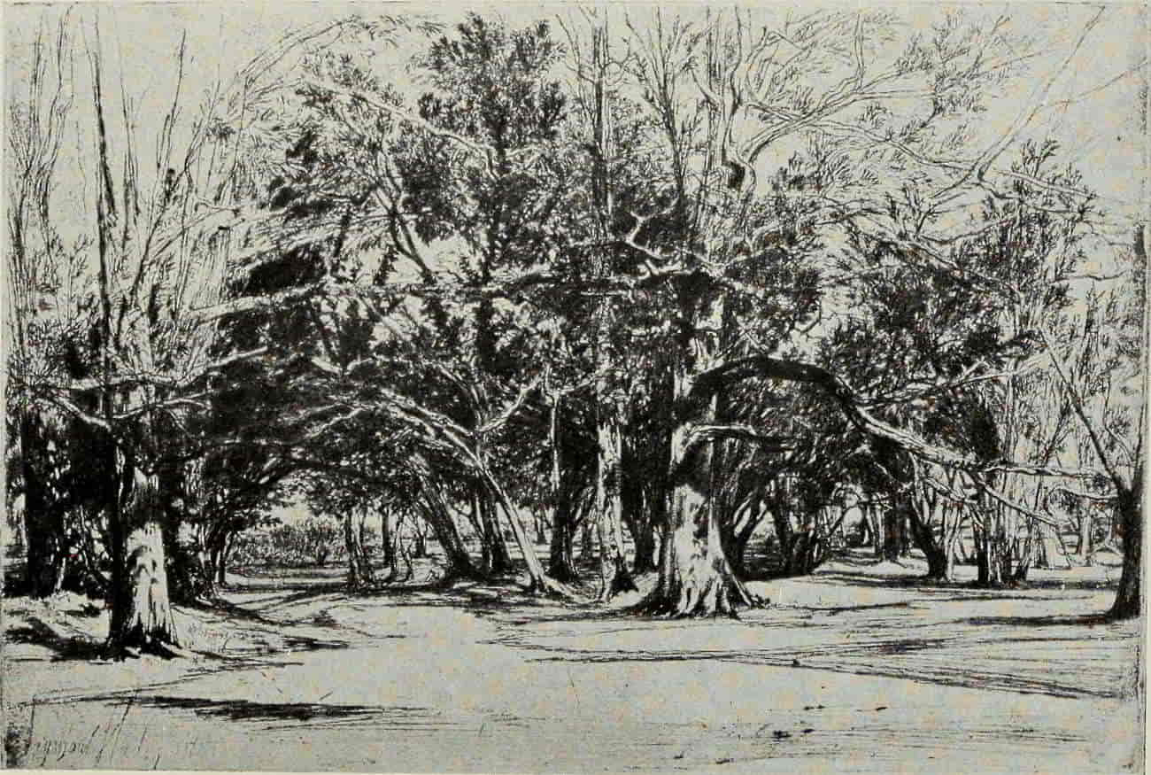
SEYMOUR HADEN. BY-ROAD IN TIPPERARY
Size of the original etching, 7½ × 11¼ inches
(If supported click figure to enlarge.)
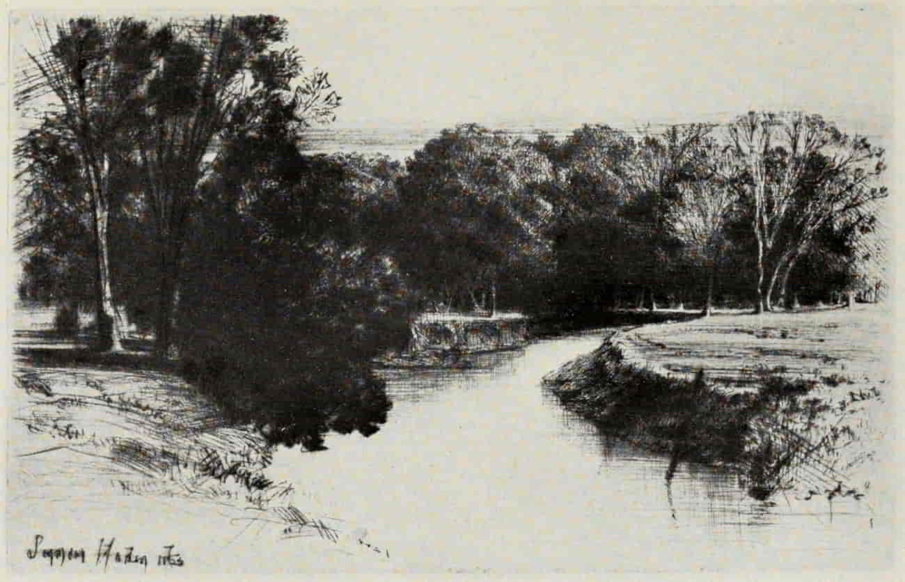
SEYMOUR HADEN. SUNSET IN IRELAND
Size of the original dry-point, 5⅜ × 8½ inches
In the Museum of Fine Arts, Boston
(If supported click figure to enlarge.)
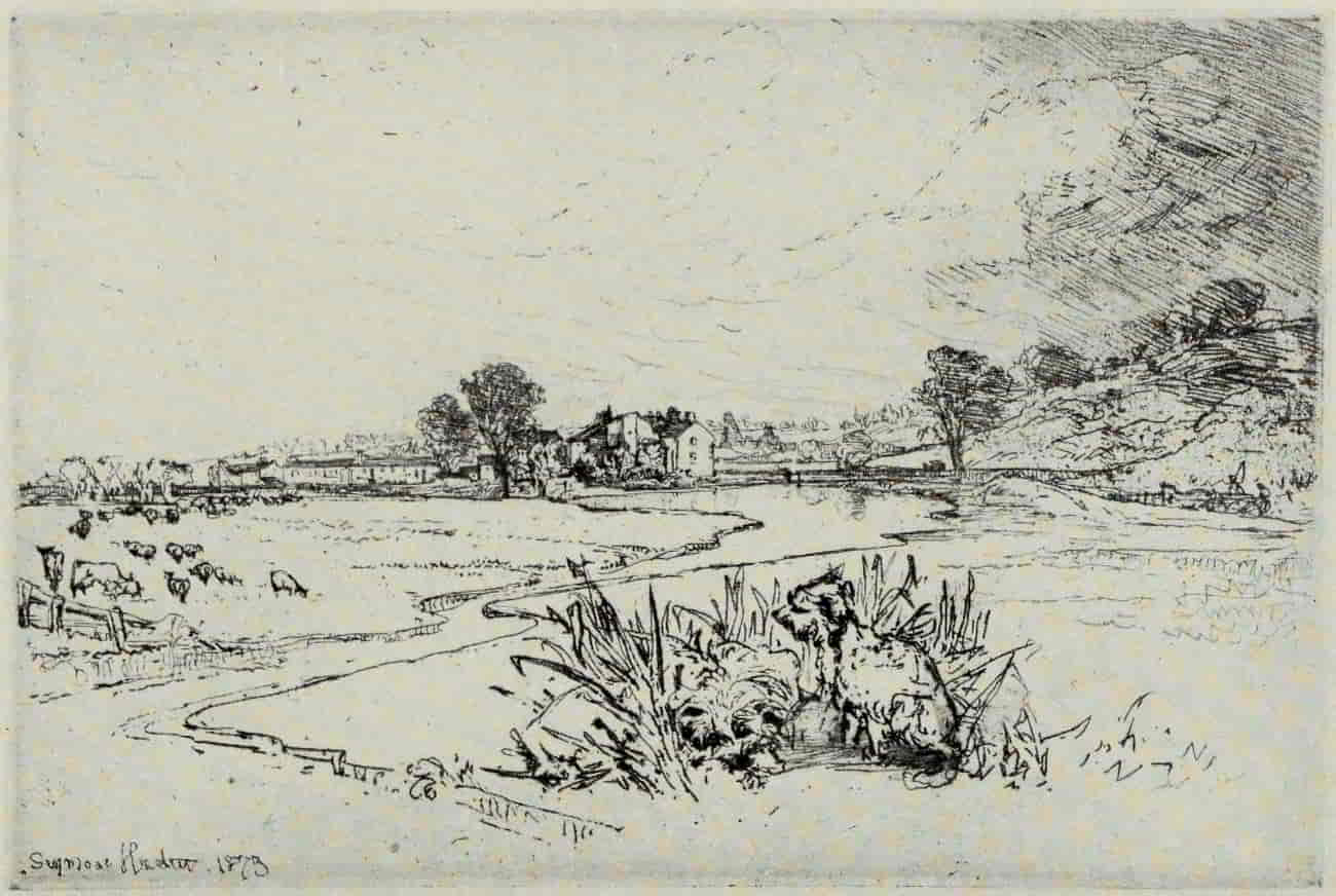
SEYMOUR HADEN. SAWLEY ABBEY
Size of the original etching, 10 × 14⅞ inches
In the Collection of the Author
(If supported click figure to enlarge.)
A Water Meadow (incidentally, a plate which the artist himself liked) is a fine transcript of a sudden shower in the Hampshire lowlands. It is bold and painter-like, admirable from every point of view, though some may prefer On the Test, with its truly noble sky, etched later in the day from a somewhat different point of view. Cardigan Bridge is a model of what a sketch should be, free, suggestive, spontaneous, [Pg 269]yet full of knowledge. It is one of five similar plates, etched in a single day, August 17, 1864, a “good day” indeed, such as rarely comes to etchers or to painters! The more one sees of modern etching, the more one is inclined to value work of this order. It is so easy, so fatally easy, to make wriggles in the water and scribbles in the sky; but to suggest, by these seeming careless loops and latchets, the flow of the river, the movement of clouds, the splendor of the setting sun—that indeed is another matter! Yet all this, and more, Seymour Haden has done in a magisterial manner.
By-road in Tipperary is the largest and most highly prized of his woodland plates and well deserves the reputation it so long has enjoyed. Structurally the trees are very fine, both as to branch and stem drawing; and, as in the two plates of Kensington Gardens, the suggestion of foliage with the light filtering through the leaves is quite beautiful. Sunset in Ireland is a plate which the artist, the collector, and the general public all unite in praising. “That is the plate,” said Seymour Haden, shortly before his death, “which, in years to come, will fetch the enormous prices!” And his prophecy has come true. Both in its earlier states, less rich in burr, with a luminous evening effect, and in the later and darker impressions, it is “a thing of beauty”—one of the most remarkable landscape[Pg 270] plates of modern times, wherein the artist has captured, for once, all the poetry and melancholy sentiment of the twilight hour. Sawley Abbey, on the River Ribble in Lancashire, has, to some of us, however, a “swing” and pattern, which make of it a better and more manly plate. It must be seen in an early state to be adequately judged. For some inexplicable reason the artist saw fit later to “clean up” the sky and all the foreground to the right, leaving the plate cold, empty, and almost meaningless.
Nine Barrow Down, a dry-point, is in Haden’s happiest vein. It is instinct with that priceless quality, the “art which conceals art,” and is so seeming simple that one may readily forget that its “simplicity” is the result of a most rigid selection of the essential lines, guided by the knowledge of a lifetime.
There is a growing tendency among the younger and more “advanced” collectors to belittle Seymour Haden and his work. Unquestionably there are many etchings which fall far short of his best; but at his best, in the dozen or two plates of which he himself approved, he towers far above any of his contemporaries, and there seems little likelihood of his supremacy in landscape being seriously threatened.
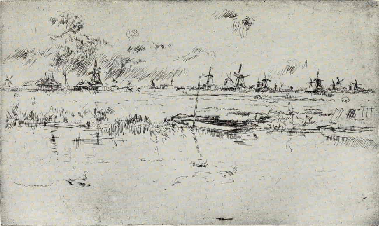
J. A. McN. WHISTLER. ZAANDAM (First State)
Size of the original etching, 5⅛ × 8⅝ inches
In the Collection of Howard Mansfield, Esq.
(If supported click figure to enlarge.)
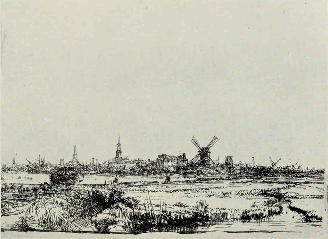
REMBRANDT. VIEW OF AMSTERDAM FROM THE EAST
Size of the original etching, 4⅛ × 5⅞ inches
In the Museum of Fine Arts, Boston
(If supported click figure to enlarge.)
Whistler, “the greatest etcher and the most accomplished [Pg 273]lithographer who ever lived” (according to Mr. Joseph Pennell), seems to have interested himself in landscape hardly at all. Not even his most ardent disciples would assert that the master’s few purely landscape plates contribute greatly to the pyramid of his fame. But even here one must tread softly. Whistlerium tremens is still a highly contagious disease; and has not his official biographer written “All his work is alike perfect”? How then may a modest lecturer presume to praise or compare? Let Mr. Pennell speak: “Look at Rembrandt’s prints made, I do not know whether with Amsterdam or Zaandam in the background, and then at Whistler’s of the same subjects. Rembrandt drew and bit and printed these little plates as no one had up to his time. But Whistler is as much in advance of Rembrandt as that great artist was of his predecessors. In these little distant views of absolutely the same subject, Whistler has triumphed. It is not necessary to explain how: you have only to see the prints to know it.... The older master is conservative and mannered; the modern master, respecting all the great art of the past, is gracious and sensitive, and perfectly free.”
“You have only to see the prints to know it.” Well, let us look at two of them: Rembrandt’s View of Amsterdam, of 1640, and Whistler’s Zaandam. “Why drag in Velasquez?” the master of[Pg 274] the gentle art of making enemies is reported to have said, upon one historic occasion. This time, so far as landscape etching is concerned, may it not be Rembrandt’s turn to say, “Why drag in Whistler?”
[Pg 275]
LANDSCAPE ETCHING
BIBLIOGRAPHY
Fine Prints. By Frederick Wedmore. 15 illustrations. Edinburgh: John Grant. 1905.
The Great Painter-Etchers from Rembrandt to Whistler. By Malcolm C. Salaman. Edited by Charles Holme. 191 illustrations. London, Paris, New York: The Studio. 1914.
Four Masters of Etching. [Haden, Jacquemart, Whistler, Legros.] By Frederick Wedmore. Original etchings by Haden, Jacquemart, Whistler, and Legros. London: Fine Art Society. 1883.
Dutch Etchers of the Seventeenth Century. By Laurence Binyon. 4 reproductions and 29 text illustrations. London: Seeley & Co. 1895. (Portfolio Artistic Monographs. No. 21.)
Altdorfer, Albrecht (c. 1480-1538)
Albrecht Altdorfer. By T. Sturge Moore. Edited by Laurence Binyon. 25 illustrations. New York: Longmans, Green & Co.; London: The Unicorn Press. 1901.
Albrecht Altdorfers Landschafts Radierungen. Edited by Max J. Friedländer. 9 reproductions and 1 text illustration. Berlin: Bruno Cassirer. 1906. (Graphische Gesellschaft. Publication 3.)
Albrecht Altdorfer and Wolf Huber. By Hermann Voss. 160 reproductions on 63 plates. Leipzig: Klinkhardt & Biermann. 1910. (Meister der Graphik. Vol. 3.)
Gellée, Claude, called Lorrain (1600-1682)
Claude Lorrain; Painter and Etcher. By George Graham. 4 reproductions and 23 text illustrations. London: Seeley & Co. 1895. (The Portfolio Artistic Monographs.)
Rembrandt Harmensz van Rijn (See also Bibliography under “Some Masters of Portraiture,” p. 224.)
Rembrandt’s Landscape Etchings. By Laurence Binyon. 8 illustrations. The Print-Collector’s Quarterly, Vol. 2, No. 4, pp. 407-432. Boston. 1912.
Jacque, Charles Émile (1813-1894)
L’oeuvre de Ch. Jacque; catalogue de ses eaux-fortes et pointes sèches. By Jules Marie Joseph Guiffrey. With an original etching. Paris: Mlle. Lemaire. 1866.
———. Nouvelles eaux-fortes et pointes sèches. Supplement au catalogue. Paris: Jouaust & Sigaux. 1884.
Charles Jacque. By Robert J. Wickenden. 18 illustrations. The Print-Collector’s Quarterly, Vol. 2, No. 1, pp. 74-101. Boston. 1912.
[Pg 276]
——— ———. Reprinted. Boston: Houghton Mifflin Co. 1914. (Print-Collectors’ Booklets.)
Daubigny, Charles Francois (1817-1878)
C. Daubigny et son oeuvre gravé. By Frédéric Henriet. 5 original etchings and 4 reproductions. Paris: A. Levy. 1875.
Daubigny. By Jean Laran. 48 reproductions. Paris: Librairie centrale des Beaux-Arts. n. d. (L’Art de Notre Temps.)
Charles-François Daubigny; Painter and Etcher. By Robert J. Wickenden. 15 illustrations. The Print-Collector’s Quarterly, Vol. 3, No. 2, pp. 177-206. Boston. 1913.
——— ———. Reprinted. Boston: Houghton Mifflin Co. 1914. (Print-Collectors’ Booklets.)
Corot, Jean Baptiste Camille (1796-1875)
Corot. By Loys Delteil. An original etching and 102 reproductions. Paris: L’auteur. 1910. (Le peintre-graveur illustré, XIXᵉ et XXᵉ siècles. Vol. 5.)
Corot and Millet. With critical essays by Gustave Geffroy and Arsène Alexandre. Edited by Charles Holme. 120 illustrations. London, Paris, New York: John Lane. 1902. (The Studio.)
“Le Père Corot.” By Robert J. Wickenden. 9 illustrations. The Print-Collector’s Quarterly, Vol. 2, No. 3, pp. 365-386. Boston. 1912.
——— ———. Reprinted. Boston: Houghton Mifflin Co. 1914. (Print-Collectors’ Booklets.)
Millet, Jean-François (1814-1875)
Jean-François Millet. By Arsène Alexandre. The Etchings of J. F. Millet. By Frederick Keppel. 85 illustrations. London and New York: John Lane. 1903. (The Studio.)
Jean-François Millet. By Loys Delteil. Illustrated. Paris: L’auteur. 1906. (Le peintre-graveur illustré, XIXᵉ et XXᵉ siècles. Vol. I.)
Alfred Lebrun’s Catalogue of the Etchings, Heliographs, Lithographs and Woodcuts Done by Jean-François Millet. Translated from the French by Frederick Keppel. With additional notes and a sketch of the artist’s life. 7 reproductions. New York: Frederick Keppel & Co. 1887.
Jean-François Millet; Painter-Etcher. By Mrs. Schuyler Van Rensselaer. With a biographical sketch of Millet by Frederick Keppel. 11 illustrations. New York: Frederick Keppel & Co. 1901. (The Keppel Booklets. 1st series.)
The Art and Etchings of Jean-François Millet. By Robert J. Wickenden. 14 illustrations. The Print-Collector’s Quarterly, Vol. 2, No. 2, pp. 225-250. Boston. 1912.
——— ———. Reprinted. Boston: Houghton Mifflin Company. 1914. (Print-Collectors’ Booklets.)
[Pg 277]
Millet’s Drawings in the Museum of Fine Arts, Boston. By Robert J. Wickenden. 11 illustrations. The Print-Collector’s Quarterly, Vol. 4, No. 1, pp. 3-30. Boston. 1914.
Haden, Francis Seymour (1818-1910)
A Descriptive Catalogue of the Etched Work of Francis Seymour Haden. By Sir William Richard Drake. London: Macmillan & Co. 1880.
The Engraved Work of Sir Francis Seymour Haden, P. R. E. By H. Nazeby Harrington. 250 reproductions on 109 plates. Liverpool: Henry Young & Sons. 1910.
The Water-Colors and Drawings of Sir Seymour Haden, P. R. E. By H. Nazeby Harrington. 8 illustrations. The Print-Collector’s Quarterly, Vol. 1, No. 4, pp. 405-419. Boston. 1911.
Sir Seymour Haden, Painter-Etcher. By Frederick Keppel. 5 illustrations. New York: Frederick Keppel & Co. 1901. (The Keppel Booklets. 1st series.)
Personal Characteristics of Sir Seymour Haden, P. R. E. By Frederick Keppel. 27 illustrations. The Print-Collector’s Quarterly. 2 parts. Part I. Vol. 1, No. 3, pp. 291-316. Part II. Vol 1, No. 4, pp. 421-442. Boston. 1911.
Whistler, James Abbott McNeill
The Etched Work of Whistler. Illustrated by Reproductions in Collotype of the Different States of the Plates. Compiled, arranged, and described by Edward G. Kennedy. With an introduction by Royal Cortissoz. 1002 reproductions. New York: The Grolier Club. 1910.
A Descriptive Catalogue of the Etchings and Drypoints of James Abbott McNeill Whistler. By Howard Mansfield. 1 portrait. Chicago: Caxton Club. 1909.
Whistler as a Critic of His Own Prints. By Howard Mansfield. 12 illustrations. The Print-Collector’s Quarterly, Vol. 3, No. 4, pp. 367-393. Boston. 1913.
The Life of James McNeill Whistler. By Elizabeth Robins Pennell and Joseph Pennell. 97 illustrations. 5th edition. Philadelphia: J. B. Lippincott Company. 1911.
Mr. Whistler’s Lithographs; the Catalogue. By Thomas R. Way. 1 lithograph. London: George Bell & Sons. 1896.
Whistler’s Lithographs. By Thomas R. Way. 18 illustrations. The Print-Collector’s Quarterly, Vol. 3, No. 3, pp. 279-309. Boston. 1913.
The Lithographs by Whistler, Illustrated by Reproductions in Photogravure and Lithography, Arranged According to the Catalogue by Thomas R. Way, with Additional Subjects Not Before Recorded. 166 reproductions. New York: Kennedy & Co. 1914.
The Art of James McNeill Whistler. By T. R. Way and G. R. Dennis. 11 portraits and 41 plates. London: George Bell & Sons. 1904.
[Pg 278]
Whistler’s Etchings; a Study and a Catalogue. By Frederick Wedmore. London: A. W. Thibaudeau. 1886.
———. Same. 2nd edition. London: P. & D. Colnaghi & Co. 1899.
The Gentle Art of Making Enemies. By J. A. McN. Whistler. London: William Heinemann. 1890.
———. Same. 2nd edition. 1892.
———. Same. 3rd edition. 1904.
The Gentle Art of Making Enemies. Edited by Sheridan Ford. Paris: Delabrosse & Compagnie. 1890.
Cameron, David Young (1865- )
D. Y. Cameron; an Illustrated Catalogue of His Etched Work; with an Introductory Essay and Descriptive Notes on Each Plate. By Frank Rinder. 444 reproductions. Glasgow: J. MacLehose & Sons. 1912.
Cameron’s Etchings; a Study and a Catalogue. By Frederick Wedmore. London: R. Gutekunst. 1903.
Bone, Muirhead (1876- )
Etchings and Drypoints by Muirhead Bone. By Campbell Dodgson. Portrait. London: Obach & Co. 1909.